- AuthorPosts
- September 22, 2019 at 7:49 am #30458
 JT890Guest
Dear BoldGrid Team & Community,
I hope you are well!
I would really appreciate your help with some issues I am facing when using BoldGrid Post & Page Builder. Specifically,
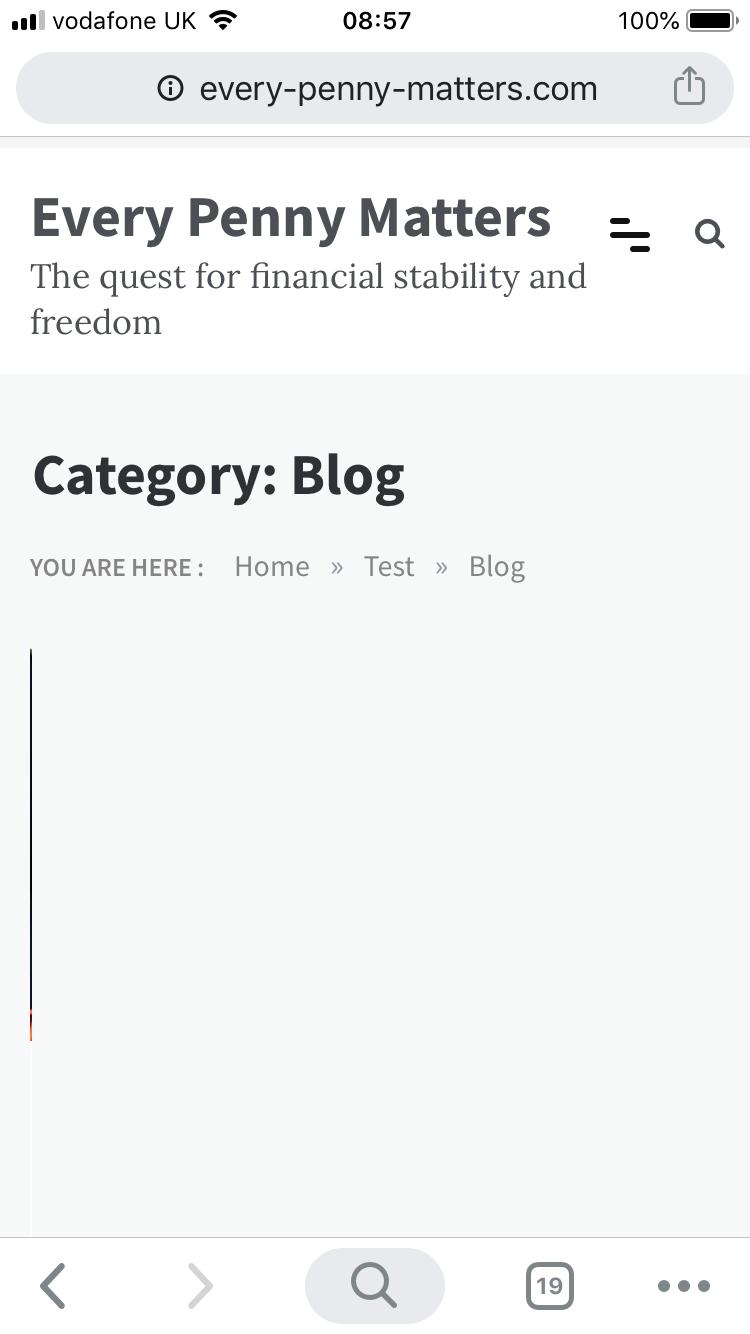
1) When BoldGrid Post & Page Builder is activated, the blog page can no longer be viewed on mobile (it is fine on tablets and desktop)
2) When I try to solve the issue by deactivating BoldGrid Post & Page Builder, the formatting goes completely awry on the desktop view (i.e. with the sidebar overlapping the main content on the Home, About Me, and Contact Me pages; no issues with the blog page in this case)
Many thanks for your help in advance and I look forward to hearing from you!
Kind regards,
JT
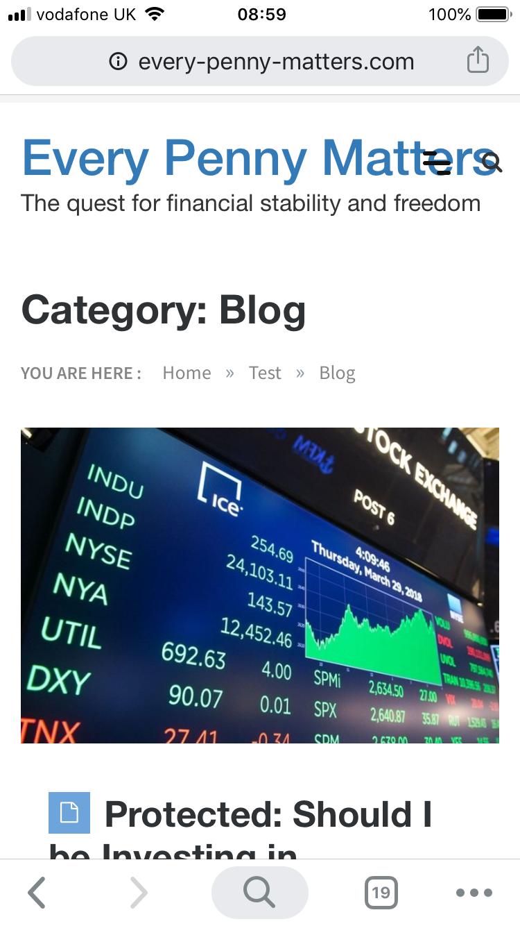
September 23, 2019 at 4:03 am #30459JT890GuestI thought I’d add some pictures to illustrate the issues! Many thanks 🙂
September 23, 2019 at 12:59 pm #30460supportGuestHi JT,
Sorry to hear about the styling problems on your website and our team will do everything we can to get this working for you.
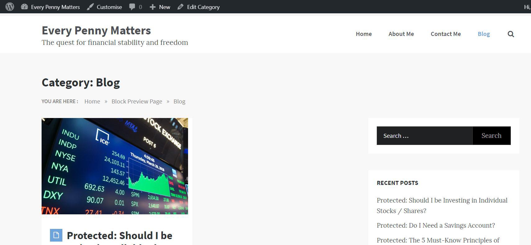
It looks like the theme you are using bases a lot of its blog styles off of the Bootstrap framework which is causing some conflicts with the Post and Page Builder since it uses Bootstrap as well to handle responsive styling.
One solution I have for this is to use custom CSS to address these style conflicts and the following code snippets that should fix this problem.
@media (max-width: 991px) {
    .archive.category #masonry-loop article {
	position: relative !important;
	top: 0 !important;
	left: 0 !important;
	width: 100%;
    }
    .archive.category #masonry-loop {
	height: unset !important;
    }
}
I hope that this code works for you and please let us know if there is anything else that we can do to assist you, we are always happy to help!
September 24, 2019 at 4:40 am #30461JT890GuestThank you so much BoldGrid Support Team, really appreciate it! I just realised I’ve found one other small styling issue with the blog page. I’ve selected masonry view and optimally the posts should appear as two columns. At the moment however it only appears as a single column and there’s a gap in the middle of the page where the second column should be (I’ve attached a screenshot). This is only a problem for the desktop top view (and not an issue for mobile and tablet).
Again, thank you so much for your help in advance! Last issue (for now!) hopefully!
Kind regards,
Justin
September 24, 2019 at 6:08 am #30462JT890GuestOh apologies! The issue seems to have sorted itself out now. Sorry for the hassle! Have a great week ahead 🙂
September 24, 2019 at 8:59 am #30463supportGuestYou’re welcome Justin, I’m glad to hear everything is working for you now! If you ever have any other questions in the future please do not hesitate to ask, we are always happy to help.
- AuthorPosts
- The topic ‘Problems with website / mobile formatting when using Post & Page Builder’ is closed to new replies.