- AuthorPosts
- December 15, 2019 at 4:36 pm #30647
 nel-de-bearckGuest
Hello. I am trying to get the Resolve Theme to play nice on a mobile phone, but have not had any success getting the header block, title, social menu, and call to action to display in a sensible place on a mobile phone. I have seen other posts about using a media query and custom CSS to address similar kinds of problems, I am familiar with that process in general, but am not familiar with the specific CSS “terms” for the relevant elements. There is also a large blank space below the header when viewing on a mobile phone. Basically, I believe I need to move the elements up or down or change their size. The site in question is neilbjorklund.com.
December 15, 2019 at 4:39 pm #30648nel-de-bearckGuestThat should say “Resolve” theme. And the blank space I’d like to remove or reduce is below the call the action.
December 19, 2019 at 4:04 pm #30650Jesse OwensGuestHello-
Thanks for the great questions, I’m sorry to hear you’re having trouble getting your site to play nicely on mobile devices.
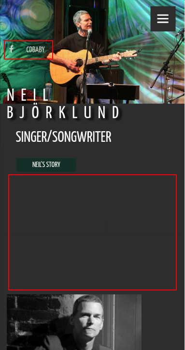
So from what I understand, you’re trying to accomplish two main things- move the social menu to a sensible place, and reduce the spacing between your call-to-action button and the start of the page content. Here’s what I see currently:

Right now, your social menu displays on the left, which isn’t consistent with your main menu hamburger, so I’m making the assumption that you’re looking to move it to the right-hand side with your other menu.
Here’s a CSS Media query rule I came up with that will hopefully accomplish what you’re looking for. You can paste this directly into your Customize -> Advanced -> Custom JS & CSS Custom Theme CSS field.
@media only screen and (max-wdith: 992px){
#menu-social {
text-align: right;
}
.mod-space-home {
margin-top: auto !important;
}
.mod-space-home div {
height: 0px;
}
div.entry-content {
padding-top: 0px !important;
margin-top: 0px;
}
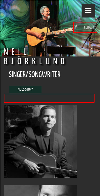
}These rules will display like this:
I hope this helps! Please let me know if we can help further for you.
- AuthorPosts
- The topic ‘How to get Revolve theme header, title, social menu, etc to display well on a mobile phone?’ is closed to new replies.