- AuthorPosts
- September 14, 2020 at 8:55 pm #26934
 lee burbankGuest
The navigation widget on the side bar in my blog is not working properly. I am using the evolve theme. The site page jumps when you click on the menu, either the top menu or the blog one.
When you click on the blog at the top the blog menu appears for a brief second on the blog page properly formatted, indented showing the sub category, then the page jumps and the formatting is gone and the indentation is gone, the menu items in the blog are just listed. What am i doing wrong? Please help.
September 14, 2020 at 8:58 pm #26978Jesse OwensMemberHello Lee-
It’s a little tough to speculate what might be going on based on your description. When you say the page “jumps,” is it reacting to clicks/hovering over menu items in your widget?
You mentioned that some formatting shows correctly for a moment and then loses its format once the page is fully loaded, which sounds like there might be a CSS rule or JavaScript that is loading late on the page.
You mentioned your site wasn’t live yet in your private data, is there a staging site that you have live that we might be able to take a look at so we can help you out? It won’t be published, just let us know in your reply if we can see this so we can check it out.
September 15, 2020 at 12:35 pm #26988leeGuestJessie, if you click on any menu item on the top and on the blog side menu, you will notice that the page jumps or readjusts. if you click on the blog menu you will notice that the menu appears the way it should in the upper right just for a split second. I have tried everything for 3 days to find out why this is happening. I am new to WordPress. This is my first attempt at building a site and using this software. Thank you so much in advance for helping me. let me know if this link works for you. Lee
September 15, 2020 at 12:57 pm #27006Jesse OwensMemberHi Lee-
Thanks so much for the link to your staging site, that definitely helps out.
I simulated loading your website on a slower connection, like a mobile hotspot, and I was able to see the behavior you described. This is because one of the stylesheets is loading later in the process and changing the behavior of the nav list.
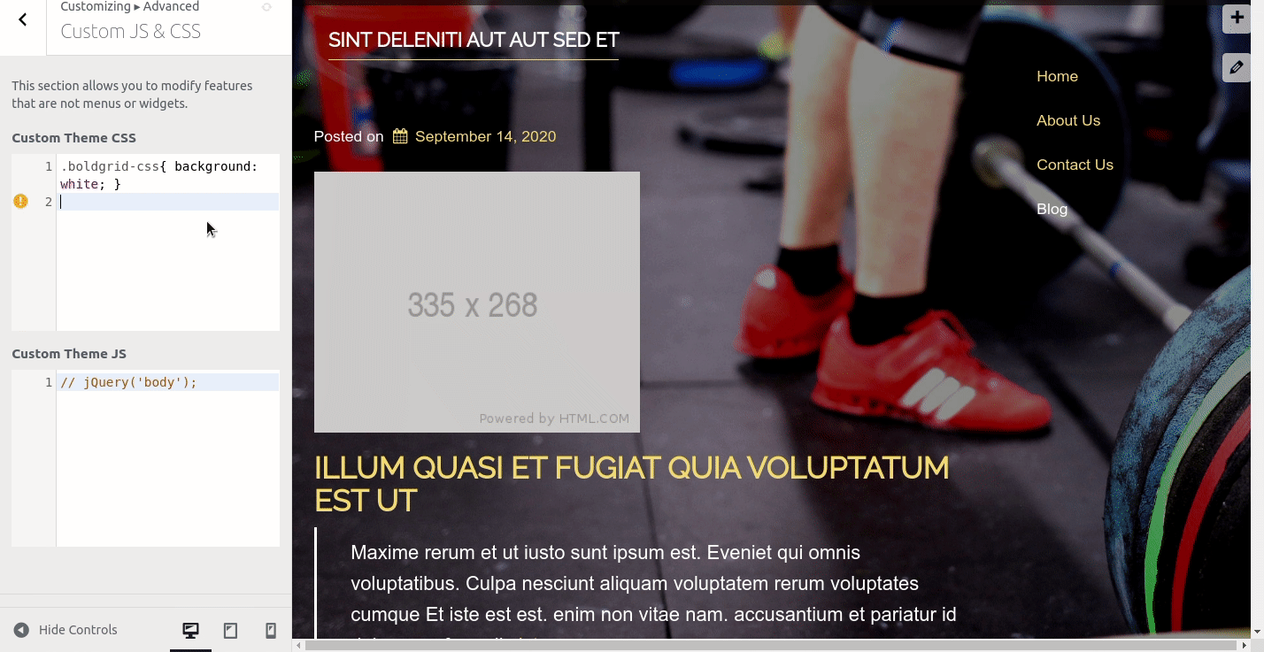
I found this Custom CSS rule restored the indented formatting that you want. Navigate to Customize > Advanced > Custom JS & CSS and paste this code into your Custom Theme CSS:
ul.nav { padding-inline-start: 40px; }September 15, 2020 at 3:52 pm #27016leeGuestJessie
I pasted it in but it gives me an error “unknown property ‘padding-inline-start'” also it didnt change it.
September 15, 2020 at 3:52 pm #27037lee burbankGuestJessie,
first of all, i really appreciate your help with this. Did you get my response that I tried the css code you gave me and it gave me an error and it didnt work?
September 15, 2020 at 4:00 pm #27050Jesse OwensMemberHi Lee-
You’re right, the Custom CSS engine doesn’t recognize the attribute “padding-inline-start,” however I took a look and it does semm like it’s working on your site’s front end.
I recreated a menu similar to yours to test it out:
 September 15, 2020 at 4:47 pm #27054lee burbankGuest
Jessie,
it indents it but still leave too much space between the lines. Isn’t there a fix with code that will make the menu that flashes stay on the screen? I thought that is what you were doing, making that menu stay and not be messed up by the style sheet loading.
September 15, 2020 at 4:57 pm #27061Jesse OwensMemberHello Lee-
Forgive my misunderstanding, I was assuming your main objective was to get the indented format back.
The other piece of the puzzle is the padding around the elements. You can fix that with this Custom CSS rule:
ul.nav>li>a {
    padding-top: 0px;
    padding-bottom: 0px;
}
Keep in mind that if your primary audience is using a slower internet connection like mobile hotspots, you may want to consider a simpler design with fewer large images to slow down the loading process. This will help prevent the “jumping” behavior you’re experiencing.
September 15, 2020 at 5:38 pm #27065lee burbankGuestThanks Jessie,
That works. Thank you! Just one more thing. Is it possible to put in code that also uses bullets in the sub categories like the upper menu that is gone? Also i was just looking at the site using the hot spot on my phone and it seems to load really well. I appreciate your advice though and i will be considering it as i move forward. I really want to get the site up and running as soon as i can. Still have a bit of writing to do..
September 15, 2020 at 5:48 pm #27070Jesse OwensMemberHi Lee-
Yes, this is possible! If you only want bullets on the sub-items, use this code:
ul.nav>li>ul>li>a {
   display: list-item;
   list-style: disc;
}
There are other options for the “list-style,” including “circle” and “square” depending on what look you’re going for.
September 15, 2020 at 6:25 pm #27077Lee BurbankGuestJesse,
Thanks so much!! I have agonized over this for days… you are the best!
lee
- AuthorPosts
- The topic ‘[Resolved] navigation on the side bar’ is closed to new replies.