Tagged: Crio, Typography
- AuthorPosts
- March 21, 2022 at 1:32 pm #48813
 Zach GunyanGuest
Good Afternoon!
I am working on a site that is based off of the Crio theme. We setup the desktop part of the site and it works out pretty well, however when brought up on a mobile device some of the text didn’t come through correctly due to block padding I am pretty sure.
So instead of working around the padding issue, I thought it would be kind of cool to have a block on the page dedicated to just mobile devices, so I turned off visibility to certain blocks based on device type, this doesn’t seem to be working at all. Now I can see all blocks on all devices. I did try flushing caches and all the normal basic diagnostic things, any thoughts on how to make this work better?
March 21, 2022 at 1:42 pm #48849Brandon CParticipantHi Zack,
Thanks for reaching out and thank you for using Crio Pro WordPress theme! Sorry to hear you’re having issues with mobile responsiveness.
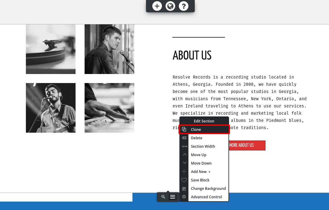
Without using custom coding, the best way to change the mobile display without changing the desktop display is to clone your blocks, and then use the responsive utilities to only show one or the either block on the mobile or desktop versions.
First, create a clone of the block you need to edit. Click on Edit Section > Clone:

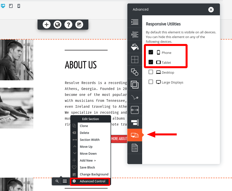
Then, assign one clone to hide on Desktops and large screens, and one clone to hide on mobile and tablets. Click on Edit Section > Advanced Control > Responsive utilities:
Then, when you switch between mobile and desktop view in the editor, you’ll only change the block that’s showing on that device, without changing the one that shows up on the other.
March 22, 2022 at 9:06 am #48878Zach GunyanGuestGood Morning;
Thank you for that information! I have been doing that, I did find out that you have to do apply this advanced control configuration on all the sections of that block or it doesn’t work.
I do have a follow-up with the Crio Premium Themes. In the editor on the back end, everything looks fine for pictures and stuff. We have a section on our website where we have two pictures side by side, and there is a circle shaped mask over top of the picture, so instead of seeing the whole picture you only see what is inside of that circle shape.
When you go to the live view of the website, the one circle turns into an oval
When you look at the editor view, it looks fine, any thoughts on how to go and fix this?
I do have pictures, however when trying to link them to this post, I keep getting a denied error.
March 22, 2022 at 10:33 am #48883Brandon CParticipantThanks for the update Zach,
I consulted with the Crio Premium team and they informed me that the cause of your issue was a bug that was fixed in the 2.13.1 version of Crio about a week and a half ago. but since then a new update (2.13.2) was released where the patch was not included.
We put together a new version (2.13.3) where the functionality is available that’s still in testing and slated to be released soon. In the meantime you can use WP Rollback to restore the functionality of Crio version (2.13.2) which should resolve your issue.
I hope this helps. Please let us know if you have any other questions for us.
- AuthorPosts
- The topic ‘Issue with mobile responsiveness in Crio WordPress theme’ is closed to new replies.