
The Post and Page Builder plugin for WordPress includes Responsive Utilities that control how elements appear on various device sizes. By default, all elements are visible on all devices. The following guide will explain how to make an element hidden on certain devices.
- While editing a page or post, select the element (column, row, or section) you wish to control
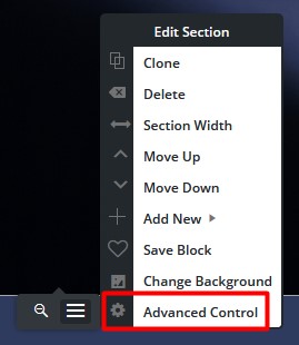
- Hover over the element, click the hamburger menu and then Advanced Control
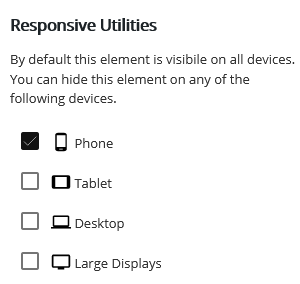
- Click the Responsive utilities option, designated by the 3 screens icon
- Check the boxes for all device sizes you wish the item to be hidden on. In this example, the element would show on all screensizes except Phone
- Click Publish or Update to save your changes
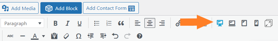
A common mistake users sometimes make is selecting the “Views” (Desktop,Tablet, Phone) Icons toward the top of the page editor, thinking it will only effect the selected screen size.
While the “Device View” icons are helpful for responsive design its purpose is to show you how your page will be seen on a Tablet or Phone.
FAQs
Can responsive utilities help my website load faster on mobile devices?
One key component for website speed is having the lowest FCP (first contextual paint) time possible. The FCP is the largest thing that needs to load first on any device. Many websites use a background image in the first section on the page – this image is likely taking up the most FCP time.
With mobile devices you want the FCP to be as fast as possible to limit how long your users are looking at a blank screen. One way to improve the mobile FCP is to use a solid color background instead of an image. Using the Responsive Utilities, you can use custom CSS to hide the image on mobile devices. Please follow along with our video below:
Congratulations! You now know how to use the Responsive Utilities in the Post and Page Builder.
SIGNUP FOR
BOLDGRID CENTRAL
200+ Design Templates + 1 Kick-ass SuperTheme
6 WordPress Plugins + 2 Essential Services
Everything you need to build and manage WordPress websites in one Central place.
Alex says:
Why is the only option to hide the elements. If I have an element on desktop, I clearly would want it to show on mobile. But there is no way to resize or make any elements appear properly across various devices. Please explain how that makes sense or is helpful?
Brandon says:
Hi Alex, this guide simply give you a run down of the responsive utilities feature. This feature allows you to hide certain elements on any screen size, which then allows you to reuse that content space to reformat fully functional versions of the same layout for any screen-size. While this is an option, you’re still able to create mobile responsive elements with Post and Page Builder. You can also create globally responsive text and formatting using your Crio theme options.
If you’re having trouble with a specific elements display please start a new forum topic and we’ll look in to coming up with a solution for you on our end right away! Thanks Alex.
Ethan says:
You can make a different version of that element for each device.
So for example on the desktop and large display you have a pic sized at 800×600 and that is hidden on tablet and phone, so it only displays on large format and desktop.
then you can have another element in the same place sized at 200×150. That second one is hidden from large format and desktop so it only displays on the tablet and phone
Brandon says:
You’re exactly right Ethan, you can make separate versions of each block element for each device size. The responsive utilities in Post and Page Builder allows you to hide elements according to screen size.
Patricia says:
So how do you make that, though? I just lost hours of work because I thought switching the view, and altering there, was how you made the different device views – but that alters site-wide. And I read this post. So I get that I can just delete, but that’s awful. I want the same pics for the site across all devices. How do you have one size pic for one device and the same pic in the same place but sized for another device? How do you actually make that happen? My desktop is beautiful. My phone looks terrible. I’m not sure I’m even asking the right questions. This is all so frustrating and not intuitive at all. Should I just be on Squarespace? (Honest question! Not being a jerk!)
Brandon says:
Hi Patricia, sorry to hear you’re having some trouble. I think you’re paying attention to the “Views” (Desktop,Tablet, Phone) Icons toward the top of the page editor, as it states in the text above these “Device View” icons are helpful for responsive design its only purpose is to show you how your page will be seen on a Tablet or Phone.
The Responsive Utilities are accessible from the “Section”, “Row” or “Column” that hold your content. Hover over the element, click the hamburger menu and then Advanced Control. Find the Responsive utilities option, designated by the 3 screens icon. This option allows you to hide content on certain screen sizes enabling you to create new content to only be displayed on the desired device size.
If you need further assistance and would like us to inspect your page please create a new forum topic and include the URL of your website. We’ll look into it ASAP! Thank you.