In this guide, we will show you how you can start working with menus in your BoldGrid site. BoldGrid gives you the ability to create, delete, reorder, add items, or assign menus to locations on your website. By working with menus, you can easily setup your social media menu to link to your own accounts.
Menus are the primary navigation method for your site visitors. They will be using the menus to learn more about your site, navigate between pages, and interact with your site offerings. For business owners, menus provide an opportunity to communicate your goals and values to your customer as well as an avenue for them to communicate with you.
It is less likely a visitor will stay on your site long enough to read it if they find difficulty navigating pages. Designers should provide an easy path for visitors to follow, and BoldGrid adds all the functionality you will need to do this right from the WordPress Customizer.
Working with Default Menus
If you started with a BoldGrid Inspiration, you may notice you have some default menus already installed. These menus will have a name and a current location. BoldGrid comes with a series of Menu Locations you can use. If a menu is currently occupying one of those locations, you can see the name of the menu in parentheses.
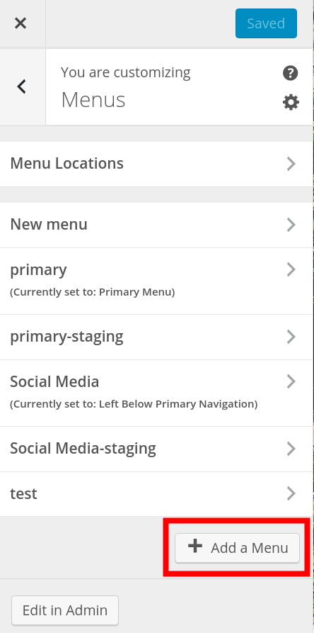
How to Create a New Menu
- Login to BoldGrid.
- Click Customize, then Menus.
- You will see the existing menus listed. Click the + Add a Menu button.

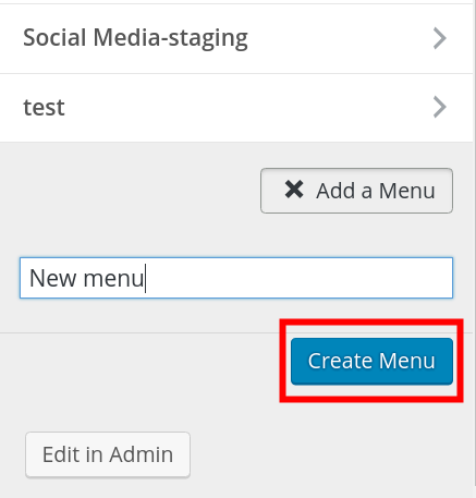
- Enter your new menu name, then click the Create Menu button. You must then add items to the menu, which is covered in the next section.

Automatically Add New Pages to Your Menu
After choosing a menu location for your new menu, you will notice the Menu Options below. If you would like a new menu item to appear for new pages, check the box labeled Automatically add new top-level pages to this menu. Continuing along in this WordPress Customizer series, you are going to learn more about using Widgets in your site.
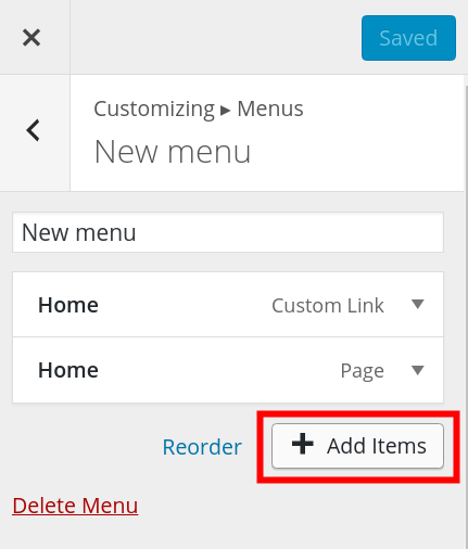
How to Add Menu Items
- Login to BoldGrid.
- Click Customize, then Menus.
- Click the menu you want to add items to, then click the + Add Items button.

- Choose the type of menu item you want to add, then click the Save & Publish button. Options are Custom Links, Posts, Pages, Categories, or Tags.
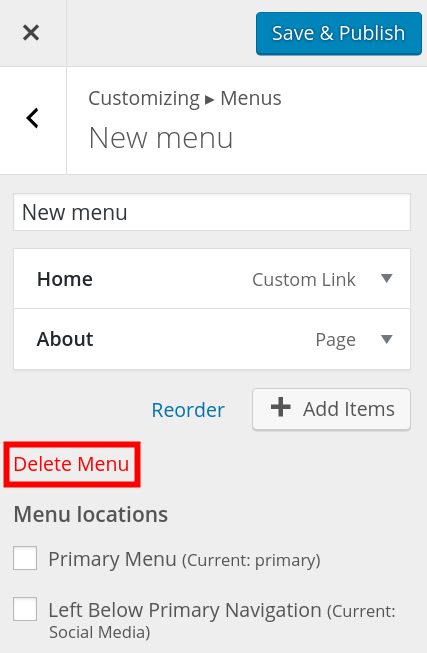
How to Delete a Menu
- Login to BoldGrid.
- Click Customize, then Menus.
- You will see your menus listed. Select the one you want to delete.
- Click the Delete Menu link.

- Click the Save & Publish button.
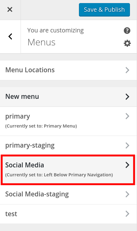
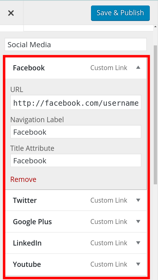
How to Setup your Social Media Menu
- Login to BoldGrid.
- Click Customize, then Menus.
- Select the Social Media link.

- You will then see a list of available social media options including Facebook, Twitter, Google Plus, LinkedIn, and Youtube. Click them to add a link to a link to your social media page. You only have to setup the ones you want to use.

- Click the Save & Publish button.
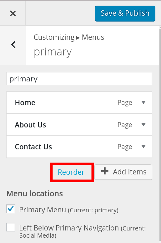
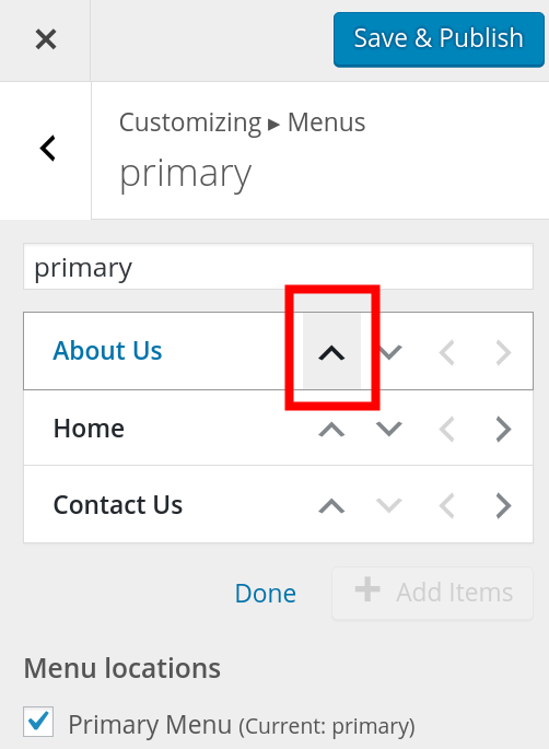
How to Reorder menus
- Login to BoldGrid.
- Click Customize, then Menus.
- Select the menu you want to reorder.
- Click the Reorder link.

- Click the arrows to move the menus up and down. Items higher on the list display first on the menu.

- Click the Save & Publish button.
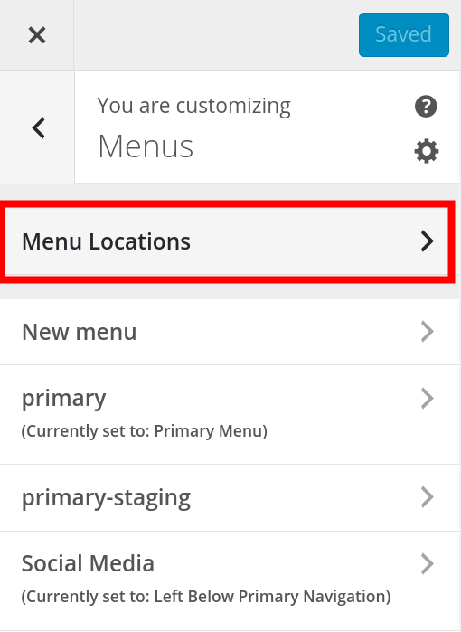
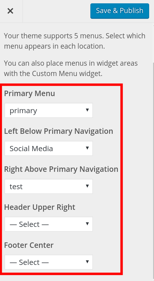
How to set Menu Locations
- Login to BoldGrid.
- Click Customize, then Menus.
- Click the Menu Locations link.

- You will see the menu locations listed such as Primary Menu, Left Below Primary Navigation, Right Above Primary Navigation, Header Upper Right, and Footer Center. Keep in mind the menu locations will differ based on your specific theme. Click the drop-down box below the menu locations to choose which menu will display there.

- Click the Save & Publish button.
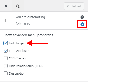
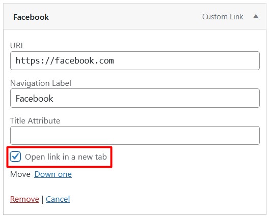
How to Open Menu Links in a New Tab
- Login to BoldGrid.
- Click Customize, then Menus.
- Click the gear icon In the Menus interface to show the Advanced Menu Properties.
- Enable the Link Target option.

- Navigate to the menu that contains the link item you want to open in a new tab.
- Click the dropdown arrow next to that link item and enable Open link in a new tab.

SIGNUP FOR
BOLDGRID CENTRAL
200+ Design Templates + 1 Kick-ass SuperTheme
6 WordPress Plugins + 2 Essential Services
Everything you need to build and manage WordPress websites in one Central place.
Ester says:
I have a problem hiding page items from my menu. Originally it was working fine through the Publish In menu section, but then I changed my theme and added commerce, and now my desktop menu is different from my iPhone menu. On the desktop menu it hides the items like I want but on the iPhone menu it shows all items regardless of the fact that I haven’t published them on my menu in editing. How can I fix this?
Brandon says:
Hi Ester! I see you also created a topic on this subject. We’ll have a reply for you at this link!
Sarjoo says:
Hi I’ve a problem with creating my website within Boldgrid. The problem is, how do I get my pages posted within the respective submenus I’ve created. Example: I’ve a page already set up for Why Proofread?, so how would I post this page under the submenu of the same name?
Boldgrid is very confusing to use…
Brandon says:
Hi Sarjoo. If you setup your submenu item as a custom link you’ll need to click the drop down and add the link to that page in the URL box. Be sure to save your changes by clicking the “Save Menu” button in the bottom right corner of the page.
Werner says:
Great post
Andy says:
I am struggling with the background for the current page.
In Crio, I used Design/Menus/Main Menu/Menu Items/Active Link Style to set the highlight for the selected page: Link Color for the text and Background Color for the background.
This works fine if I am on a page on the main menu but not if I am on a secondary page. If ABOUT US in on the main menu and I am on that page, the menu text is highlighted in red and the menu background is highlighted in green (see attached https://ibb.co/5rM0xTF). But if I am on Projects, a sub-page of ABOUT US, the ABOUT US text on the menu remains highlighted in red but the background is no longer green.
It seems odd for the ABOUT US text to continue to be highlighted but the ABOUT US background to no longer be highlighted. Shouldn’t they both work in the same way? How do I get the background of ABOUT US to be highlighted?
BoldGrid says:
Hello Andy,
Thanks for your comment, I have created a ticket with our developers to address this issue in a future Crio release. In the meantime, this custom CSS should work for you:
 #main-menu .current-menu-item > a,
 #main-menu .current-menu-ancestor > a,
 #main-menu .current-menu-parent > a {
 background: var(--color-2)
 }
You will need to change the 2 to the Color Palette position of the color you’ve selected as the background. If it is the last position, please use –color-neutral instead of –color-6.
If you’d like to create a post in our forums and provide your website URL we can further assist if necessary.
Thanks,
Nicole
Manu says:
Question: Why when I switch to laptop, phone or table view my menu disappears? it seems only be working on large screens.
Joseph says:
Hi Manu!
Menus in our themes automatically collapse down into the Hamburger style display when viewed on smaller screens and you should be able to interact with your menu items by clicking on the Hamburger icon. Is that icon not displaying for you when viewed on smaller screen sizes?
If you are using Crio, our most powerful WordPress theme, to design your website then you also have the option of disabling the Hamburger design completely and your menu items will show up in the expanded view across all device sizes. You can disable the Hamburger display by opening up your website Customizer and navigating to Design > Menus > Main Menu > Hamburger Style. In the Hamburger Style section you should see a control that allows you to toggle the Hamburger Menu design state for your menu and deactivating that option will prevent your menu items from collapsing into the Hamburger display for smaller screens.
Please let us know if you have any other questions for us!
Andy says:
I created a widget menu. I even followed this to make it horizontal using this https://www.boldgrid.com/support/wordpress-tutorials/how-to-create-a-horizontal-navigation-menu/
But I cannot figure out how to change the formatting (font type, size & color + where to space it on page horizontally) nor how to have the active page highlighted.
BoldGrid says:
Hi Andy,
You’ll need a little more CSS to accomplish those tasks, here’s the code for the font type, size, and color:
 #horizontal-menu li {
 color: #000;
 font-family: 'Roboto';
 font-size: 16px;
 }
To have the active page highlighted you will need code like this:
 .boldgrid-shortcode.horizontal-menu .widget li.current-menu-item a {
 color: #000;
 }
Finally, could you please clarify “where to space it on the page” to be sure I provide the correct code?
Thanks,
Nicole
Andy says:
Nichole – that code was perfect as it afforded me the traction to start playing with things to get what I needed including the location.
I had a follow up question. The client (aka my wife) wants 3 secondary pages to ‘belong’ to a page on the main menu:
Main Menu: HOME / ABOUT US / PROJECTS
Secondary Menu: About Us / People / Clients
When you click on ABOUT US on the Main Menu, the About Us page shows up with the secondary menu (no secondary menu on HOME or PROJECTS). ABOUT US on the Main menu is highlighted as is About Us on the Secondary Menu.
She wants ABOUT US on the Main menu to stay highlighted when we click on People or Clients so all three pages listed on the Secondary Menu are ‘subpages’ of ABOUT US on the Main menu. She doesn’t want the Main menu to show People or Clients as subpages of ABOUT US on the Main menu.
Is there a way to do this, i.e., have a Main Menu item show as active if a certain other page is active?
Thanks for the help.
Jesse says:
Hi Andy-
If I’m understanding you correctly, what you’re describing *should* be the default behavior. Check out this screenshot:

Take note of the menu items beneath “About Us.” Even though I’m currently viewing the “People” page, “About Us” is still using the highlighted style to indicate that you’re currently viewing a sub-menu item.
It’s a little tough to visualize though, so forgive me if I’m not understanding correctly. If you’d like, start a new Support Forum topic where you can share the link to your site privately with us, so we can take a closer look.
Andy says:
Thanks Jesse.
The default behavior is not what I want – the boss wants no dropdowns in the Main Menu for ABOUT US. I agree it is hard to explain (i realize I did a lousy job above) but perhaps a pic would help and I just figured out how to share an image with you via this link: https://ibb.co/h83QrYj
Jesse says:
Hi Andy-
Thanks! That diagram helps a lot. In order to accomplish this without a lot of really fancy coding, I recommend using Crio Pro’s Custom Page Headers feature. (If you’re using one of our Platinum WordPress Hosting partners, Crio Pro is already included in your hosting subscription). Check out this video where I showed another user how to use different Headers and Menus on different pages:
Ksenia says:
Hi, How can I add a Telegram icon that would lead my Telegram account and an envelope icon that would lead to the “Contact Us” page in the Social Media menu? Thanks!
Jesse says:
Hi Ksenia-
Check out these instructions for adding custom icons to your menu.
Matthew says:
Hi, is it possible to add a private page to a menu such as the primary menu such that it only appears in the menu to logged in members and not to the general public?
Jesse says:
Hi Matthew-
This functionality isn’t included in BoldGrid or WordPress out-of-the-box, but you could accomplish it with a plugin like If Menu. It lets you set menu item visibility based on WordPress conditional logic. In this use-case example, you’d use logic similar to
( is_user_logged_in() )Matthew says:
Thanks.
Alternatively would it be possible to have a members-only page which was only accessible to logged in people but which appeared in the menu for everybody?
Jesse says:
Hi Matthew-
Yes, you can accomplish that with WordPress out-of-the-box without additional plugins. When you publish your page, set the Visibility setting to Private, and it will only be accessible to logged-in users:

Matthew says:
Thanks, but when I tried that the private page, ‘Members’, didn’t appear in the column of available pages in ‘Add Items’. I tried to add it by typing Members into the ‘Add New Page’ field, and could add a page called ‘Members’ to the menu. However then when I tried to reorder it two items called ‘Members’ appeared on the actual page to the right of the Customize panel, one at the end where it first appeared in the Primary menu list, and one wherever I dragged it. In both cases after Publishing this page turned out to be /members-2/ not /members/ as was the private one I created in Add New Page. Not only that when I refresh the page in another browser where I’m not logged in it wouldn’t even change the order when I’d changed it in the logged in browser and clicked Publish.
Matthew says:
Not only this but I see in editing the proper Members page there is a part of ‘Publish’ panel where it says In menu: None Edit. I click Edit, and tick the checkbox next to primary, and click OK. Now it says In menu: primary. But if I click Update, it changes it back to None. If I go onto a different page, or go back, again it resets it to None.
Joseph says:
Hi Matthew!
If there are problems adding your Members page to your menu with the Pages menu items then another solution you could try is the Custom Link option. Add a Custom Link to your menu and then supply the full permalink of your Members page in the URL field to see if that helps you create the menu behavior you are looking for. I am not entirely sure why the Pages option is behaving as expected, but hopefully using a Custom Link instead will be a suitable workaround.
Please let us know if you have any other questions for us!
Matthew says:
Hi
I took Joseph’s advice, and added the Members page via Custom Links, and re-ordered the menu, and that worked. I then tested how it looked both when logged in and logged out.
When logged in, “Members” appears at the right place when you’re on every other page, but when you’re on it it disappears from the menu.
When not logged in, it appears in the right place in the menu when you’re on all pages, except Home, where it disappears. I don’t know if it’s relevant but I was on the Home page when using Customize to add the Custom Link. When not logged in the Member page returns a 404.
Jason says:
Hi,
How do you create sub-menus?
I thought it would just be a matter of nesting links, but I can’t drag and drop, and the re-order doesn’t work either (the arrows on up,down,left,right are completely random and jumbled).
If I change the location from ‘Primary Header’ to ‘Upper Right’ then there are some random nested links.
I’m using Google Chrome, any ideas?
Jesse says:
Hi Jason-
That’s pretty odd behavior that you’re describing. It should be relatively straightforward to move the menus into the nested position either by dragging or using the arrows:

If that’s not what you’re seeing, can you start a new Support Forum thread and include some details like which theme you’re using, and exactly what happens when you try to drag or use the reorder arrows?
Jason says:
Thanks Jessie, will do! 🙂 (Yeah super odd)
For the time being I’m using a menu plugin (not ideal) just to get the drop downs working.
I’m not sure if it’s a theme setting either, but in the ‘Primary’ menu it displayed a random dropdown, and in the ‘Upper’ menu location it would flatten and bunch up all the menu items.
I’ll log a support ticket and see how it goes (It’s a pretty simple site) Thanks!
Megan says:
Hi, I am wondering how to make the social icons, when clicked on, open into a new tab?
BoldGrid says:
Hi Megan,
Thanks for the great question! It just takes a few extra clicks to have menu items open in a new tab. First, open the Customizer and click on Menus. On the right side of the panel, you will see a gear icon like shown here:

Click the gear to open the panel and then check Link Target. Next, click on your social media menu and open the menu item you’d like to change. There will be a new checkbox to Open link in a new tab. Check this box on each menu link as needed, then publish and close the Customizer.

The links will now open in a new tab! Please let us know if you need anything else.
Thanks,
Nicole
Hannah says:
Hi, I am wondering how I can edit the size and placement of the menu icon on the mobile website? (The box with 3 lines) I am using the Boldgrid Florentine theme.
Jesse says:
Hi Hannah-
The size and position of the mobile “Hamburger” menu aren’t adjustable without custom coding in Florentine. If you’re looking for a fully customizable experience, I recommend checking out our newest theme, the Crio WordPress SuperTheme.
Hannah says:
Thank you, as I have already created the website I don’t want to create it in a new theme. So I have amended my header to suit the menu tab. However, I now notice that while in the Mobile Website, because my font colour is white, the drop down menu is not visible on some pages (Because white text on white nackground).
Is there any way I can edit the drop down menu so that it has a coloured background?
I have already tried multiple ways, of changing the theme colours for different locations but it stil remains the same.
If you can help that would be great! Really appreciate your fast and informative replies that have helped me so far. Thank You
Joseph says:
Hi Hannah!
If you only need to change the background color of the dropdowns then you might be able to use the following CSS code in your Customize -> Advanced -> Custom JS & CSS menu to make the alterations you need.
ul.dropdown-menu { background: #123456 !important; }Just replace the color hexcode is that CSS snippet to the color you want to set as the dropdown background and you should be all set! Please let us know if you have any other questions for us!
Hannah says:
Hi Joseph, Thanks for your reply. I have tried that and it does not seem to have made a difference. Is the code you suggested the same one for the Mobile phone website Menu?
Jesse says:
Hi Hannah-
You’re right, that previous code only affects “drop-down” menus in the desktop mode. To give a color background to the menu items on mobile, try this:
ul.sm-collapsible { background: #123456; }Hannah says:
Hi Jesse, Thanks for your latest reply on this (unable to reply to the latest thread). That code also does not seem to make a difference. It may be something on my end, maybe updating the code into the wrong area into the CSS. Will try some other ways. Thanks again
Jesse says:
Hi Hannah-
If you’d like us to take a closer look, feel free to start a new support forum thread where you can share your website URL privately, and we’ll be happy to help further.
Tasneem says:
Hi , I am wondering how to create one page menu by using this theme
BoldGrid says:
Hello,
If I’m understanding you correctly you’re looking to add anchor links for a single page and add those anchor links to a menu. We have a separate article – https://www.boldgrid.com/support/boldgrid-themes/how-to-use-anchor-links-to-navigate-on-a-single-page/ – on how to do this.
Please let me know if this answers your question.
Thanks,
Nicole
Sarah says:
Wondering how to add an opaque background to the hamburger menu in florentine for mobile only as the menu is difficult to see over our background image.
Jesse says:
Hi Sarah-
You can use a little bit of Custom CSS to accomplish this. Depending on your color palette, you’ll need to adjust the color here, but a good idea is to copy the color from the hover style of your hamburger menu. Here’s the code using one of the default color palettes. Navigate to Customize > Advanced > Custom JS & CSS and paste this code into your Custom Theme CSS:
.palette-primary .navbar-default .navbar-toggle { background-color: #592d2e; }Sarah says:
hm, I did try that – i’m using florentine
www. play-n-gro .com – doesn’t seem to be working.
Jesse says:
Hi Sarah-
Thanks for the link! The code I provided makes the inside of the hamburger solid, not the background behind it. You could try something like this to improve it:
.site-header {
    background-color: rgba(253, 224, 224, 0.75);
}
This is a semi-transparent background, similar to the one in the block at the bottom of your page, at 75% opacity so you can still see the image, but the contrast is much better for the menu.
Kay says:
Hi. I’m trying to create a primary menu whose ONLY function is to show dropdown menus on hover.
I do not want the primary menu items themselves to be clickable or to lead to “original” pages, but when I delete the “original” page (autogenerated by adding an item in the primary menu) the primary menu item also disappears and with it the dropdown menu it contained.
How do I generate a primary menu item that ONLY calls a dropdown menu on hover and does NOT itself lead to its own page? I’m using the Wedge theme.
Jesse says:
Hi Kay-
Thanks for the great question! You can accomplish this with a work-around, but the process is a little strange.
First, create your top-level menu item as a Custom Link. For the URL, enter only the ‘#’ character, and click Add to Menu:

Once it’s been added to your menu, edit the custom link, and delete the # character and Publish the result:

Once you’ve published it after deleting the # character, you’ll have a non-clickable top-level item, with the sub-items showing up on hover.
Tara says:
I am using the Resolve theme and am trying to figure out how to change the colors for the Social Media menu items.
Jesse says:
Hi Tara-
In Resolve, the Social Media menu icon color is hard-coded. You can change it with a little bit of Custom CSS, though. Navigate to Customize > Advanced > Custom JS & CSS and paste in a line similar to this:
.palette-primary .fa, .palette-primary .menu-social li a { color: #ffffff; }Then you can replace
#ffffffwith the color name, hex code, or RGB value of the color you’d like to use.Tara says:
Jesse,
That code worked perfectly! Thank you so much for the help!
Tara
Bridget says:
Hi there — I left a comment on 10/7/20 in this thread that could be helpful for reference. Jesse Owens helped me out with some nested menu items for the Swifty theme, they weren’t working when the Primary menu was set to an alternate location. He provided a code snippet to fix this. However when viewed on a mobile device, the + sign for revealing the submenu items overlaps with the primary menu item title, blocking some of the words. Is there a way to control where this + sign appears? Perhaps just at the start of the title word? Thanks!
BoldGrid says:
Hello Bridget,
Sorry for the delayed response, but I just spoke with our theme developer and he recommended using this custom css to move the + sign below the text instead of in the same line. This way you can be sure they won’t overlap.
.navbar-toggle.sub-arrow {
position: relative !important;
}
Please let us know if you need anything else!
Thanks,
Nicole
Bridget says:
That worked great, thanks so much!
Daniel says:
I am using the BoldGrid Uptempo theme and I have two boxes on the home page. The problem I am having is that the menu is nested above the first box which has my logo on it. Id like my menu to sit between the two boxes versus on top of the first or in the footer.
Currently:
Primary Menu
Box 1 (Logo)
Box 2
Desired:
Box 1 (logo)
Primary Menu
Box 2
Jesse says:
Hi Daniel-
Can you start a new Support Forums post, and let us know which theme you’re using, and a link to your website (if you’re willing to share) so that we can give you specific instructions?
Matthew says:
Hi, is there a way to resize the text in the header menu? The theme looks great, but I could definitely use slightly larger text. Also, is there a way to switch the site logo and the header menu?
Jesse says:
Hi Matthew-
The answers to those questions are going to depend on which theme you’re using. The Crio Supertheme allows you to swap the sections around and customize the design. You can accomplish that with Custom CSS as well.
You can change the font size in Customize > Fonts > Menus in any theme. If you’d like help customizing your header in more detail, start a new support forum thread and let us know which theme you’re using, and we’ll be happy to help.
Benjamin says:
When I go to Customize>Fonts. the option for Menus appears for a second then disappers and I can’t change the menu fonts. What is going on?
Joseph says:
Hi Benjamin!
Are there any updates available for the plugins and themes installed on your website? If so then running those updates might address whatever compatibility problem is causing the issue with the menu font controls.
One other thing to look for is to make sure that you have at least one menu assigned to any of the Menu Locations available in the WordPress Customizer. The controls might be getting disabled automatically if there aren’t any active items for them to edit.
Sara says:
I am using the DICED theme in WordPress. I have added Menus but it does not give me an option to re-order them (literally…there is no button). Bold Grid seems to be what I go into instead of the “Appearances” tab many others talk about. Also, I set the area I want each of my tabs to appear in but for some reason it will only show ONE of them…not ALL of them. I am SO FRUSTRATED with WordPress. What should be easy is frustrating and difficult. Would you be able to share how to add multiple menus and also change the order they appear on my site?
Jesse says:
Hi Sara-
You should be able to reorder the menu items by simply clicking-and-dragging them to the right locations:

As for your menu areas and adding multiples, would you be able to fill out a new Support Forum post with a link to your site so we can check it out? Each theme has slightly different options for displaying multiple menus so it’ll help if we can see what you’re seeing.
Bridget says:
Hello, I am working with the Swifty theme and it appears that if I want my Primary Menu to display properly as a nested menu, it can only be placed in the location of Primary Menu. Once I move it to a location of Header Top or Header Bottom, it will not appear as nested anymore. Is this correct? I have completely deleted the Menu and rebuilt it but that didn’t fix anything. The default location of Primary Menu is unfortunately too short to make all of my menu items appear in one line, even when nested. Thank you!
Jesse says:
Hello Bridget-
Yes, you’re right that the secondary and tertiary menus, “Header Top” and “Header Bottom” in Swifty, do not support nested menu items. In order to accomplish this, you can use this snippet of code with the Code Snippets plugin to add nesting support:
Bridget says:
Thanks so much Jesse — got this installed, pasted the code, and it does take the sub-menu items out of the main menu line. However, when I hover over the menu item, none of the sub-menu items display below it. So the sub-menu pages aren’t accessible. Any code fix for that?
Jesse says:
Hi Bridget-
Sorry about that, I made a mistake and missed the navbar-default class. I’ve updated the code above, so if you reload this page and re-copy the code, it should work as expected now.
Bridget says:
No worries, that worked, thanks!
One last question and I’ll leave you alone.
Changing that code magically changed the alignment of that one menu to be right-justified, rather than centered.
I had previously been trying out modifying different parts of styles.css to get it left-justified. I located one item that was right-justified, but changing that code didn’t change anything with this menu.
Am I on the right track to keep [cautiously] poking at styles.css to change this alignment, or is there another file I should be focused on instead?
Thanks!
Jesse says:
Hi Bridget-
First thing, I don’t recommend changing the styles.css file directly, because any changes you make will be overwritten next time the theme is updated. Instead, use the Custom Theme CSS in Customize > Advanced > Custom JS & CSS. Once you’re there, add this CSS rule to left-justify the secondary menu:
div.secondary-menu {float: left;}If you’re using the “Header Bottom” location, use this instead:
div.tertiary-menu {float: left;}Cat says:
How do I create a drop down menu within my menu? I sell food and jewelry under the same title and I’d like a way to indicate that while keeping them separate.
Jesse says:
Hello Cat-
You can make a drop-down menu by dragging the sub-menu items slightly to the right, underneath their parent menu item. The end result should look something like this:
There are some more detailed instructions in this article.
eperpetua says:
I have a bunch of listings that I want to have links that lead to their own separate page that is not visible in the menu. Like, you see something and you click on the more info button, and it takes you to a page dedicated to that one thing, but the only way to get there is by clicking the more info button. How do I do that?
Jesse says:
Hi Eperpetua-
If each listing has its own page, you can do this with a button. If you’re using the Post and Page Builder, click the + button at the top of the editor, and choose a button. Then, you’ll be able to link the text “more info” to your page.
DJackson says:
Hi. I’m using the Swifty theme. I created a primary menu (orange boxes with white writing). It shows up fine on a large screen, but when the screen is medium or small, the primary menu disappears entirely. I know on mobile, menus usually default to a hamburger menu, but I don’t see it (perhaps it’s white on white).
How do I either keep the primary menu the same on medium and small screens (orange boxes with white writing) or change the color of the hamburger menu so users on smaller screens can see them?
I’d like to test both to see what looks best. Thanks!
Jesse says:
Hello DJackson,
It’s possible that your hamburger menu is being shown as white-on-white and making it invisible. These colors are going to be controlled by the Color Palette in your Customize > Colors menu. You can also customize any of these colors in your menu using Custom CSS. Here’s some more information about how to use Custom CSS on your menus:
If you need help determining exactly how to accomplish this, please visit the Support Forum and include a link to your site so our team can assist you.
Arthur says:
How can I center the header menu? Right now it is set to align right.
Joseph says:
Hi Arthur,
If you are using Crio to design your website then you will find the controls to change your header layout by navigating to Design > Header > Layout in your website Customizer. You will then be able to add new header sections and reorganize the content as need to get the design you are looking for! We also have a guide on customizing your header design with Crio that should be useful as a reference.
Travis says:
When on mobile my primary menu located in the top header collapses into a hamburger menu. That’s great. Except that is placed a line below the site title. How do I move the hamburger menu to the top line next to the site title?
Jesse says:
Hi Travis-
The specific answer to this is going to depend on the theme you’re using, but I took a few minutes to make this video to show you how to do it.
Here’s the code from the video:
jQuery('.header-6').not('.row').addClass('col-xs-6');jQuery('.header-7').not('.row').addClass('col-xs-6');
dionne says:
on my Wedge -child theme, Primary Naviagation Menu Bar is white. ive deleted and readded. still white utiil i hover i get one menu item at a time show up. On mobile the enitre menu it white-out. Was not happening until i installed the child theme. How can i fix?
Jesse says:
Hello Dionne-
If you’re creating a child theme, make sure you’re enqueueing the computed styles from the parent using the instructions found here. Specifically, you’ll need a function like this in your functions.php file:
function boldgrid_enqueue_styles() {
 $parent_style = 'boldgrid-wedge';
 wp_enqueue_style( $parent_style, get_template_directory_uri() . '/style.css' );
 wp_enqueue_style( 'child-style', get_stylesheet_directory_uri() . '/style.css', array( $parent_style ),
 wp_get_theme()->get('Version') );
 }
 add_action( 'wp_enqueue_scripts', 'boldgrid_enqueue_styles' );
Brenda says:
How can I make the menu items link to different sections on the page, as opposed to entirely separate pages?
Jesse says:
Hello Brenda-
This is called creating an Anchor Link. You’ll need to add an ID to a piece of your page, such as a heading, and then create a link to that ID using the # symbol. For example, if you had a heading that was called
<h2 id="section-home">, you can link to it with<a href="#section-home">. I took a few minutes to make a video to walk you through doing it the easy way:More info can also be found in this article about using anchor links.
david says:
am i able to adjust the line spacing on a menu? on a laptop it’s fine, but, on a mobile the third item is below and too close to the top items.
Jesse says:
Hi David-
If you’re using a BoldGrid Theme, you can target your menu items with the CSS selector
li.menu-item a. So for example, if you only need to increase the line-height on mobile, you can use code like this in your Custom Theme CSS:@media only screen and (max-width: 768px) {li.menu-item a { line-height: 1.5em; }
}
Arthur says:
Where exactly in the css do I edit to remove the button background color of the dropdown menus?
The theme I am using is Hifidel.
Jesse says:
Hi Arthur-

The dropdown menus in Hifidel use the first and second color palette options in your Customize -> Colors menu:
I recommend using the color palette to keep your site design consistent, but if you do only need to remove the background color of the dropdowns, use this CSS code in your Customize -> Advanced -> Custom JS & CSS menu:
ul.dropdown-menu { background: transparent !important; }You can also use another color in place of transparent if you need to.
Javed says:
Hi there!
Please help me.
1. How our Navigation bar will stick to the top when we reach its scroll position. using bold grid themes and other than Boldgrid themes.
2. How can we finish ATTRIBUTION PAGE linked in footer of Boldgrid themes Named as ” SPECIAL THANKS”.
Best Regards,
Javed Awan.
Carlos says:
Hi, Javed.
Thanks for posting your comment regarding the navigation bar appearance when scrolling and how to edit the Attribution Page linked in your footer.
The scroll effect requires custom CSS modification. You can use the following code:
#site-navigation {background:#83745d;
height:60px;
z-index:170;
margin:60 auto;
border-bottom:1px solid #dadada;
width:100%;
position:fixed;
top:0;
left:0;
right:0;
text-align: center;
}
.site-branding {
margin-top:60px;
}
You would add this code by navigating to Customize > Advanced > Custom JS & CSS, then copying/pasting it into the field labeled: Custom Theme CSS.
NOTE: This is the code used for a test website I have, you may need to make adjustments to the code to customize the appearance, to match with your website.
The Attribution page is not able to be edited. However, if you are using a Premium Connect Key, you can use our guide, how to remove the Attribution/Special Thanks Link, to remove it.
I hope this helps!
Sincerely,
Carlos D
Javed says:
Thanks a lot….
jabar says:
How can I add an erased social media icon?
Arnel says:
Hello Jabar,
You should be able to re-add them by using the Social Media widgets. Follow this tutorial and it should help you get them back in place. If you continue to have problems, please let us know.
Alex says:
My Widgets tab doesn’t seem to include Social Media as an option. Any idea how to fix this? Thank you.
Jesse says:
Hello Alex,
By default, BoldGrid Themes handle the Social Media icons as a Menu, not a widget. If you do need to use the social media menu as a widget, choose the Navigation Menu type of widget and select your Social Media Menu from the options there. Or, you can check out these many other social media widgets available on the WordPress Plugin Repository.
janterraadmin says:
Hi I was wondering why I would have child pages showing up on my main menu, and as they should be as child pages? I should not this is only a few of them, there are other child pages that are presenting as they should.
JohnPaul says:
Hello janterraadmin,
Thank you for contacting us. As a test, try deleting the menu item from the main menu as described above. This should remove the link to the pages in your menu.
Thank you,
John-Paul
jsdekruif@gmail.com says:
Can I make the top menu “not clickable”? I just want the submenu to be clickable. Thanks! Juile
Carlos says:
Hi, Julie.
Yes, you can make the Top Menu without having a link to click on. Have a look at our article on How to Disable a Top Menu Item Link. Setting up the “Custom Link” menu item as outlined in the guide, will result in a non-clickable menu item (like the top menu), which you can add sub-menus to, as well. I hope this helps!
Sincerely,
Carlos E
Debbie says:
How do I change the color of the text of my menu. The current color is not in the color palette I chose and does not show against the background I want for my home page. Thanks!
Christopher says:
Which theme (Inspiration) are you using?
Luciana says:
Hello! I need to change the menu item color and the “hover” color as well… I’m using Haven theme. Thanks!
Jesse says:
Hello Luciana- You can also modify these manually using custom CSS in your Customize -> Advanced -> Custom JS & CSS menu. You can use a CSS rule like this- simply replace the color codes with the ones you need:
In Haven, the menu’s hover/active color is the 4th color in your color palette, and the inactive color is the 5th color. You can access this by going to Customize -> Colors
.palette-primary .navbar-default .navbar-nav > li > a { color: #e7e7e7; }.navbar-default .navbar-nav > .active > a, .navbar-default .navbar-nav > li > a:hover { color: #000000 !important; }
Benjamin says:
How do I change the font of the menu? My background makes my menu difficult to read.
Arnel says:
Hello Benjamin,
Apologies, but there is no direct way to change the font of the menu. You may want to adjust your background image using an image editor. Themes developed for BoldGrid are responsively designed so that the color and font type are considered against the background image.
If you have any further questions, please let us know.
Kindest regards,
Arnel C.
Madhan says:
Can we atleast change the size of the font please? They are too small.
Madhan says:
Also, how do I move the menu items to the left? In the ‘Evolv’ theme they are far to the right and I want to move them down and towards the left side.
Jesse says:
Hello Madhan-
The Evolv Theme is designed to use a right-side primary menu, but you can accomplish this with a couple of steps.
1. Navigate to Customize -> Menus -> Primary
2. Un-check “Primary Menu” and check “Below Header”
3. Navigate back to Customize -> Advanced -> Custom JS & CSS and paste the following code into Custom Theme CSS:
.header-8 { padding-left: 0px; }
 #tertiary-menu { text-align: left !important; }
 #tertiary-menu a { font-size: 18px; } //Adjust font size to your need
Jesse says:
Hello Madhan-
You can change the font size of your menus in Customize -> Fonts -> Menus.
Thai says:
Thanks a lot, John.
I will try it.
Merry Christmas!
Casey says:
Thai, you’re very welcome. We’re always glad when our users are happy! Have a great day, and a very Merry Christmas!
Thai says:
Hi,
How can I freeze the top menu when scrolling down the page? So I can still see it.
Thank you.
Thai.
JohnPaul says:
There is not currently a “built-in” way to make a floating menu in BoldGrid. This means you will have to custom-code a solution or use a 3rd party plugin for adding this functionality. There are many plugins available for adding a floating menu in WordPress, view them here:
https://wordpress.org/plugins/search.php?q=floating+menu
You may have to test several to determine the one that works for you. Ensure it is compatible with the latest version of WordPress (4.7).
rd@caribbeanwineclub.com says:
How can I resize the social media icons in my social media menu? They’re too small.
Scott says:
Hello rd,
You can adjust the size of the icons by using the Custom CSS tool located in the Advanced tab of the Customizer. Simply add the following code, close the editor, and click the “Save and Publish” button.
#menu-social i {font-size:30px;}
You can adjust the number 30px up or down to for the icon size.
Kindest Regards,
Scott M
Daniel says:
Can i add a drop down to the titles on the menu?
Christopher says:
You can by setting new Pages or Categories as the “children” of the pages or categories in the menu.
Daniel says:
Is there a tutorial for this?
JohnPaul says:
Here are the basic steps, though it may differ on your specific theme.
1. Login to the Dashboard
2. Click “Customize”
3. Click “Menus”
4. Click the menu you want to add a child to, such as “primary”
5. Add menus as needed
6. Move the new menus below the menu you want to drop down, and drag them slightly to the right, almost like it is indented. It will then add the menu item as a drop down option
Daniel says:
John, WOW! That’s simple! Thanks so much!!
Jen says:
Question: If I set a Child Menu for the Primary Menu Location it works..but if I try to set a child drop down menu on the Top Menu it does not create a drop down. How do I fix?
carlosd says:
Hi Jen,
I’m sorry to see you are experiencing issues with your Menus. I’m not quite sure what you mean by Child, Primary, and Top menus. To add a drop-down to your menu, simply drag and drop to indent the item in the list of menu items. If you are still experiencing issues with this, please be sure to provide the exact steps you are taking so we can replicate the issue you are having. At this time though, I am unable to determine an issue with BoldGrid menus, as described in this guide.
Best Regards,
Carlos D