The 1.21.0 release of the Post and Page Builder includes a tool to create responsive table designs. Tables are a great way to show comparisons or feature lists on your website. Most tables look the same on mobile devices, meaning a horizontal scrollbar appears so the user can see all of the information. The Post and Page Builder’s table tool includes a responsive option so your content will collapse down elegantly, without scrollbars.
How to Add a Table
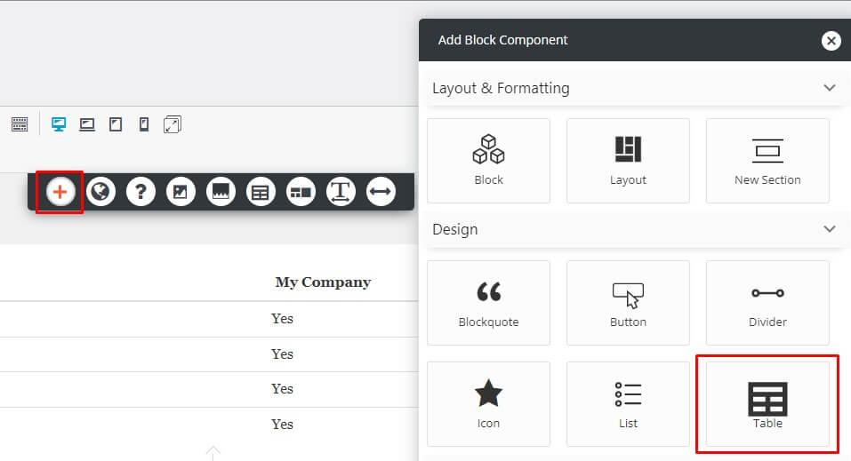
To get started, open a page or post in your dashboard. Click the + icon in the DropTab above the editor, then click the Table option.
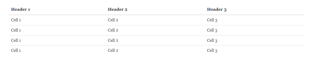
You will now see a basic table on your page:
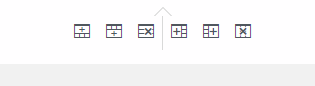
To add additional rows or columns, you can click the Table icon in the DropTab, or use the controls below the table like shown below.
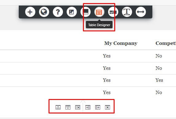
When you click on the Table icon in the DropTab, you will see these options:
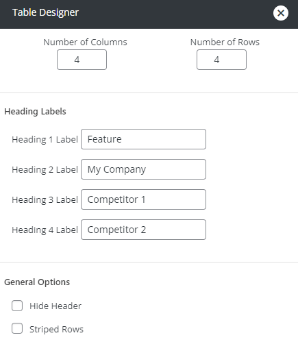
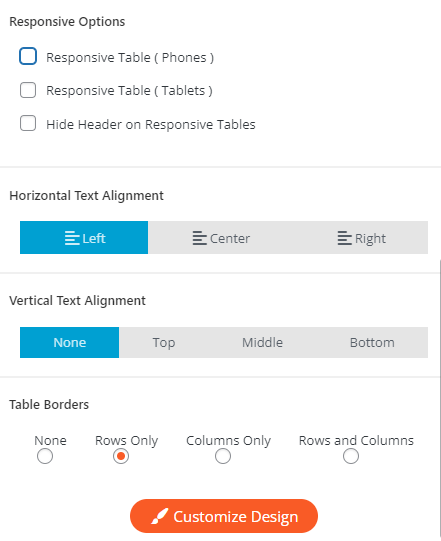
Responsive Table Designs
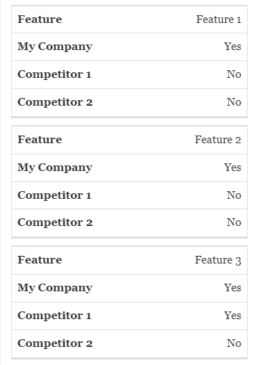
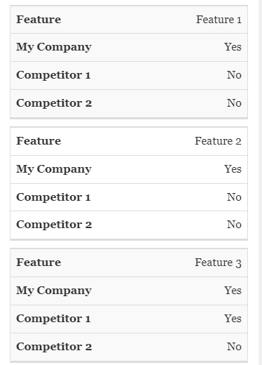
Using the Responsive Options you can have your table change to a responsive design on tablet and/or phone devices. The responsive layout uses the Heading Labels in the popover for each row. If Striped Rows is enabled, the cards will alternate like in the 2nd example below:
Change Table Column Width
To change the width of a column, hover between columns until you see the drag arrows. Click and drag to the desired width, like shown below:
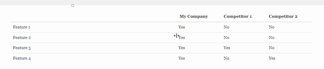
After you drag and drop the column, percentages will flash on the screen for a few seconds so you can get them equal. If your rows become too tall you can also drag and drop them smaller as needed.
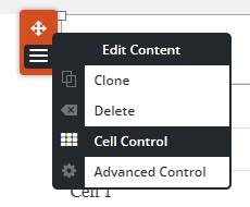
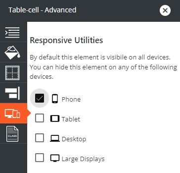
Individual Cell Control
To hide an individual cell on certain devices, click the Orange popover and then Cell Control. In the Responsive Utilities panel, check the box for each device you want the cell hidden on. Many comparison tables have the very first cell empty. We recommend hiding that cell in responsive views to improve the design.
You can also use the individual cell controls to add borders to achieve your desired design.
SIGNUP FOR
BOLDGRID CENTRAL
200+ Design Templates + 1 Kick-ass SuperTheme
6 WordPress Plugins + 2 Essential Services
Everything you need to build and manage WordPress websites in one Central place.