- AuthorPosts
- October 29, 2018 at 2:44 pm #29267
 ChadmichenGuest
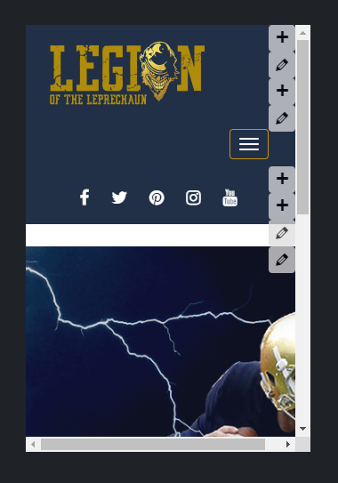
After finding out that if the footer text is to long it creates a “run off” on mobile past the screen. Well now I can’t seem to figure out how to get bold grid to scale text and images down to where you can view the entire image uploaded. Even the text seems to stay the same size on mobile as it does on desktop.
The picture attached shows a portion of the image below the header. And I did shorten the footer text but it stills seems to run off a little.
Can anyone help with making bold grid to scale down to mobile properly?
Here is the link to site but in order to see what I am saying you have to view it mobile. I also attached a screentshot. http://www.LegionoftheLeprechaun.com
Any help would be greatly appreciated! Thank you!

- This topic was modified 2 years, 11 months ago by
 BoldGrid Support.
October 29, 2018 at 4:24 pm #29268carlosdGuestHi Chad.
I’m sorry to see that you are experiencing issues with the responsiveness of your BoldGrid website. If you create a new footer Text Widget with the long text you were using, this corrects the run-off you mentioned in your previous question. Under the section titled “Getting Shortcode and Adding Widget” in our guide “How to add Shortcodes to Text Widgets“, start at Step 3 if you need assistance with how to make the Text Widget in the footer.
I’m still trying to diagnose the issue with the appearance of the image you are reporting. I will respond back once I have some more details.
October 29, 2018 at 4:25 pm #29269ChadmichenGuestThank you carlosd!
October 29, 2018 at 4:35 pm #29270ChadmichenGuestWe are using the Swifty theme.
October 29, 2018 at 5:03 pm #29271carlosdGuestHello again.
You’re welcome, thanks for the extra information. I am unable to replicate the issue when I change the image or with the default image. What are the dimensions of the image you are using? Or is this occurring with the original image?
October 29, 2018 at 5:42 pm #29272ChadmichenGuestDimensions: 1640 × 624. When viewing on mobile it should resize the image down in scale so you can see the entire image like you can on desktop. The footer widget you mentioned worked btw.
October 29, 2018 at 5:57 pm #29273carlosdGuestAwesome, I’m glad that the footer Text Widget worked for you. For the Background Image settings in the Customizer, I recommend using:
Background Effects – Fixed
Background Image Size – Scaled to Fit
Those both work for the image I am using, which is smaller than the default (1920 x 1080). For your specific image size, I recommend using the same settings but then adjusting the Vertical and/or Horizontal Position sliders to adjust it to best fit as it appears in the mobile preview.
I hope this helps!
October 29, 2018 at 7:31 pm #29274ChadmichenGuestIs there not any CSS script to make everything just adapt to mobile. I guess I just figured that bold grid was optimized for mobile. It seems to be optimized for desktop but have to make a lot of changes to make it optimized for mobile. I guess I am just confused why the platform is not already mobile friendly.
October 30, 2018 at 11:48 am #29275christophermGuestUnfortunately there is not a CSS script to make everything adapt to mobile (at least not a single script in itself). Rather, BoldGrid designs are built with a CSS framework called Bootstrap, which is a “mobile-first” framework. This means the framework itself was made specifically to prioritize mobile responsiveness. And Bootstrap CSS selectors will work on your page, if you choose to mix and match them with what’s already available. The whole framework itself is available to you so you can tweak your pages to get the exact look you want. The Inspirations are a starting point and require some adjustment.
- This topic was modified 2 years, 11 months ago by
- AuthorPosts
- The topic ‘How to make bold grid fully responsive on mobile?’ is closed to new replies.