- AuthorPosts
- July 5, 2019 at 1:11 pm #30270
 samuel.leibelGuest
Hello,
I’ve been at this for hours. How do I use @media to resize a particular image on my webpage (not the background image)? It’s fine when viewed on a computer but it looks terrible when viewed on a phone.I put this HTML tag right in <head> to tell the browser to scale the site to the screen device’s level:
<meta name="viewport" content="width=device-width, initial-scale=1.0">
@media only screen and (max-width : 768px) {
body.palette-primary.custom-background {
background-size: auto 100%;
}
}Any assistance you can provide would be greatly appreciated.
July 5, 2019 at 5:38 pm #30271Jesse OwensGuestHello, thank you for the excellent question. It sounds like what you’re looking for is how to find the CSS Selector for your image.
In the example you provided, the CSS Selector is “body.palette-primary.custom-background” which means it will affect an HTML element like this:
<body>
 <div class="pallette-primary">
  <div class="custom-background">
   This is the element with the auto-scaled background
  </div>
 </div>
</body>
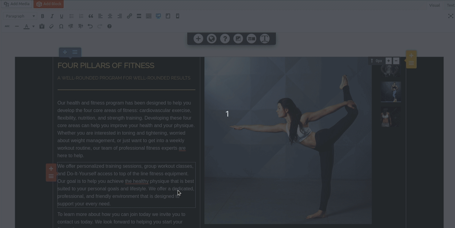
Now, the question is how to find the right selector for the image you need to target. The easiest way to do this in the Post and Page Builder is to add a Custom Class or Custom ID to your image, as shown in this screenshot:

Once you have a Custom Class (in this example I used “mobile-scale”) you can then use your Custom CSS to perform the modification:
@media only screen and (max-width : 768px) {
 .mobile-scale {
  object-fit: scale-down;
  width: 300px;
  height: 300px;
 }
}
Change these 300px values to suit your need.
You can also use your browser’s developer tools to see what Class and ID your image is already using, by right-clicking the image and choosing “Inspect” in Chrome or “Inspect Element” in Firefox.
- This reply was modified 2 years, 12 months ago by
 BoldGrid Support.
July 8, 2019 at 2:16 pm #30272samuel.leibelGuestHello Jesse,
Thanks so much for this detailed response and active screenshot! It was extremely helpful and was exactly the info/code I needed to do what I wanted to do. This would have been a lot harder without your help and support.
Thanks again and take care!
-Sam
July 8, 2019 at 5:38 pm #30273Jesse OwensGuestGlad to hear I was able to help Sam!
If you have a moment, I would be extremely grateful if you could help by rating our Post and Page Builder plugin on the WordPress Repository to help us spread the word! https://wordpress.org/support/plugin/post-and-page-builder/reviews/
- This reply was modified 2 years, 12 months ago by
- AuthorPosts
- The topic ‘Using @Media to resize an specific Image (not the background image)’ is closed to new replies.