- AuthorPosts
- September 18, 2019 at 4:04 am #30452
 David A MulhollandGuest
Guys as I have a few pages on my site http://www.redacted.co.uk and the site default forces my page menus onto at least 2 lines (the gap below is already too big without this) and if I add more pages it will go to 3 lines. So when it is live the sub menus overlap other menus and it looks terrible. Can you not adjust these template so that a menu can be place all on the one line as normal?

- This topic was modified 2 years, 12 months ago by
 BoldGrid Support.
September 18, 2019 at 11:13 am #30454Jesse OwensGuestHello David,
Thanks for the excellent question, I’m sorry your menu isn’t working the way you need it to.
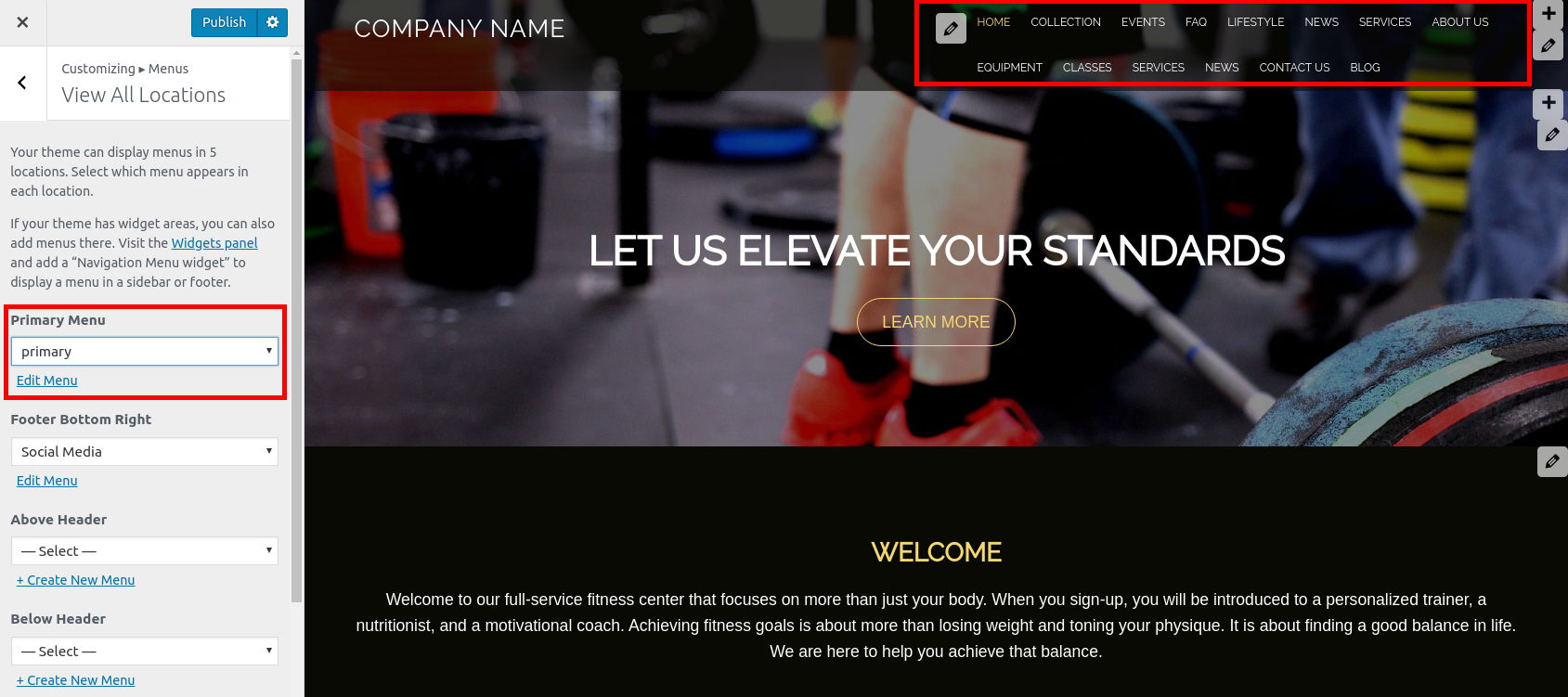
In the BoldGrid Evolv theme, the “Primary” menu location is on the same row as the Site Title or Logo, so its container is only given half of the page-width even on wide screens.
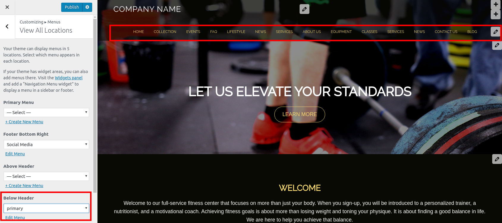
However, there are two other menu locations in your header that have the full width of the page, either above or below your Site Title/Logo. Navigate to Customize -> Menus -> View All Locations, and set your menu to display either Above Header or Below Header.
Here’s an example of a website with many pages, using the Primary Menu location:

And here’s an example of the same site, using Below Header:
I hope this helps!- This reply was modified 2 years, 12 months ago by BoldGrid Support.
September 23, 2019 at 10:34 am #30455David A MulhollandGuestHi Jesse, I tried that mate, but a couple of problems.
The menu text now changes to red instead of white.
Secondly, even though the sub pages still show in the menu options as sub pages, on the site itself they are now showing as main pages thus still making the menu appear on 2 lines instead on 1.
As I also said before the gap below the logo etc is far too big so surely you guys can give us an option of more than minus 20 to fix this ongoing problem?
My other suggestion would be to make the main menu itself stretch 2 thirds of the way across the pages thus making it look a lot better being alongside the same row as the logo because if you change the menu either above or below the heading there is a terrible looking big gap which covers the top of the main pic?
September 23, 2019 at 5:08 pm #30456supportGuestHi David, sorry to hear that there are still some problems working with your menu and our team will help get this working as best we can.
Unfortunately the dropdown on hover functionality for menus only works when the menu is placed in the primary menu location and if you use a different location to display your menu then all sub items will be expanded by default, and this might explain the problem you are seeing with overlapping menu items.
These alternate locations for menus also have different style rules applied to them from the theme and this is most likely the reason the text you are seeing displays as red instead of white.
We will do everything we can tohelp you create the design you are looking for, but we will need some additional information. Any screenshots you can provide in addition to a link to your website’s domain will give our team the opportunity to reach a solution and get this working to your liking.
Thank you for your patience throughout this troubleshooting process.
- This topic was modified 2 years, 12 months ago by
- AuthorPosts
- The topic ‘Primary menu is all over the place’ is closed to new replies.