- AuthorPosts
- June 24, 2022 at 7:30 am #54661
 DeeGuest
Greetings 🙂
I’m looking for some help with a couple of things I’m trying to do in Boldgrid (Crio theme):1. Logo size in navbar on mobile – I can see in the forums that there’s supposed to be a logo size slider (for the logo in the header). I don’t get that option in the customizer, only the “remove” and “change logo” buttons. How can a logo in a navbar be resized?
2. Inline hamburger menu on mobile – On mobile the site title/logo and hamburger menu are stacked, is there a setting to adjust that to inline, or can this only be done via CSS media queries?
3. Font size of various headers on mobile – I can see in the documentation that there’s supposed to be a field at the bottom of “font” settings where one can specify the font size on other screen sizes. I don’t see that option on any text settings. How can font sizes for mobile be set?
4. Container widths on mobile – Widths of certain modules on desktop don’t work for mobile, but I can’t seem to see a setting anywhere that lets me adjust widths for mobile. How do I change what is at 60% width on desktop to 90% width on mobile?
I’ve had a look at some Boldgrid documentation, articles and forum entries, but I can’t seem to find what I’m looking for (I’m not too familiar with Boldgrid so apologies if these questions are too obvious).
Looking forward to your feedback.
Regards
DeeJune 24, 2022 at 8:32 am #54746Brandon CParticipantHi Dee!
Thanks so much for reaching out with your Crio Pro WordPress theme and BoldGrid Post and Page Builder questions.
I’m sorry to hear you’re having some issue with mobile responsiveness in your theme but lets see if we can help you out. Lets start with your first question:
1.) Logo Size in Mobile Nav Bar – I think the best way to go about resizing your logo is to use a 3rd party platform like Pixlr to resize the image to the suggested 400px x 100px. Then if you would like to further you could use custom CSS to adjust the height and width of your logo. For example if you want to change the dimensions to 280px x 80px you could add this bit off CSS to the CSS/JS editor section of your WordPress Customizer:
  @media only screen and (max-width: 600px) {
  .custom-logo-link:not(.bgc_logo) {
    width: 280px !important;
    height: 80px !important;
}
 }
We apologize for the outdated documentation you may have come across. If you can link me to that page we’ll get that updated right away.
2.) Inline hamburger menu on mobile – One great thing about your Crio theme is you have the ability to structure your page headers in many different ways. What you should do is open your WordPress Customizer and navigate to design < Header < Site Header Layout < Select Layout and switch your site header layout to one that better fits your needs.
To take it a step further you can also create a custom page header for your Crio theme. The Custom Page Header editor allows you to create a custom page header from scratch using the same drag and drop functionality as the Boldgrid Post and Page Builder.
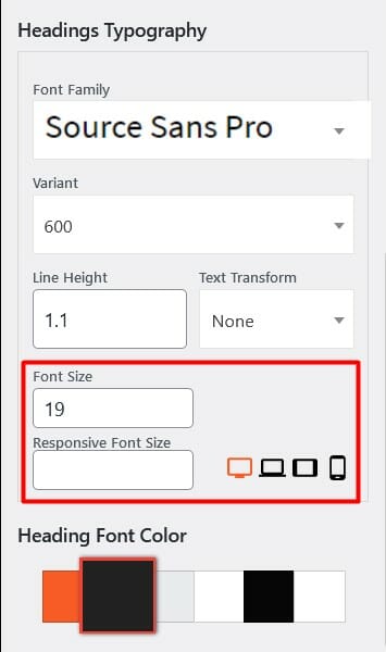
3.) Font size of various headers on mobile – You can control responsive text size in your theme from the WordPress Customizer Fonts section.

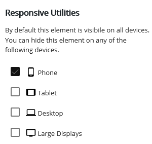
Using this control, you can set unique font sizes for Large Desktop, Desktop, Tablet, and Mobile. We strongly recommend you add responsive typography as it improves website user experience. You can enter responsive font sizes for Main Text, Headings, Site Title, and Tagline.4.) Container widths on mobile – You can use the responsive utilities in Post and Page Builder to adjust your content for smaller screens. These controls are very similar to the global typography controls the WordPress Customizer.

You can use these Responsive Utilities to control how elements appear on various device sizes.I hope this helps Dee! Please don’t hesitate to reach back out if you have any other questions for us.
- AuthorPosts
- The topic ‘Adjusting for Mobile Responsiveness in Crio WordPress Theme’ is closed to new replies.