Tagged: BoldGrid Themes, Cobalt
- AuthorPosts
- April 18, 2022 at 10:39 am #50313
 Heather M SpencerGuest
Hi,
I just received an Email from someone looking to do some webwork that said these things about my Momentofperception.com site.– It doesn’t work properly on Mobile Phones, at all (which is how people browse the web these days).
– It doesn’t adjust properly when you resize the screen (Google recommends RESPONSIVE Websites rather than ADAPTIVE)
– It’s hard to read on larger displaysIt’s working fine on my mobile phone, but I have an older android. I also have a mobile version of the home page. My theme is Cobalt. Can you have a look and see if you have any problems ?
Thank you,
HeatherApril 18, 2022 at 10:49 am #50572Brandon CParticipantHi Heather,
Thanks for reaching out your Cobalt WordPress theme, as well as, all our other BoldGrid themes use a framework called Bootstrap which is configured for mobile responsiveness right out of the box. Our auto-generated content in BoldGrid Post and Page Builder for WordPress is also created with a “mobile-first” approach which means the framework, theme, and page builder were made specifically to prioritize responsiveness on smaller screen sizes.
I tested your site on a few different mobile browsers and I didn’t see any overages in text or anything that struck me as out of place. If the marketer could provide you with a few screenshots of the issues they see we can review them and give our best suggestions on how to correct any problems you may have.
I hope this helps. Please reach back out if we can answer anything else for you.
April 19, 2022 at 9:50 am #50608Heather M SpencerGuestThanks Brandon,
It does help. The only thing I noticed was that the backgrounds do not adapt to different screen sizes. Is that normal, or can they be made adaptable ?
Thank you !April 19, 2022 at 3:24 pm #50676Brandon CParticipantYou’re welcome Heather!
With background images you want to set your image size before uploading the image to WordPress. You can use a free third party tool like Pixlr to set your image dimensions.
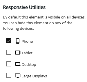
You should also take advantage of the responsive utilities in Post and Page builder .

The responsive utilities control allows you to set the visibility of a specific element according to screen size. This way you can upload scaled versions of the same background image to fine tune your proportions.
It should help to familiarize yourself with this guide on changing backgrounds in Post and Page Builder. It’ll give you a bit more insight on how to control your background settings.
I hope we’ve answered all your questions Heather! Definitely reach back out if you need any further assistance.
- AuthorPosts
- The topic ‘Are there any noticeable mobile issues within my Cobalt WordPress theme?’ is closed to new replies.