Tagged: Typography
- AuthorPosts
- April 29, 2021 at 1:56 pm #36984
 Rachel KwanGuest
Hi there, I was wondering how I could get the H1 and H2 text smaller on mobile devices only. I tried the vw css but it makes it too small.
Thanks
April 29, 2021 at 2:07 pm #37005Joseph WKeymasterHi Rachel!
Sorry to hear that using VW to control your font sizes did not work out as expected and we will do everything we can to help work with our WordPress themes on your website!
Right now the best way to control the specific font sizes of HTML text elements on mobile displays in our themes is to use some custom CSS with media queries.
The following CSS snippet uses a media query that tells the code within it to only run on when the webpage is displayed below a particular pixel width, in this case the break point between mobile and tablet sizes.
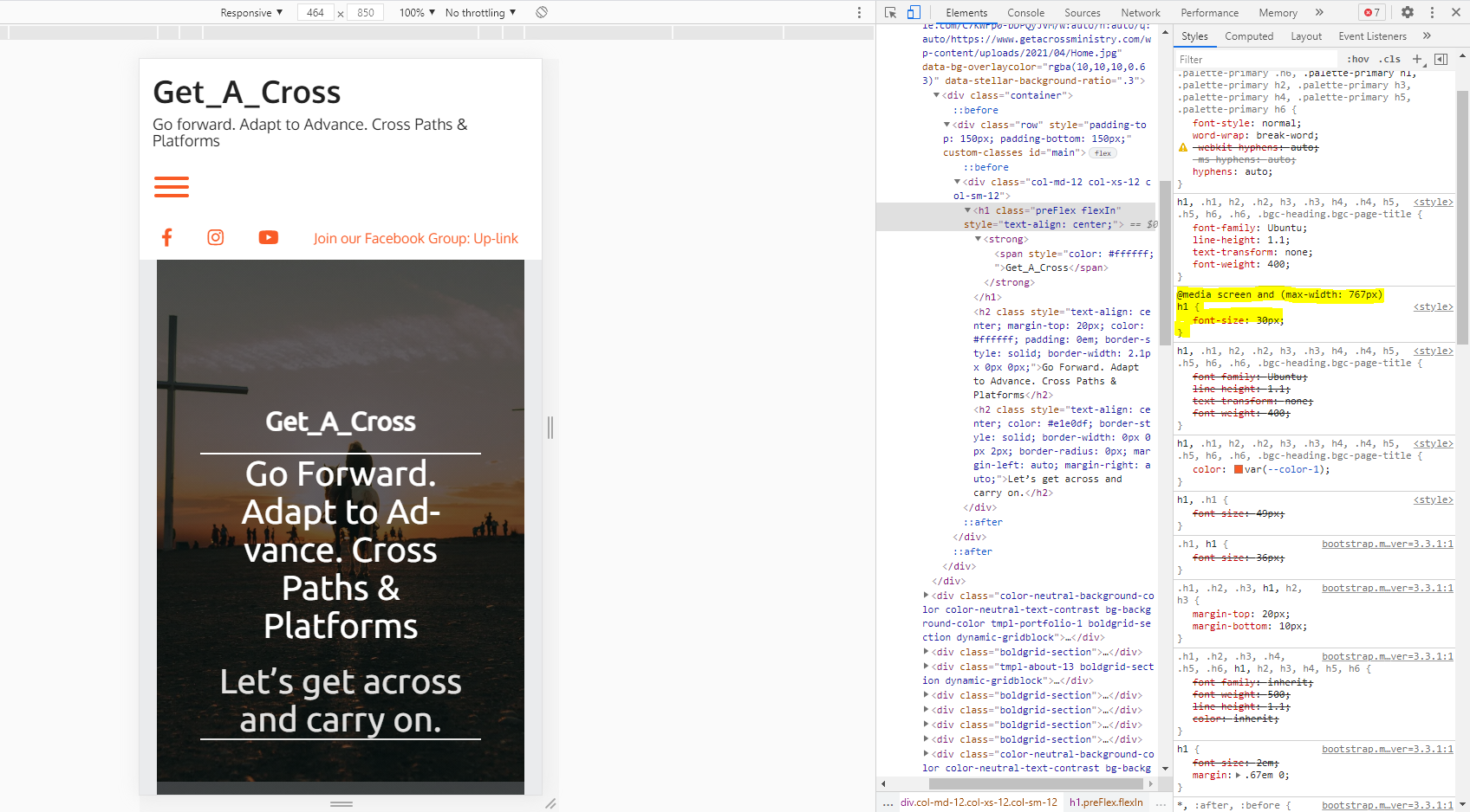
@media only screen and (max-width: 767px) {
h1, h2 {
font-size: 30px;
}
}That code is currently configured to only target elements the use the H1 and H2 element types, but please let us know if you need any additional help getting the code tailored to fit your website structure and we will help as best we can! If you ever have any other questions for us in the future please do not hesitate to ask, we are always happy to help!
April 30, 2021 at 3:22 pm #37056Ethan KwanGuestAm I supposed to put the code here? Because nothing is happening.
I thought maybe the preview just wasn’t updating so I published the changes and opened the website in Mobile View but nothing had changed.
Thanks.
April 30, 2021 at 3:30 pm #37073Jesse OwensMemberHi Ethan-
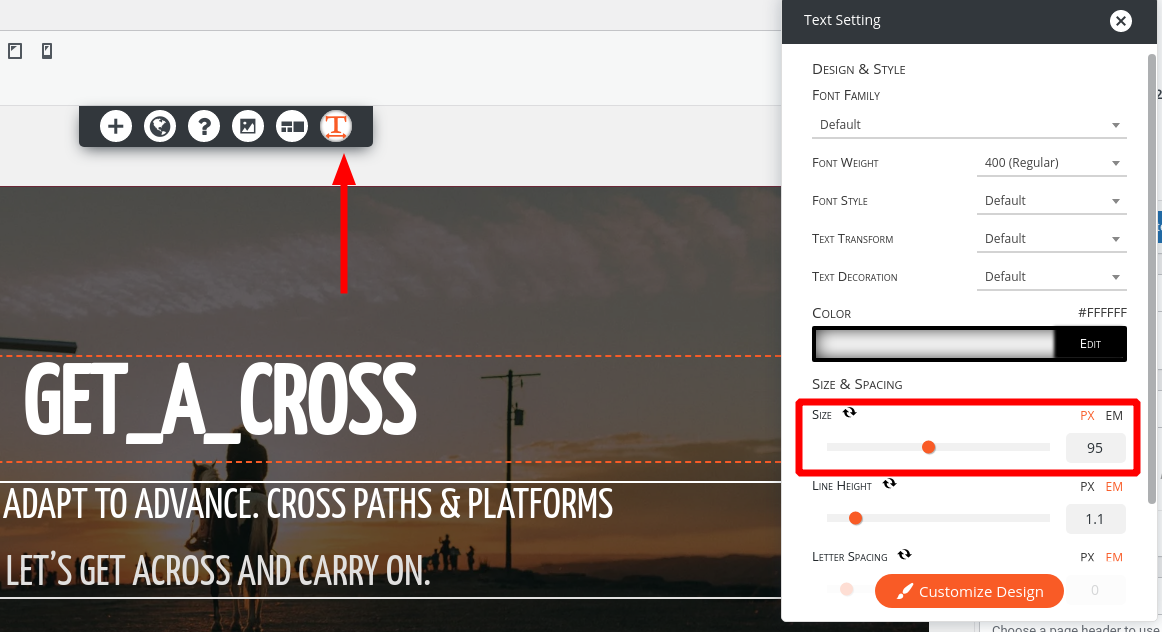
You’ve got the right place there, but there was something we didn’t notice before. That particular heading has an explicit
font-sizeset right now.Edit the page, and you can use the text tool to adjust it:

Or, switch to the text editor and delete the explicit font size altogether:
 May 3, 2021 at 6:27 pm #37198Ethan KwanGuest
Okay, I deleted the explicit font size and put the
@media only screen and (max-width: 767px;) {code in but it’s still not changing.
h1, h2 {
font-size: 30px;
}
}May 3, 2021 at 6:43 pm #37218Jesse OwensMemberHi Ethan-
Sorry about that, there was a typo in the original code we provided to you. Remove the semi-colon in the media query on the first line, so that it looks like this:
@media only screen and (max-width: 767px) { h1, h2 { font-size: 30px; } }May 4, 2021 at 10:50 am #37221Ethan KwanGuestThanks for getting back to me. Unfortunately, it still doesn’t seem to be working.
May 4, 2021 at 10:59 am #37249Joseph WKeymasterHi Ethan, sorry to hear that there are still some problems getting your font to display as expected!
I took a look at your website in a mobile view and it appears that your rule to change the font size of H1 elements is now working.

One possible reason why you might not have seen that changes on your last attempt is browser caching. Forcing your browser to fetch the new CSS rules by either clearing the cache or viewing ytour website is Private/Incognito window is the best to way to ensure that you are getting the most updated style rules for your website.
I hope that this was just a caching issue and the fonts are working as expected on your end now, but please let us know if there is anything else that we can do to help!
May 4, 2021 at 4:57 pm #37270Ethan KwanGuestOkay, it works now. Thank you!
- AuthorPosts

- The topic ‘Change font size for mobile screens’ is closed to new replies.