Tagged: Crio
- AuthorPosts
- January 22, 2024 at 11:33 am #123107
 timGuest
My header title breaks to two lines on wide screens, one line on middle screens, and back to two lines or more on small screens. How do I keep the title on one line on wide screens.
January 22, 2024 at 11:40 am #123122Brandon CParticipantHi Tim,
Thanks for reaching out and thank you for using Crio Pro WordPress theme!
We inspected your site and it looks like your site title font is too large for the column it sits in on larger screen sizes and that’s why it breaks down to a new line.
I found that the breaking point for your text size is 39px and it looks like setting your font size from 42px to 39px seems to resolve the issue. If this doesn’t work for you we can also help you adjust the overall width of the column the text sits in. We’d just need to know if you’re working inside of the WordPress Customers Header section, or is this a custom Crio header?
I hope this helps Tim and we look forward to assisting you further with this!
January 22, 2024 at 12:24 pm #123123timGuestThanks. 39px font will work for me.
I would like to know how to change the column width.Is there a general technique? I have a similar issue in the footer where my text is two line on wide screens. I don’t find a font size control for the footer.
A general question would be: should I try to stick with the column structure that came with the template? Is that what makes things work on mobile?January 22, 2024 at 12:43 pm #123130Brandon CParticipantThanks Tim,
I’m happy that will work for you! Changing column sizes in Crio and BoldGrid Post and Page Builder ultimately depend on which site element you’re working with.
Set Responsive Font Size
One global approach is working with responsive typography in Crio to set font sizes according to screen size.
Custom Page Headers/footers
Using Custom Page Headers/footers and footers is a lot like using the drag and drop editor in the BoldGrid Post and Page Builder.
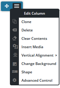
You can adjust the padding or margin of a column by opening the section in the editor, hover over the block that contains the columns you want to adjust and select the hamburger toggle from the blue column selector, then choose Advanced Control.

Here you’ll see controls for the padding and margin of your columns which will allow you to adjust the width.
Remove Auto-Hyphens for Headings
Crio is set to break up longer words in your headings and add hyphens to them as the available screen real estate shrinks by default. This can cause your text heading to drop-down as well. You will need to use some custom CSS to change how auto-hyphens function for your headings.
The following snippet will deactivate the automatic word breaks and hyphens normally added by Crio to all website headings:
.palette-primary .h1, .palette-primary .h2, .palette-primary .h3, .palette-primary .h4, .palette-primary .h5, .palette-primary .h6, .palette-primary h1, .palette-primary h2, .palette-primary h3, .palette-primary h4, .palette-primary h5, .palette-primary h6 {
    word-wrap: normal;
    hyphens: manual;
    -webkit-hyphens: manual;
}
You just need to add this to the CSS/JS editor section of your WordPress Customizer under the CSS section.
WordPress Customizer
You can also control basic Crio header and footer layouts directly from the WordPress Customizer. Here are guides to editing layout design for both the Crio site header and footer:
– Adjust Header Layout
– Adjust Footer LayoutI know this is kind of an info dump Tim but please let us know if you have any questions. Thank you!
- AuthorPosts
- The topic ‘Crio WordPress Site Title Breaks Down to Two lines on larger Screen Sizes’ is closed to new replies.