Tagged: Post and Page Builder, Responsive Design
- AuthorPosts
- September 11, 2023 at 3:55 pm #105267
 Lisa TemkinGuest
the large image on the home page appears responsive on the preview screen in WP Admin. But, on a phone it is a small strip going down the center of the screen. In addition to that, I have an “Our Locations” section at the bottom of the screen. The 2 addresses do not line up properly they are different depending on which screen you’re looking at. I can’t turn off maintenance mode until these two issues are resolved. thanks
September 12, 2023 at 12:41 pm #105368Brandon CParticipantHi Lisa,
Thanks for reaching out and thank you for using BoldGrid Post and Page Builder for WordPress! We can definitely assist you with this Post and Page Builder concern.
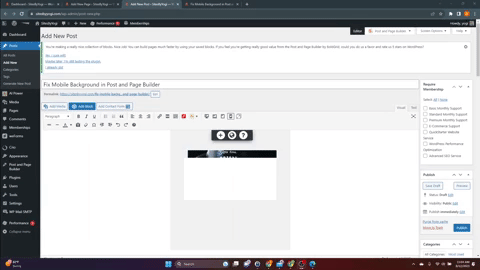
Homepage Image
It would be hard to tell exactly going what’s going on without inspecting your page directly but I do understand your need to display the maintenance mode page. Your issue could possibly be due to the dimensions of the image you’re displaying as your section background. You might be able to resolve an issue like this by adding padding to this row using the Mobile Device Responsive Utility control:

I really want to understand the exact issue Lisa because of course I’m only guessing here. If you could send us a screenshot of the problem using a platform like ImgBB it would really helpful to us in assisting you to resolve this.
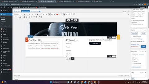
Locations Section
It’s possible that this issue is due to an extra blank element displaying on one or more of your device screen sizes. By default, all elements are visible on all devices but you can use the responsive utilities in Post and Page Builder to hide specific elements. This allows you to easily build out your WordPress site with a mobile first design approach but they can be tricky to locate when switched on or off to suite different screen sizes.
Again, I’m still guessing but I created a short gif to show you what I mean:
If you notice the element is hidden on larger desktop screens but displays on medium sized “laptop” screens. Just like in the video, once you find the blank element you can either hide it by clicking the elements hamburger toggle then Advanced Controls > Responsive Utilities or delete the element altogether.
Other helpful links
– Working with Images
– Changing Backgrounds in Post and Page Builder
– How to Use the Post and Page BuilderWe’re looking forward to assisting you further with this Lisa! If you still have questions it would be awesome if you would include a screenshot with them and we will get right on it!
September 12, 2023 at 3:27 pm #105382Lisa TemkinGuestUpdate: I think I got the locations section to be acceptable for now at least.
But, no matter how I tweak the margins and padding on the home screen image/section, It still does not look right in the mobile view. I don’t have the settings you referred to, to change settings to individual screens. I have preview screens above the editor where I can click on the different screens but any edits I make changes all of the screens, not just the one I want to change. When I click the mobile screen it looks okay. However, it looks bad on an actual phone. I have a screenshot that I downloaded from a dreamhost chat rep, but I guess I can’t attach that here?
This is frustrating as I thought responsive themes wouldn’t be difficult to customize (especially for non-coder beginners)
September 13, 2023 at 10:56 am #105458Brandon CParticipantHi Lisa,
I realized you have your background image set to the “Row” instead of the overall section and that’s is why it’s adding padding based on a Media Query break point. What you should do is remove the image from the row, then hover over the section and select the black (section) toggle to add your background image.
Adding the image as your section background should ensure that is spans the full with of the element no matter the screen size.
I hope this helps.
September 13, 2023 at 4:14 pm #105479Lisa TemkinGuestlooks like this worked. Thanks!
September 13, 2023 at 4:15 pm #105486Brandon CParticipantYou’re very welcome Lisa!
I’m so happy we we’re help you get this functioning properly! Please let us know if there’s anything else that we can answer for you.
Thank you!
- AuthorPosts
- The topic ‘Having trouble making the home page fully responsive with BoldGrid Post and Page Builder’ is closed to new replies.