- AuthorPosts
- September 23, 2020 at 11:23 am #27367
 Nancy GiovanniniGuest
The header image of the website does not display on mobile devices. At least not the latest version of iOS. It’s just showing a blue color. I’ve checked on multiple phones. If I’m working on the site on my desktop computer, and I go to Customize, and I look at the various layout the image shows. But in real life, it’s not working. Help!
September 23, 2020 at 12:01 pm #27390Jesse OwensMemberHi Nancy-
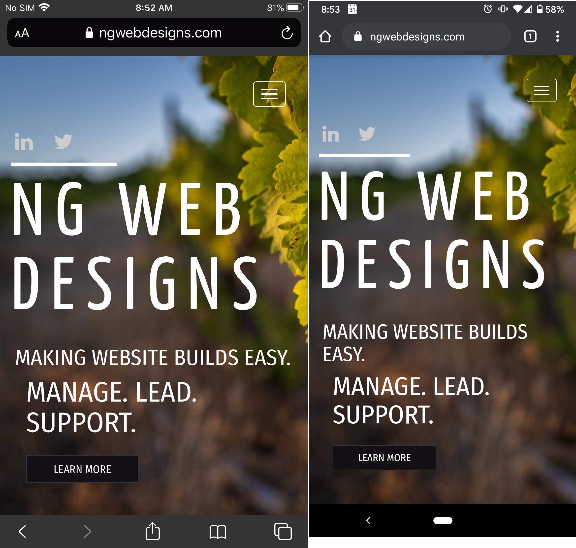
Thanks for the question, and thanks for using the BoldGrid WordPress Website Builder. This issue is caused by how iOS devices interpret the “Cover” background image size attribute. Here’s what I see when I check out your site on an iOS and Android device:

My iPhone is a pretty large one, so if you were checking on a smaller model you may only see the blue sky that’s at the top-left of your image.
If you’d like the focus section of the image to be more prominent, you can add a little bit of Custom CSS to accomplish that. Navigate to Customize > Advanced > Custom JS & CSS and paste the following code into your Custom Theme CSS field:
@media (max-width: 991px) {
    body.custom-background {
        background-size: auto !important;
        max-height: 100vh;
        background-position: center top !important;
    }
}
This will center the image and scale it a little better on iPhones, so that you get a look like this:
- AuthorPosts

- The topic ‘Header image not displaying on mobile’ is closed to new replies.