Tagged: Background
- AuthorPosts
- August 3, 2020 at 2:39 pm #25537
 DavidGuest
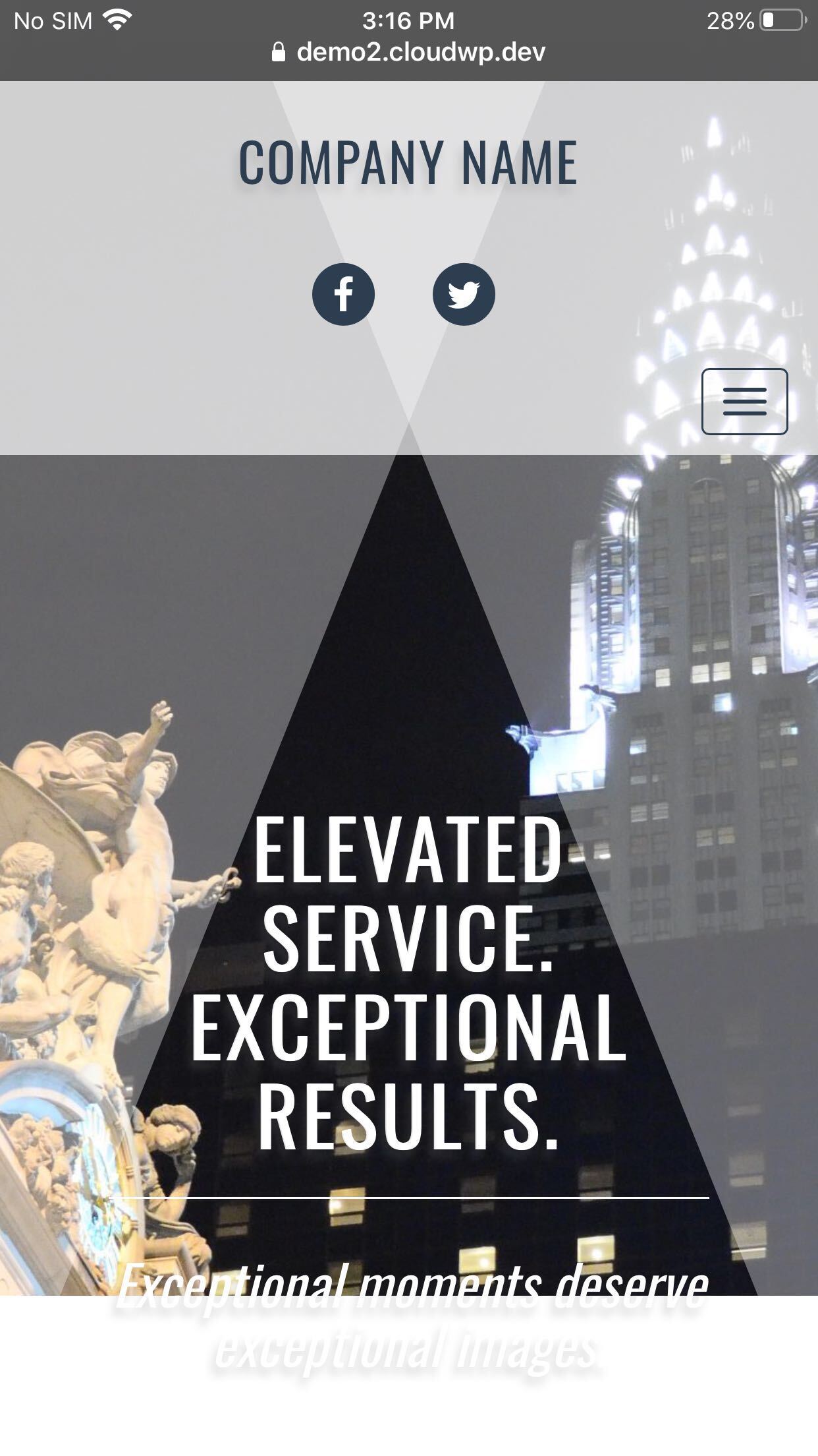
When I go to my homepage on my iPhone, the graphic and text intro do not resize for mobile. Looks fine on laptop. I’m using Venetian theme.
Thx in advance
August 3, 2020 at 5:18 pm #25570Jesse OwensMemberHi David-
We’re currently working on a fix for this issue, which has to do with the way iPhones handle the CSS “cover” image size. In the meantime, you can fix this with custom CSS.Navigate to Customize > Advanced > Custom JS & CSS and paste the following code into your Custom Theme CSS field:
@media only screen
and (max-device-height : 1024px)
and (max-device-width : 1024px) {
    .palette-primary.custom-background,
    .boldgrid-section.background-fixed {
        background-attachment: scroll !important;
	background-position: center top;
    }
	.call-to-action h2 {
        font-size: 10vw !important;
    }
}
This will give you an iPhone view that looks like this:
 August 3, 2020 at 6:59 pm #25575DavidGuest
Jesse-
Really appreciate the response and specific CSS you provided. Looks like the graphic and pattern cuts off midway through text below CTA.
pls advise,
Thx!
August 3, 2020 at 7:30 pm #25591Jesse OwensMemberHi David-
Because of the square-ish dimensions of your image and the length of the text in your call-to-action, you’ll have to make a design judgement call for this.I played around with a couple different solutions, and here’s the one I like best. This will make your call-to-action area black after the image ends, which actually makes your button stand out even better:
{
    .palette-primary.custom-background,
    .boldgrid-section.background-fixed {
        background-attachment: scroll !important;
	background-position: center top;
	background-color: #000;
    }
    .call-to-action h2 {
        font-size: 10vw !important;
    }
}
You can also experiment with reducing the margin at the top. Here’s the code I tried:
@media only screen
and (max-device-height : 1024px)
and (max-device-width : 1024px) {
    .palette-primary.custom-background,
    .boldgrid-section.background-fixed {
        background-attachment: scroll !important;
	background-position: center top;
	background-color: #000;
    }
    .call-to-action h2 {
        font-size: 10vw !important;
    }
    .site-content {margin-top: 0px;}
}
Which ends up looking like this:
August 4, 2020 at 12:39 pm #25611DavidGuestLooks good! Thanks for the rework! If I may ask you one more question that’s been plaguing me. I’m trying to figure out how to remove the heavy blue bar underneath the graphic on headings of linked pages (About Us, Contact Us, etc). If possible, I’d also like to simplify the heading to be a solid color (rather than geometric graphic) on those pages. These changes would make pages more mobile friendly. Right now these headings don’t show up well on iPhone.
Thanks again!
August 4, 2020 at 12:53 pm #25621Jesse OwensMemberHi David-
Glad to hear we’re making progress! To get rid of the blue bar, add two more lines to your custom CSS:
.page-template-default .entry-content { margin-top: 0px; }
.post-title-hidden .site-content {padding-top: 0px; }
In order to remove the v-shaped spotlights, add two more lines:
body.page-template-default:after { border: none; } body.page-template-default:before { border: none; } - AuthorPosts

- The topic ‘Homepage Graphic on Mobile’ is closed to new replies.