- AuthorPosts
- December 8, 2020 at 2:25 pm #32013
 Emily GaleGuest
I’ve been having very frustrating times trying to make the images fit right on my site (florentine theme). Often the text i input is longer than the sample text, which elongates the block, however the images do not re-size along with the rest of the block and I cannot find a way to manually resize them. Similarly, if I choose to just add my own image via a new media space, i cannot adjust it’s size or location on the block (other than margins/padding). Is there a way to make this image placeholder more manoeuvrable?
On the example page I’ve linked, the original block had the image flush to the top and bottom of the block and it looked a lot more crisp than it does with the borders around it. I understand that the image I have chosen is not the right size/shape to fill the space, and I’m willing to crop it, but i can’t figure out how to know what size to crop it to in order for it to fill that specific space?
I feel like there has to be an easier way to deal with adding and replacing images in blocks that doesn’t result in a hopeless formatting nightmare, what am i missing?
Thanks,
EmilyDecember 8, 2020 at 3:48 pm #32033Jesse OwensMemberHi Emily-
Depending on the screen size, I can see what you mean. On my large monitor, the image looks great, but as the screen gets smaller I can see the borders above and below the image form as the text grows larger than the image size. That’s because the image will always resize to preserve the aspect ratio of the original one to avoid distorting the image.
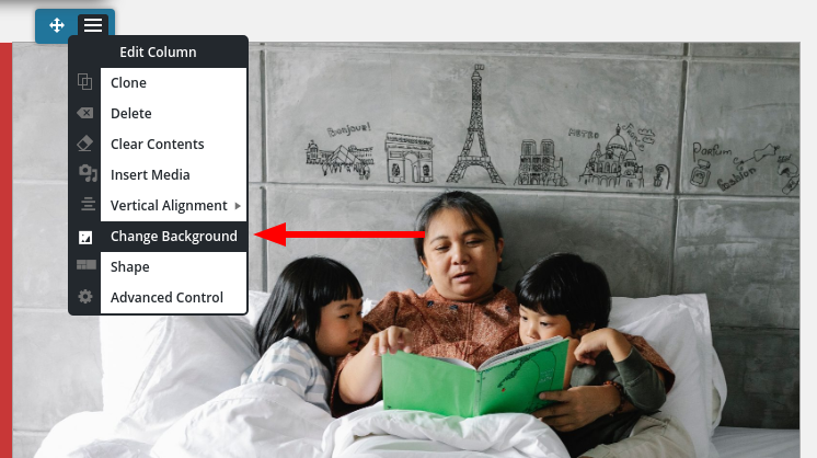
One way you can get around this is to use the image as a background for the right-hand side, rather than as an actual media file. First, add the background to the section:

Then, use the Advanced Control to add 100% padding to the top and bottom of the section. That should make the image take up the full space at every screen width.
December 11, 2020 at 4:37 pm #32133Emily GaleGuesthi Jesse,
thanks! making it a background image has indeed cleaned it up. Before I go implementing this on every block i have trouble with the images on, does setting the image as a background rather than a media file have any repercussions on SEO, loading time, or accessibility (so long as i fill in the alt-description etc.)?
Emily
December 11, 2020 at 5:08 pm #32168Jesse OwensMemberHi Emily-
Using the background rather than an actual image shouldn’t have any effect on SEO or loading time, especially for images that are mostly decorative in nature. I wouldn’t recommend using this method for images that are relevant to the content, because background images don’t have alternative text for accessibility and SEO.
For images that do have semantic importance, I’d recommend trying out some other design techniques so that the scaled image doesn’t look so out-of-place. For example you can add a subtle drop-shadow:
December 14, 2020 at 3:13 pm #32173Emily GaleGuesthmm, sounds like i might not want it as a background picture then/
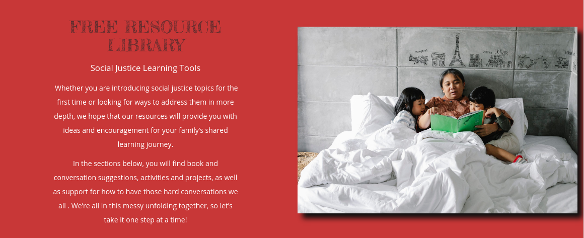
if you look at my free resource library page again, it now has a different image and i made it a background image for that column as you suggested, i like how it fits in line with the background colour of the other side of the block. Is there a way of knowing the measurements of a space in order to crop the image to the right size to fill it? Or to tell images to resize alongside screen resizing? It would be great to achieve this look while maintaining the SEO and alt-description abilities.
I feel like there should be a bit more in the image customization area of things that I maybe don’t know about?
- AuthorPosts
- The topic ‘how can i edit the image place-holder size when i replace images?’ is closed to new replies.