Tagged: Blocks, Post and Page Builder
- AuthorPosts
- September 23, 2022 at 9:06 am #58909
 Mark SpillerGuest
Hi –
I’ve been trying to figure this out for a while now – how do you force a section to occupy the full vertical visible portion of a browser window? For example, for the home page of http://www.snowcamping.org/ , I create a section, and set the background image to an image. I’d like that section/image to fill the entire screen, and ideally not scroll. If the window is resized, I’d like it to adjust so that the text stays relatively the same, but the image rescales so that it still fills the screen.
I see options for having the screen width fill the entire width of the window, and that seems to work fine – but nothing for doing the same thing vertically. I’ve seen other themes that allow this – e.g., this site does it using Neve – https://academyselfdefense.com/ .
Is there an option I’m missing? I don’t see any custom blocks available that do this either, but maybe I’ve missed one?
Thank you!
MarkSeptember 23, 2022 at 9:27 am #58934Brandon CParticipantHi Mark,
Thank you for reaching out with your BoldGrid Post and Page Builder for WordPress questions!
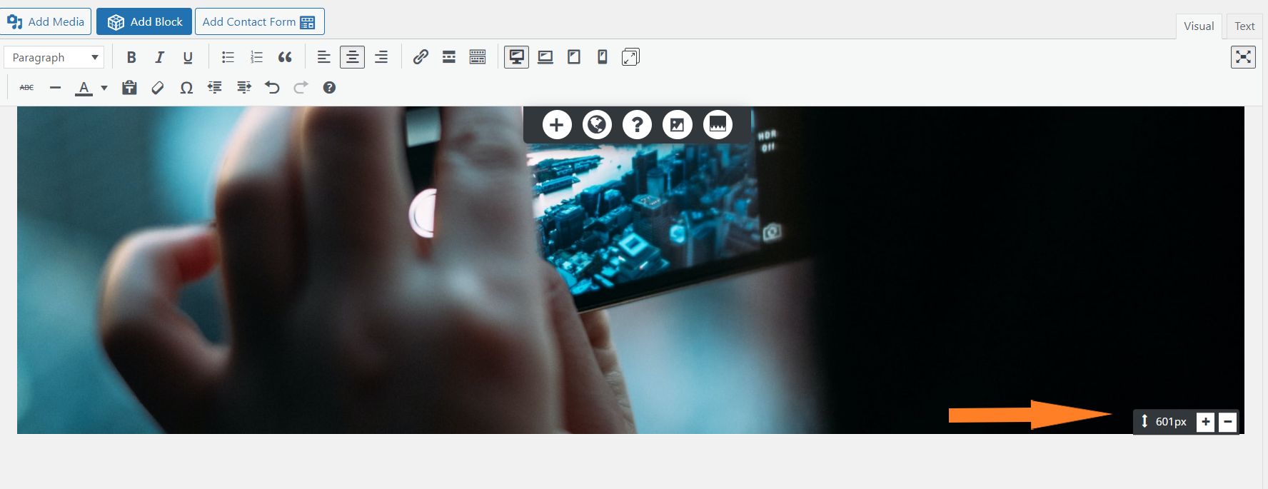
I inspected your page and it looks like you may have already found a solution for this issue but one way I always accomplish vertical adjustments is by using the section drag handles in Post and Page Builder:
 .
.Please let us know if you need further assistance with this Mark!
September 26, 2022 at 5:37 pm #58939Mark SpillerGuestHi Brandon,
Thanks for the reply – I have *not* found a solution for this, I still get bars on the bottom when I have it on a large display – e.g., https://capture.dropbox.com/C0k8nPKEg4KVcbs3
I’ve looked for section drag handles like the one you indicated, and I don’t have those. If I adjust row sizes within the section it effectively increases the section size, but feels a bit like a kludge. Is there any way to force it to 100vh?
And any idea what that green bar at the bottom is? Looking at the code, and don’t see where that is coming in, I see the two rows added in (with padding 142 and 300), but no references to background-color other than the background of the one text field. (code below).
Thanks!
Mark<div class=”boldgrid-section” style=”border-width: 0px; background-image: url(‘http://www.snowcamping.org/wp-content/uploads/2022/09/cropped-IMG_1324.jpg’); background-size: cover; background-position: 50% 50%;” data-image-url=”http://www.snowcamping.org/wp-content/uploads/2022/09/cropped-IMG_1324.jpg” data-imhwpb-asset-id=”1183900″>
<div class=”container”>
<div class=”row”>
<div class=”col-lg-12 col-md-12 col-xs-12 col-sm-12″>
<h4 class=”h1 color1-color” style=”text-align: center; border-width: 0px; font-size: 29px; margin: 2% 0% 1%;”>There is no camping like Snowcamping!</h4>
</div>
</div>
<div class=”row” style=”border-width: 0px; margin-left: 0px; margin-right: 0px;”>
<div class=”col-lg-12 col-md-12 col-xs-12 col-sm-12 align-column-center” style=”border-width: 0px;”>
<h5 class=”color1-color color-5-text-contrast color5-background-color” style=”text-align: center; padding: 5px; line-height: 1.6em; margin: 2% auto 1%; border-width: 0px; width: 65%;”>2023 SEASON Updates coming October 15, 2022</h5>
</div>
</div>
<div class=”row” style=”padding-top: 142px; padding-bottom: 300px; border-width: 0px;”>
<div class=”col-md-5 col-xs-12 col-sm-12 col-lg-5″>
<div style=”border-width: 0px;” class=””>
<h2 class=”h1 color1-color” style=”text-align: center; border-width: 0px; font-size: 34px;”> </h2>
<h2 class=”h1 color1-color” style=”text-align: center; border-width: 0px; font-size: 34px;”> </h2>
</div>
</div>
</div>
</div>
</div>September 26, 2022 at 5:37 pm #58942Mark SpillerGuestBrandon,
Was wondering if the green bar was related to a footer stub, so went to search for those settings. Doesn’t seem to be the case, and it only shows up on the home page, not on any of the other pages. Is there anywhere where one can remove the footer completely? I don’t see any option to have absolutely no footer, only to remove any items from it?
Thanks!
MarkSeptember 26, 2022 at 6:18 pm #59237Brandon CParticipantHi Mark,
I think you might be right about the footer stub, try using some custom CSS to clear that up Customize > Appearance > CSS/JS Editor:
#colophon.site-footer {
    display: none !important;
}
I added this bit of CSS and it looks like it cleared up both issues on my end. Can you let us know how this works for you?
October 12, 2022 at 8:43 am #61136Mark SpillerGuestHi Brandon,
Sorry to take a while to get back to this, been trying to get other parts of the site working. That CSS unfortunately doesn’t seem to do the trick – I still can’t get a picture to reliably fill the window. We updated with a new image that we like a lot, but we get problems when the window gets too large (white border at the bottom instead of expanding to fill), and we also have problems on mobile (where it is too big and zooms in strangely).
The white bar on the bottom doesn’t seem to be footer related after all.
What we’d really like to do is have it reliably fill 100% vertical browser window on large desktop windows, but *not* zoom in on mobile so that the full heart portion still shows on the screen. Ideally I would have a custom version for desktops that always fills 100% vertical space and zooms the image to adjust as needed horizontally, while a second custom version for mobile does the opposite (locks the image width to 100% horizontal space, and may not fill the full vertical space so that the image still makes sense). Is this possible with Crio? I haven’t been able to figure it out.
Thank you for any tips!
MarkOctober 14, 2022 at 10:30 am #61983Brandon CParticipantHi Mark,
I apologize for the delay as well, I’m sorry to hear you’re still having trouble with this.
I suspect your issue has a lot to do with the actual image size, if you inspect it here https://www.snowcamping.org/wp-content/uploads/2022/10/P23_2978.jpg you can see the image only has a height of 551px which is causing trouble with the larger screen sizes.
Try adding this media query to your Custom CSS/JS editor. This should stretched the height of the image on larger screen sizes:
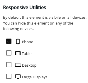
@media only screen and (max-width: 600px) {
  #main-wrapper.full-width .main .entry-content .boldgrid-section {
    height: 1200px !important;
  }
}
Also yes, you can control the output of elements based on device screen size using the Responsive Utilities in BoldGrid Post and Page Builder.
 .
.The responsive utilities allows you to hide or display elements according to device size.
- AuthorPosts
 .
.- The topic ‘How do I force a section to fill browser window vertically with BoldGrid Post and Page Builder?’ is closed to new replies.