Tagged: Theme Customization, Troubleshooting
- AuthorPosts
- September 30, 2020 at 4:21 pm #27725
 Bryan forsytheGuest
Hi.
Help me figure out how to make the buttons smaller. If you look at my site on desktop it looks good but if you look at it on mobile the two buttons labeled member sign in and donate are mashed up on top of one another. When I add a button to the site, where is the call code for it? Cause I have messed with the many div parameters in the text editor section, and I don’t see anything I do as making it do what I want it to do.
Thank you.
Bryan
September 30, 2020 at 6:03 pm #27731Jesse OwensMemberHi Bryan-
Checking out your site, right now your top block that contains the buttons and the text below it are all in one single row and column, and in particular the buttons are positioned with manual margin settings. That’ll make it look fine on screens a similar size to the one you designed it on, but you’re right that they’ll act strange on smaller devices.
Instead, you’re going to want to set the buttons up in their own row, and each button in their own column so they can react to different screen sizes.
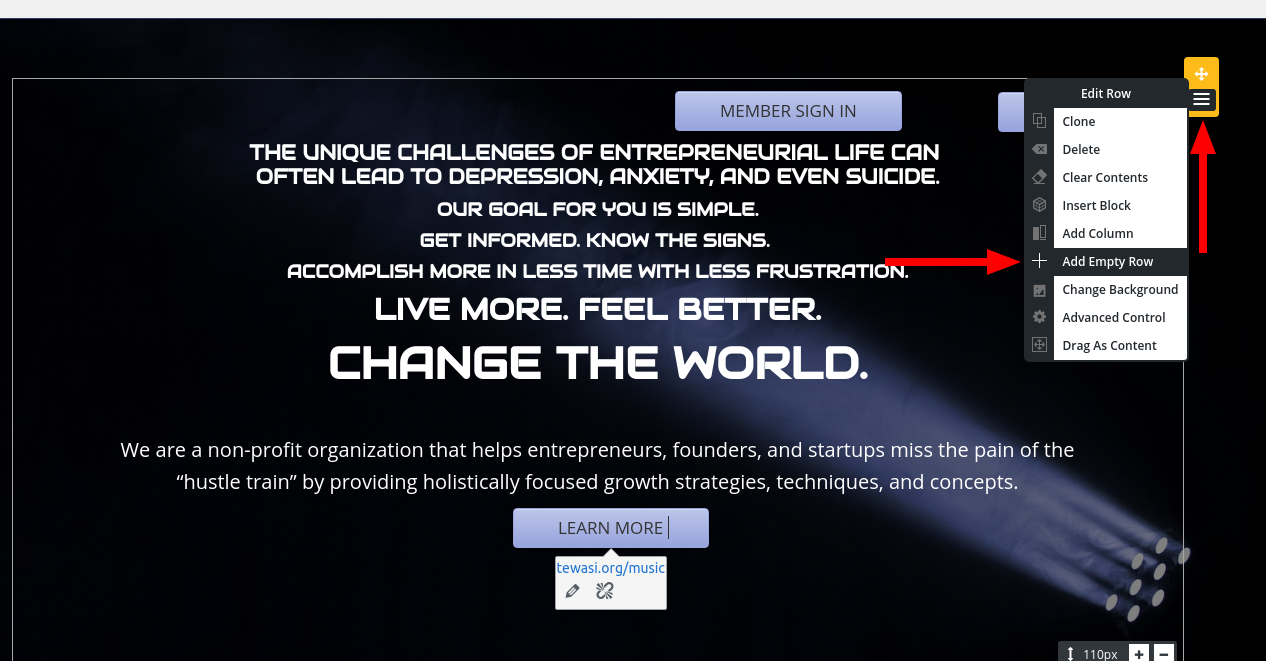
First, add a new row above your current block using the yellow-colored Edit Row control:

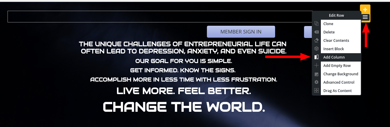
Next, add two columns to your new row, using the Edit Row control. Make sure you grab the one for your new empty row above your original row:
Finally, copy-and-paste your buttons into the new columns, and drag the column widths until they more-or-less line up with your original design:
October 1, 2020 at 1:12 pm #27741Bryan forsytheGuestGreetings Boldgrid God-man.
It is I humble Boldgrid-Neophyte Bryan. Truly, Your good grace and knowledge is boundless. Blessed be your hamsters forever!
I have done as you instructed and my website has verily become ten times more aesthetically pleasing. Sadly on mobile, the two buttons are stacked one upon another like two mice trying to win cheese from a rabid barracuda. I hope you can help.
Thank you so much and may the bulls sit but never upon your cushions.
Amenshsky. Amen.Your humble Boldgrid Neo-Bryan
October 1, 2020 at 2:16 pm #27764Jesse OwensMemberHi Bryan-
There’s a couple things you’ll need to do to get these on the same row. First, switch highlight one of your buttons and then switch to the Text Editor.
You’ll see your three columns are currently coded like this:
<div class="col-md-5 col-xs-12 col-sm-12"></div>
<div class="col-md-4 col-xs-12 col-sm-12" style="...">...Membership Login...</div>
<div class="col-md-2 col-xs-12 col-sm-12" style="...">...Donate...</div>
<div class="col-md-1 col-xs-12 col-sm-12"></div>
The responsive “Grid” in BoldGrid is based on Bootstrap, which means that every row has up to 12 columns, and these numbers represent how many of the 12 each column occupies, and the abbreviations md, xs, and sm are the screen sizes.
So that means, on a “medium” size screen, you have four columns taking up 5/12, 4/12, 2/12, and 1/12 of the width of the row, but on “small” and “extra small” screens, each column is taking up all 12, which is why they switch to being on top of each other at mobile device sizes.
So, the first step is to modify these so that each button’s column is using 6/12 on small screens:
<div class="col-md-5 col-xs-12 col-sm-12"></div>
<div class="col-md-4 col-xs-6 col-sm-6">...Membership Login...</div>
<div class="col-md-2 col-xs-6 col-sm-6">...Donate...</div>
<div class="col-md-1 col-xs-12 col-sm-12"></div>
You’ll also need to remove the style=”…” parts from the two columns with the buttons.
Then, you’ll also need to use some Custom CSS to make the buttons small enough to fit side-by-side on a mobile device. Here’s the CSS I found worked correctly:
@media (max-width: 991px) { a.btn { padding-left: 5px; padding-right: 5px; } } - AuthorPosts

- The topic ‘How to make buttons smaller and mobile responsive’ is closed to new replies.