- AuthorPosts
- August 17, 2020 at 11:29 am #25935
 Willem de BieGuest
Hi, I use BoldGrid for some years and overall I am satisfied. What I don’t like is the ‘phone view’. For instance the menu in top does not show up.My question is: how can I use ONLY the desktop view? Thanks! regards, Willem
August 17, 2020 at 12:27 pm #25950Jesse OwensMemberHi Willem-
BoldGrid’s themes are designed to be “Mobile-First,” which means they’re built from the perspective of giving mobile users the best experience, and scaling up if your users are on a wider device.Mobile traffic now accounts for about half of all internet traffic, and search engines have stated that mobile user experience is one of the most important ranking factors for your SEO.
That said, there’s not really an easy way to force the “desktop version” for your users on mobile devices.
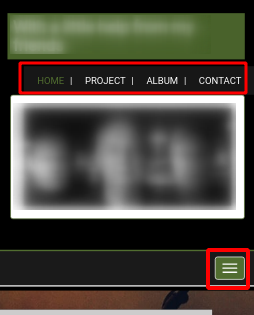
You mentioned that you’re having trouble with your top menu. Here’s what I see when I view your site on mobile:

It looks like two copies of the same menu, and the one labeled as “Primary” automatically shrinks into a mobile menu called a “Hamburger,” (the three horizontal lines). It might be more appropriate to only show the Hamburger menu on mobile, and omit the one above it. In order to do that, you can use Custom CSS in your Customize > Advanced > Custom JS & CSS menu, with code similar to this:
@media only screen and (max-width : 767px) {
    #tertiary-menu {display: none;}
}
If that’s not what you’re trying to accomplish, let us know how you’re needing those menus to show up on smaller devices, we’ll be happy to help.
- AuthorPosts
- The topic ‘I want to use only the desktop view’ is closed to new replies.