Tagged: Advanced Customization
- AuthorPosts
- May 11, 2021 at 1:39 pm #37640
 DawnKovacovichGuest
I contacted Webhosting Hub for assistance with moving or resizing text boxes on the heading block of my Homepage. I would like to include both my Title and subheading along with our logo. When I add the logo, the Title and Subtitle disappear and will not move over. We were not able to resize or move the text boxes.
A second issue is that an odd white border keeps showing up around the buttons that I added for links. The Webhosting Hub team did not know how to remove those white borders either.
The heading is really important and I DO NOT wish to change themes. Please help.
Sincerely,
Dawn KovacovichMay 11, 2021 at 1:39 pm #37642DawnKovacovichGuestDo you have a chat line or direct support if Webhosting Hub is unable to answer my question? They tried to connect me directly to you, but were unable to do that. The issues I had with my website were with moving and/or resizing the the text boxes so both the heading and logo could be used in the heading. We could not manipulate any of that. Please get back to me ASAP!
May 11, 2021 at 2:42 pm #37657Jesse OwensMemberHello Dawn-
Thanks for reaching out, I’m sorry to hear about the frustration. Displaying the Logo along with the title and tagline is a built-in feature of our newest theme, Crio, but you can accomplish this without changing themes with a little bit of custom CSS.
Navigate to Customize > Advanced > Custom JS & CSS.
There are two options you can use. First, if you want both the title and tagline to show below the logo, paste in this code:
h3.site-description {visibility: visible; }
.site-title:after {
	display: block;
	content: "A-Team Minnesota";
}
Alternatively, you can show the title above the logo, with the tagline below. Simply change
.site-title:afterto.site-title:before.Finally, you can add one more line to get rid of the white borders on your buttons:
a.button-primary { border: none; }As a software provider and in order to keep our prices as competitive as possible, we don’t have a direct chat or phone support line, but because Web Hosting Hub is one of our Platinum WordPress Hosting partners, you do have the option of using our private Premium Support ticket system. If you’ve never logged into your BoldGrid Central account before, make sure to use the same email you use for your Web Hosting Hub account and submit a password reset request.
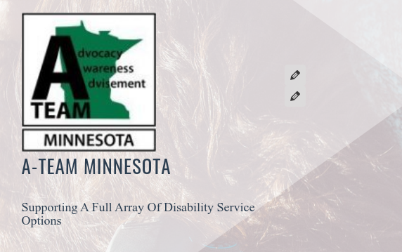
May 11, 2021 at 3:26 pm #37661Dawn KovacovichGuestJesse – I would actually like the logo off to the left of the Title and tagline, with the tagline in one line instead of broken into two:
LOGO A-TEAM MINNESOTA
LOGO Supporting a full array of Disability Service OptionsI would like the font of A-TEAM MINNESOTA to be Doppio One, larger than the tagline.
I would like the font of the tagline to be Hammersmith One, smaller than the Title.I would also like to reduce the huge amount of green space below the menu. The header is just way too big. Is there a way to do any of this?
I appreciate your help. The Header is a very important part of the website and I really want it to look good. I appreciate your timely help – we were hoping to get this website up and running as soon as possible.
May 11, 2021 at 4:18 pm #37668Jesse OwensMemberHi Dawn-
Thanks for the additional info! Yes, we can accomplish all of these with a little more custom CSS, and we’ll also need a small amount of JavaScript so that the title and tagline fit when they’re beside the logo.
I’m going to include the whole block of CSS here, which includes another rule to eliminate the green space below the menu:
h3.site-description {
	visibility: visible;
	padding-top: 100px;
	font-family: Hammersmith One;
}
.site-description:before {
	content: "A-Team Minnesota\a";
	white-space: pre;
	font-family: Doppio One;
	font-size:27px;
}
.site-title {
	float: left;
	margin-right: 20px;
}
#content { margin-top: 0px; }
There’s one line you may need to adjust depending on the size of your logo,
padding-top: 100px;will work to vertically “center” the title and tagline with your logo full-size, but if you make it smaller like you had it before, you’ll need to reduce the number 100 until it looks aligned the way you like it.Finally, you’ll need to add these lines to the Custom Theme JS to adjust the widths of the columns in the header, so your tagline doesn’t wrap:
jQuery('.row.header-1 .col-sm-4').addClass('col-md-9').removeClass('col-sm-4');
jQuery('.row.header-1 .col-sm-8').addClass('col-md-3').removeClass('col-sm-8');
Be careful when you paste this in, because the JS editor may automatically include
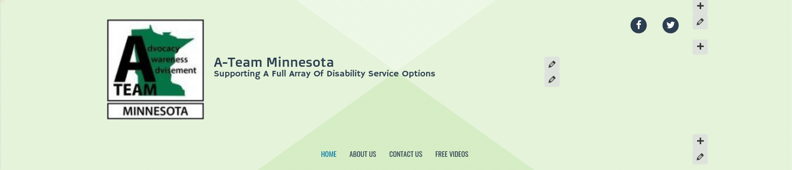
//at the beginning of the first line. Make sure you remove those slashes.Once that’s saved, you should end up with a header that looks like this:
 May 11, 2021 at 4:52 pm #37670Jesse OwensMember
Oh, I just realized I forgot your button borders. Add this line to the end of the CSS code above:
.palette-primary a.button-primary { border: none; }May 12, 2021 at 11:40 am #37681Dawn KovacovichGuestYou have been tremendously helpful! I think we are almost there! When I click Preview, it does not look like the logo and Title/Tagline move to the full width of the screen. Is this something that can be fixed? Also, the Facebook Icon looks off balance. I want it to be off to the side, but not in its current location. It would be nice if it could be in line with the Tagline so the eye doesn’t move up to the right.
Now I have another question: Is it possible to make the entire block of “Links to Affiliated Disability Advocates” smaller? We would like all of the content to remain as is, but just in a narrower strip with smaller boxes so it isn’t so prominent. I would still like it to stretch across the full width of the page though. It is especially prominent in a phone view. Thank you!!!
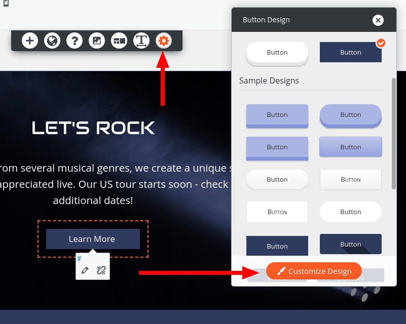
May 12, 2021 at 11:41 am #37683Dawn KovacovichGuestI should clarify about the button borders – these are not buttons in the heading. They are buttons I added to boxes in the section below the Welcome section. One of the boxes was set up with a button as part of the Boldgrid block, but the others did not have buttons. I wanted each box to have a button with a link to the corresponding section. I do not see a place for CSS codes within elements, columns, or rows. Where would I put this code or is there something else I should do instead?
May 12, 2021 at 1:52 pm #37729Jesse OwensMemberHi Dawn-
Thanks for the updates! I’m glad to hear about the progress.
I should have tested the code I gave you at a couple more screen sizes. Modify your JS to give the logo/title area a little more space:
jQuery('.row.header-1 .col-sm-4').addClass('col-md-11 col-xs-12 col-sm-12').removeClass('col-sm-4');
jQuery('.row.header-1 .col-sm-8').addClass('col-md-1 col-xs-12 col-sm-12').removeClass('col-sm-8');
Then I came up with a few screen-size rules to make sure the header looks good on tablets and mobile devices:
@media screen and (max-width: 420px) {
    .site-description:before {
        content: "\a \a A-Team\aMinnesota\a";
    }
}
@media screen and (min-width: 992px) {
    #menu-social {
        padding-top: 100px;
    }
}
@media screen and (max-width: 992px) {
    #menu-social {
        text-align: center;
    }
}
These will also align your Facebook icon the way you’re looking for.
For the buttons, you can add that rule I provided above:
.palette-primary a.button-primary { border: none; }If you add this to your customizer with all of the other CSS code, it will remove all of the white borders on your buttons. If you’re only looking to remove it from individual buttons, you can use the button design tool inside the Post and Page builder:

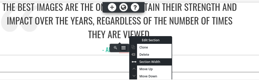
In order to make the “Links to Affiliated Disability Advocates” section full-width, use the gray-colored Edit Section and use the Section Width option, which will expand the entire section to be full-width.

As far as the individual images with the semi-opaque backgrounds, I’m not sure I understand your goal for those. Were you thinking of removing the backgrounds, or were you trying to fit more than one in a row on mobile phones?
- AuthorPosts
- The topic ‘How to display Title, Tagline and Logo in Venetian’ is closed to new replies.