Tagged: Post and Page Builder, Responsive Design
- AuthorPosts
- February 14, 2023 at 2:23 pm #79366
 SteveGuest
I’ve been trying to determine what setting(s) I have not correctly set to get my site mobile friendly. Currently on Boldgrid with Crio theme and Google says the site is not useable on mobile (can confirm on my mobile device). I’m using the Post and Page Builder plugin and when I select the mobile viewing option in the editor it doesn’t scale/adjust the site down to a mobile friendly experience.
February 14, 2023 at 2:34 pm #79379Brandon CParticipantHi Steve,
Thanks so much for reaching out, I’m sorry to hear you’re having some issues with mobile responsiveness in BoldGrid Post and Page Builder.
Post and Page Builder allows you to set conditions for which blocks and elements appear on the page, depending on the size of the screen.
By default, all elements are visible on all devices but you can use the responsive utilities in Post and Page Builder to hide specific elements. This allows you to easily build out your WordPress site with a mobile first design approach.
You may also benefit from reviewing this comprehensive guide on using the Post and Page Builder in general.
Other helpful links:
– Using the Desktop, Tablet, and Phone Views
– Working with Columns
– Working with Fonts
– Working with ImagesIf you let us know what exactly what issues you’re experiencing with mobile responsiveness and we will help you to tackle them one by one.
February 17, 2023 at 1:49 pm #79802SteveGuestWhat’s strange is that when I edit in mobile view, those changes carry over to the desktop view. Example, If I change the font size to view smaller on mobile its the same size on desktop. It seems like I have some strange global setting enabled.
February 17, 2023 at 1:57 pm #79816Brandon CParticipantThanks Steve,
So what’s happening here is when you select the responsive views it will change the screen size but the elements in the editor itself are still global.
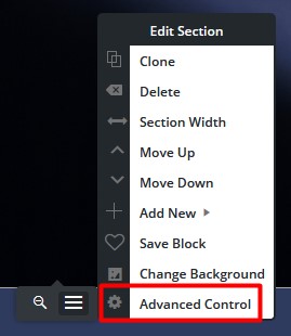
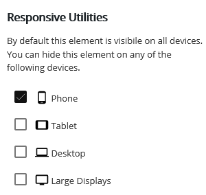
The next step is to select the element you would like to hide on a particular screen size. Hover over a section, column or row to bring up its properties. Click the “three bar” icon, then Advanced Controls > Responsive Utilities.

Check the boxes for all device sizes you wish the item to be hidden on. In this example, the element would show on all screen sizes except smaller ones “phones”.

Then click publish or Update to save your changes.
February 21, 2023 at 10:07 am #80152SteveGuestI have two small white sidebars next to my home page wallpaper banner that I can not seem to remove. I’ve tried expanding this area without luck in both the page builder and customize area. It is viewable in all size displays. Any help would be appreciated.
February 21, 2023 at 10:20 am #80222Brandon CParticipantHi Steve,
I inspected your page and I don’t see the two small white sidebars you mentioned. The only thing out of the ordinary that I notice is towards the bottom of your page it looks like you have a couple extra sections you might want to remove.
You can use a free software like ImgBB to send us a screenshot of your page so that we can pinpoint this issue and address it for you.
We look forward to assisting you further with this Steve!
- AuthorPosts
- The topic ‘Issues with mobile responsiveness in BoldGrid Post and Page Builder’ is closed to new replies.