- AuthorPosts
- February 8, 2021 at 5:57 pm #33563
 Cliff HighmanGuest
Hi, I’m using a slider with images that have different heights. When the images move, the block below the slider moves up and down to accommodate the images’ different sizes. Can I lock the height of the slider block so this doesn’t happen?
Thanks!
February 8, 2021 at 6:11 pm #33620Jesse OwensMemberHi Cliff-
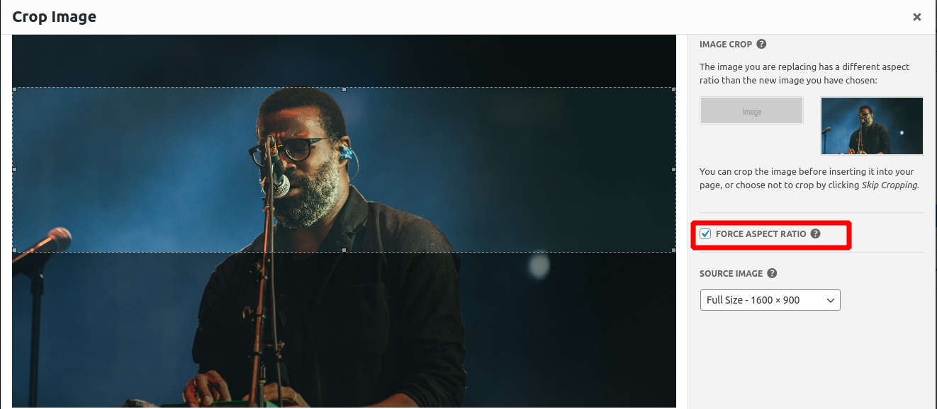
Thanks for reaching out! Probably the best way to avoid this issue is to make sure that the images you’re using in your slider maintain the same aspect ratio. When you first add images to your slider, you’ll be presented with this dialog to make sure your slides remain the same size:

This is the ideal way to handle that, because if you do start using images of different aspect ratios, they’ll be scaled differently on different screen sizes. So if you force it to remain the same size on a desktop monitor, they may end up looking too tall on a mobile phone.
It may be possible to add some Custom CSS to your sliders to make sure that they stay the same height, but it will be unique to the images you’re using and various screen sizes.
February 10, 2021 at 10:51 am #33660Cliff HighmanGuestJesse – thanks for the suggestion! I decided to leave the images as-is since some are square and some are landscape so I couldn’t really force one aspect ratio into the other or the cropping was too much.
February 10, 2021 at 11:07 am #33668Jesse OwensMemberHi Cliff-
One alternative you could consider is using a slider-type image gallery, if your slider consists of only images, or images with captions. That will display images in a lightbox-style gallery that pops-up above the page content, and doesn’t shift the page layout.
April 8, 2021 at 5:17 pm #35894AntonisGuestHi Jesse, thank you so much for your valuable help.
I’m having the same issue with sliders. So, if I get it right, there is no way to add the slider inside a container or a box that keeps the same size (and bigger than any photo in the slider) no matter what the height of the slider is, so the next block will not move accordingly?
My problem is that I need to use both vertical and horizontal photos in the same slider, so cropping them doesn’t really help.
Thank you in advance!
April 8, 2021 at 5:32 pm #35898Jesse OwensMemberHi Antonis-
There are a couple ways you can mitigate this other than the above solution of using a slider-type gallery, but I don’t really consider them to be ideal.
For example, you can determine the height of your vertical photos, and set the entire slider to be a little bit taller. This would have the benefit of keeping the navigation arrow buttons in the same place, but they wouldn’t be “centered” vertically on the shorter slides.
To accomplish that, you could use CSS Code like this:
.slick-slider { height: 500px; }The other downside of that approach is that this rule would be in effect for all of your sliders, unless you do something like make separate CSS rules for individual posts and pages, for example something like this:
body.page-id-ID .slick-slider { height 500px; }Where ID is the numeric page ID.
If you’d like to try something like this out, include the URL to one of your sliders in the “Website” field of a reply here, and I can provide you with an exact rule for your image size and page ID.
April 9, 2021 at 2:36 pm #35903AntonisGuestThanks a lot! That was actually really helpful. I used the page ID.
Any thoughts on how to place the horizontal images in the middle of the slider, instead of the top of the it as they are now, when in mobile view? I have already set them to be in the middle through boldgrid builder but that doesn’t seem to help.
Also, is there any way to move forward to the next image by mouse-clicking anywhere in the slider?
Thanks again!
April 9, 2021 at 2:45 pm #35921Joseph WKeymasterHi Antonis!
I sent this CSS in a response to your Premium Support ticket, but I am including it here as well just in case someone else might need to achieve a similar design with their sliders. The following code should vertically align the horizontal slider images to appear in the middle instead of pushed up against the top.
body.page-id-725 .slick-initialized .slick-slide { display: flex; }body.page-id-725 .slick-slide { height: 310px; align-items: center; justify-content: center; }body.page-id-725 .slick-list { height: unset !important; }Unfortunately there isn’t a way to advance the slides by clicking on them directly, only the navigation dots and arrows will advance on click, but you can also click and drag on each of the slides to move through your slider content.
Please let us know if you ever have any other questions for us!
April 12, 2021 at 3:01 pm #35925AntonisGuestThat was super helpful! Everything works fine. Thanks a lot!
- AuthorPosts
- The topic ‘Keep Slider Block Same Height with Different Images’ is closed to new replies.