- AuthorPosts
- September 8, 2020 at 1:28 pm #26534
 AlanGuest
I’m not sure how to describe this problem. Please bear with my attempt.
When you reduce the width of the webpage viewing window too much to display all of the content, I want the excess content to simply be “hiding” off the to right or left such that the viewer would need to scroll right or left to see it.
Instead, the text scrunches up to fit into the viewable window, sometimes creating a vertical mess.Yuck.
I’ll bet there’s an easy fix for this fundamental problem. (Please say, “Yes, there is!”)September 8, 2020 at 1:51 pm #26578Jesse OwensMemberHi Alan-
What you’re describing is known as “wrapping” text, versus “overflow” text.
Generally speaking, scrolling left-and-right is considered a poor user experience for smaller devices like phones. However, if you’d like to do this anyway you can accomplish it with a little custom CSS.
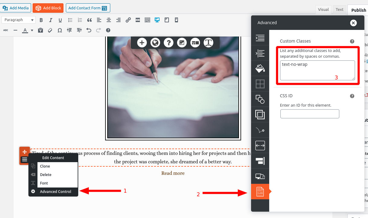
Here’s how I would accomplish this. First, come up with a custom class name for your elements that you don’t want to wrap. In this example, I’m using the class text-no-wrap. First, identify the paragraphs that you don’t want to wrap, and then add the class to them using the Advanced Control in the Post and Page Builder:

Then, navigate to Customize > Advanced > Custom JS & CSS and paste the following CSS rule in your Custom Theme CSS:
.text-no-wrap { white-space: nowrap; }September 9, 2020 at 12:24 pm #26672AlanGuestVery informative, Jesse, thank you!
It’s my wife who prefers the overflow text, but she’s on a desktop computer, and most of my visitors will, I expect, be on smart phones. So I will defer to your advice and stick with what I’ve got.
But I have made notes of your “how to” in case I want it in the future! - AuthorPosts
- The topic ‘[Resolved] Overflow text instead of wrapping on mobile’ is closed to new replies.