- AuthorPosts
- October 21, 2020 at 5:29 pm #28480
 DavidGuest
I can’t figure out how to make a video behave responsively in a post on my page:
https:// ml-insure. com/living-benefits-2/
This is a video I uploaded and am pulling from the media library into the post. When I look at the page on a mobile phone, the video does not shrink its width to accommodate the viewport’s width.
Conversely, I have 2 other posts each with a video I pull from YouTube, and these videos do act responsively:
https:// ml-insure. com/jessicas-story/#more-2193
https:// ml-insure. com/living-benefits/I have looked at the HTML code for all three posts and I don’t really see a difference between them, insofar as the embedded video is concerned. The only difference is that I have a video hosted on my site for the post that is not responsive, and I link to videos on YouTube in the two posts that are responsive.
Why does it make a difference in displaying on a mobile device? How do I correct this situation? What additional code do I need to include, if any?
Thank you very much for your kind assistance!
October 21, 2020 at 7:21 pm #28489Jesse OwensMemberHi David-
Thanks for pointing this out, I experienced the same problem using the Wedge theme. It seems to only occur on self-hosted videos on blog posts. Using the same code on a page works as expected.
I’ve created a bug report for our development team to investigate the issue. In the mean time, you can use a Page rather than a Post, or host your video on YouTube. If you don’t want it to be featured on your YouTube channel, you can set it up as an unlisted video.
I’ll update you here as soon as we’ve discovered the cause of the problem for a more permanent solution for you.
October 21, 2020 at 7:32 pm #28491Jesse OwensMemberHi David-
I wanted to give you an update, we’ve found a better temporary workaround for you until we can resolve the underlying problem.
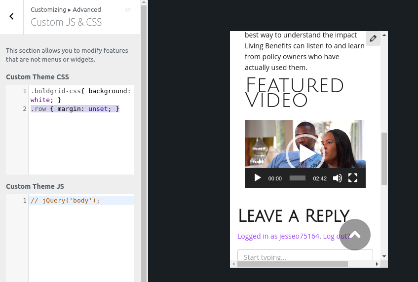
Navigate to Customize > Advanced > Custom JS & CSS and add this line of code to your Custom Theme CSS:
.container .row { margin: unset; }Here’s how that looks on my testing site:
 October 22, 2020 at 12:27 pm #28494DavidGuest
Thank you very much for your quick responses, Jesse!
However after I added the code to Custom CSS the page still didn’t work properly.
You can check it out at https://ml-insure.com/living-benefits-2/.
I’ll look around to see what else is going on, but so far I’m still just as stuck.
David
October 22, 2020 at 12:29 pm #28495DavidGuestThank you very much for your quick response, Jesse!
However after copying the code you provided to the Custom CSS, I still had a post with a video (and text above it) which extends beyond the viewport of my mobile phone. You can verify it here:
https:// ml-insure .com/living-benefits-2/
I’ll dig around some more while waiting for your reply, thanks again very much Jesse.
David
October 22, 2020 at 12:30 pm #28502Jesse OwensMemberHi David-
Thanks for your patience on this one. Our developers were able to identify the problem and a new update for the Wedge theme has been released.
Go ahead and delete the Custom CSS, and update your theme, and the issue will be fixed for you.
October 22, 2020 at 5:01 pm #28521DavidGuestHello Jesse, thanks again for your prompt action on my request.
It’s great that the new theme update will fix the issue I’ve run into. However I’m putting off updating until later, until I have a better handle on all the fixes I’ve done to the current theme, and how to transfer them all to a child theme before I do an update.
In the meantime I’ve gone ahead and scrapped self-hosting my videos, I’ll use either YouTube or Vimeo to sidestep the issue for now. Again thanks for your help here.
I have come across another head scratchers though:
1. I want my posts to NOT have a sidebar. I also want my posts page, the one where posts are listed one after the other, to ALSO NOT have a sidebar. I’ve looked around and cannot find a way to do this. I can delete all the widgets in the sidebar using Customize, but the sidebar space remains, and the post’s text or the post excerpts won’t flow to 100% of the width of the page.
Thanks one more time, hope to hear from you again soon.
David
October 22, 2020 at 5:13 pm #28531Jesse OwensMemberHi David-
The Wedge theme is hard-coded to include the sidebar, regardless of whether or not there are widgets added to it. If you’re interested in getting more complete control over your site design without code, consider checking out our advanced Crio Theme.
That said, you can remove them from Wedge with a little work. This article on how to remove the sidebars was written for the GridOne Theme, but it works on Wedge as well.
To summarize, use a plugin like Code Snippets to insert this chunk of code:
function hide_sidebar ($config) {
    $config['template']['sidebar'] = [
        'is_archive',
        'is_blog',
        'is_single',
        '[page_home.php]is_page_template',
        '[default]is_page_template',
    ];
    return $config;
}

add_filter( 'boldgrid_theme_framework_config' , 'hide_sidebar' );
October 23, 2020 at 8:04 am #28542DavidGuestAlright, your added code worked like a charm when I pasted it into a Code Snippet!
Yes, I will look at your advanced Crio Theme, as there are several other things I’d like to do on the site, which I don’t think I can achieve with the Wedge theme I’ve set up currently.
Thank you again for all your help, Jessie!
- AuthorPosts
- The topic ‘Self-hosted video in post not responsive’ is closed to new replies.