- AuthorPosts
- September 24, 2020 at 2:19 pm #27484
 WhitGuest
I’ve googled this and tried all the suggestions I could find with no luck. What do I need to do to get Swifty to respond to smaller screen sizes. Is there a quick fix or do I need to start over?
September 24, 2020 at 2:35 pm #27492Jesse OwensMemberHello Whit-
Thanks for using the Swifty Theme from the BoldGrid Inspirations WordPress website builder.
I checked out the website you sent over privately, and I spotted two main issues causing the problem with mobile responsiveness.
The first issue is the long text in the footer, “Paid for by… Authorized by…” Right now, that text is set not to wrap. Navigate to Customize > Advanced > Custom JS & CSS and paste the following into your Custom Theme CSS:
.contact-block span { white-space: normal; }The second issue I noticed was the image just below the header (with the star in the middle) is set up as a background image on a block, so the names and copy on either side are cut off. I’d recommend adding this image normally, rather than as a background, so it scales down with the screen width.
Other than those two issues, did I miss anything? Let us know if you’re still having any issues, we’re happy to help.
September 24, 2020 at 4:43 pm #27493WhitGuestThanks Jesse. That helped a lot. Backgrounds aren’t great but it’ll do.
September 25, 2020 at 5:01 pm #27552WhitGuestHi Jesse, While I’ve got you. I changed the lead pic to an image instead of a background. How can I get rid of the left and right margins?
The 4 columns of text stack on small displays but left justified and not using the available space well. I have a feeling it’s just a couple of lines of css that I can’t get figured out. Thanks!
September 25, 2020 at 5:27 pm #27558Jesse OwensMemberHello Whit-
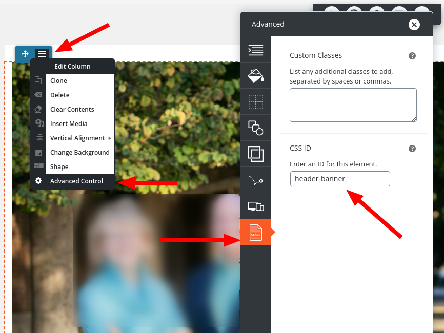
For your first question, first you’ll need to add a CSS class or ID so you can target the row that contains that image. Use the blue-colored Edit Column menu, and select Advanced Controls. Then add a CSS ID, in this example I used “header-banner.”

Once you’ve got that set, you can target that row with Custom CSS, similar to this:
div#header-banner {
 padding-left: 0px;
 padding-right: 0px;
}
For your second question, you’ll need to switch over to the Text editor tab in your editor. You’ll see that each one of those columns is inside a <div> element that looks like this:
<div class="col-md-3 col-xs-8 col-sm-6">
These CSS classes control the width of the columns at different screen sizes. On “Medium” size screens, each column takes up 3/12 (one quarter) of the screen, on “Small” screens, 6/12 (half), and on “Extra Small” screens, 8/12 (two thirds). So, in order to make sure they fill up a small screen, change each one of those elements so that col-xs-8 is col-xs-12:
<div class="col-md-3 col-xs-12 col-sm-6">
That will fill a vertical mobile screen.
- AuthorPosts
- The topic ‘Swifty Theme and Mobile Responsiveness’ is closed to new replies.