Tagged: Typography
- AuthorPosts
- July 16, 2021 at 1:54 pm #40569
 CrizzoGuest
Not sure if this is better in “Questions” or “Boldgrid Themes” but I used a Boldgrid template for my site. Edited it to how I would like and published it. The site looks great on a desktop/laptop/tablet, but when viewing it on a cell phone the words get chopped up and lowered to the line below and/or go beyond the background “shape”. I saw how texts/fonts can be individualized to specific device viewing in the CSS but doing that kind of stuff is beyond me. I imagine many other people have had this problem too. Anyone know how to fix it?? I am also trying to figure out how to remove an oval shape object at the top center near my header and have everything below it raised up closer to the header.
July 16, 2021 at 2:04 pm #40606Joseph WKeymasterHi Crizzo, we are happy to answer any questions you have about working with our WordPress themes on your website!
Are your heading elements the ones that are getting chopped up when viewed at the mobile device screen size? If so then I might have a solution for you!
Our Working with Fonts in Crio article has a troubleshooting section that provides some Custom CSS that disables word breaking and auto-hyphens for heading elements.
As for the oval shaped object that needs removing, could you send us a link to the page on your website that contains that element? Once we are able to take a look at that page we should be able to help you figure out how to remove it!
July 16, 2021 at 3:02 pm #40608CrizzoGuestHello Joseph, thank you for the reply. Yes the text break up happens on all pages in the header. The current font size is ideal for desktop and tablet viewing but should ideally be smaller for cell phone viewing. I do not know how to reduce it for cell phone view (words still get chopped up though) without it lowering on other devices either. I viewed the link you provided about trying to fix it in CSS. I do not know where to find the corresponding CSS for this issue nor what to put in the CSS (copy and past what is in that link and then..?)..
The oval shaped object is on my home page. The site is besamemuchoent.comJuly 16, 2021 at 3:03 pm #40610CrizzoGuestupdate… i was able to remove the oval box by switching to text editor of that page and deleting the code text for it. Still have the text chop up during cell phone view. Not sure how to find the corresponding CSS for cell view nor what to enter into it.
July 16, 2021 at 3:14 pm #40615Joseph WKeymasterHi Crizzo, I am happy to hear that you were able to get that box removed from your home page!
The CSS snippet found in that troubleshooting section should be copied into the Custom CSS area located in the Crio theme Customizer. Once that code is added your headings should no longer break or hyphenate on mobile devices.
If you also want to reduce the font size used for the Site Title on mobile devices then adding this CSS should be able to help you with that.
@media (max-width: 767px) {
  h1.site-title {
    font-size: 36px;
  }
}
The font size of 36px in that code can also be increased or decreased depending on how large you want the site title to appear on mobile devices. Please let us know if you have any other questions for us!
July 19, 2021 at 3:22 pm #40626CrizzoGuestSorry but I just cant find where to copy and paste that info into the proper CSS…. Ive gone from Crio them customizer to the Css/Jss editor, pasted it in there, published, purged caches, to no avail. Went to customizer to header, site title…nothing there… customizer to fonts and didnt see anywhere in there.
July 19, 2021 at 3:33 pm #40719Joseph WKeymasterHi Crizzo!
The Custom CSS editor found in the Customizer is the correct location to input that code and I see the hyphen and word wrap rules applied to your Site Title, but not the media query CSS used to reduce the font size of the title on mobile display sizes. The word Entertainment is your Site Title looks like it is still breaking, despite the custom CSS rule, because the font size makes the word too large to display completely in your header.
Is that CSS currently added through the Customizer? If so then it looks like we might need to created a more targeted set of CSS selectors in order to get the Title font sized reduced.
Hopefully once all of the Custom CSS is implemented your title will start behaving as expected and I hope that we will be able to get this sorted out for you soon!
July 20, 2021 at 10:45 am #40738CrizzoGuestHello, I am not sure what you mean with “is that CSS currently added through the customizer?”. I copy and pasted the code within the link you previously provided into the CSS through customizer but it did not do anything. No changes were visible in my site at all. So I deleted it.
I wish I could provide jpgs of what I am seeing on my cell phone. It is not just the header showing issues with the word “Entertainment”, but is is every word in the title. The last letter in “Besame” goes on to the next line down, the last letter in “Mucho” goes to the next line down, and the second half of the word “Entertainment” gets chopped. ALSO, within the About Us page, various words throughout the description section do not get chopped, but they do go beyond the black shaped background for the text. It also happened with one or two words within the “Contact Us” page. So it is not just the header, but other areas within those two pages as well.July 20, 2021 at 11:29 am #40781Joseph WKeymasterHi Crizzo!
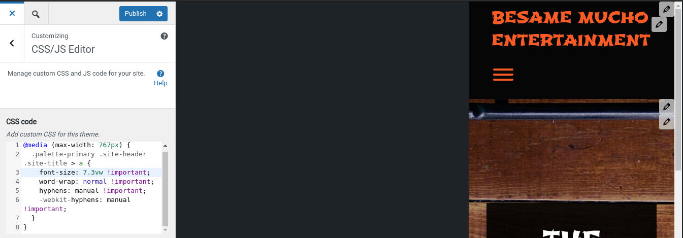
Thanks for the reply, and there was an error in that CSS above. Here’s a rule that should work for you, for the site title, as well as the other headings and body text that are too big:
@media (max-width: 767px) {
  .palette-primary .site-header .site-title > a {
    font-size: 7.3vw !important;
    word-wrap: normal !important;
    hyphens: manual !important;
    -webkit-hyphens: manual !important;
  }
  p {
      font-size: 100% !important;
  }
  h2,h3,h4,h5,h6 {
      font-size: 135% !important;
  }
}
That CSS should work a little better than the previous one and sorry about the mix up! Please let us know if there is anything else that we can do to help!
- AuthorPosts
- The topic ‘text chopped up in cell phone viewing’ is closed to new replies.