- AuthorPosts
- September 11, 2020 at 11:37 am #26791
 Neil BjorklundGuest
I’m using the Florentine template, and I’m really like the title in Fredericka the Great font. I want to add my logo to this, but the template only offers either the text or the logo. Can I hack this and put the logo next to the title?
Thanks,
Neil
September 11, 2020 at 12:06 pm #26813Jesse OwensMemberHi Neil-
Yes, you can “hack” this together. Check out this video where I walked another user through the process:
To summarize, first put your “title” into the “tagline” field, and then add a Custom CSS Rule similar to this:
h3.site-description.invisible {
	visibility: visible;
	font-family: Fredericka the Great;
	font-size: 48px;
}
You can change the 48px size to suit your needs. If you’d like to align the text to the right of the logo, like that user did, you can also add this rule:
div.site-title { float: left; }September 11, 2020 at 5:24 pm #26885Neil BjorklundGuestThanks, Jesse. That was useful in helping me see more options for the logo and tagline. Now I want to be able to override the size limit for the logo, as I decided to incorporate two hierarchical tag lines into the logo. The built-in limit is 260 units, and I need to go about 30% larger.
Thanks,
Neil
September 11, 2020 at 5:29 pm #26887Jesse OwensMemberHi Neil-
A little more Custom CSS will do the trick for this. Add a new rule similar to this:
.logo-site-title img { width: 600px; }You can adjust the value 600px to suit your needs.
September 14, 2020 at 12:47 pm #26898Neil BjorklundGuestJesse–Thanks for all these tips. You are saving me a LOT of time hunting for answers on my own. Next is: on a single page for which I am not displaying the page title, can I hide the section or strip that the page title would appear in?
Thanks!
Neil
September 14, 2020 at 12:48 pm #26899Neil BjorklundGuestI have a couple more construction conundrums. First, I would like to control the display of my blog posts in the “post list” block component I am using to provide access to my posts. Currently, the title does not show up as a link when I view the page, so there may be a glitch there. I want to make sure that is working properly. And I would like to be able to put the title and the date of each post on the same line to save space.
Second, I would like to edit the color and height of the footer that appears below every page, and while I easily found the way to edit the text, I haven’t been able to find the process for removing extra space and changing the background color of the entire footer.
That’s it for now (until I run into the next mystery).
Thanks,
Neil
September 14, 2020 at 3:00 pm #26932Jesse OwensMemberHi Neil-
I’ll try to answer each question in turn.
On a single page for which I am not displaying the page title, can I hide the section or strip that the page title would appear in?
Yes, a little more Custom CSS will accomplish this:
body.post-title-hidden header.entry-header {
    margin-top: -25px;
    margin-bottom: -25px;
}
[On the Post List Block Component] Currently, the title does not show up as a link when I view the page, so there may be a glitch there.
This one’s a little tougher to answer, because it has to do with some specific customizations on your page.
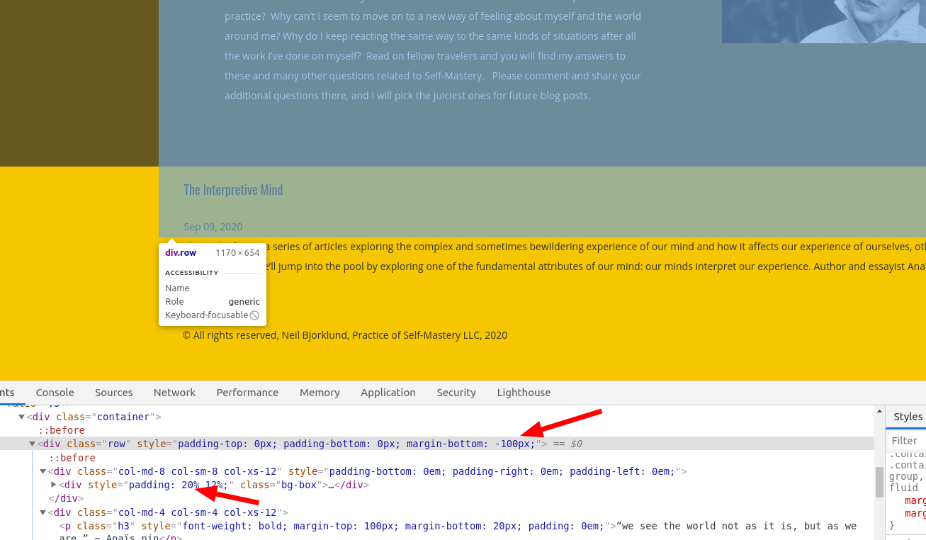
If you check out your site, you can see that the title is actually a link, but it’s being “covered” by some strange margin and padding settings for the paragraph above it:

Edit this page, and check out the advanced controls for the row above the Post List. You’ll see that the bottom margin has been set to -100 Pixels, which is what’s causing your post list and your row to “overlap,” so you can’t click the link.
And I would like to be able to put the title and the date of each post on the same line to save space.
You can do this with a little more Custom CSS. Here’s the CSS rules that worked for me. I found that a 15px padding between the Post Title and the Post Meta (date) looked pretty good:
div.bgc-postlist .bgc-single-title, div.bgc-postlist .bgc-single-title .widget-title { float:left; }
div.bgc-postlist .bgc-single-excerpt { clear: both; }
div.bgc-postlist .bgc-single-body span { padding-left: 15px; }
I would like to edit the color and height of the footer… removing extra space and changing the background color
Generally speaking the Footer color is determined by the color palette, but you can manually change it with some more Custom CSS. Enter a new rule similar to this:
.palette-primary .site-footer { background-color: purple; }Simply replace purple with your color, hex code or rgb code.
The height of the footer comes from a few different places, primarily on your site from the one widget that is in the footer. Add this rule:footer .widget { margin-bottom: 0px; margin-top: 0px; }September 14, 2020 at 9:24 pm #26942Neil BjorklundGuestThanks, Jesse! Two down, and three to go. The footer is now as I want it, and the unwanted title is gone from the Blog page. Great!
I removed the overlap from the post list, which I inadvertently created trying to remove all the extra space in the block above the post list. I want to remove that wasted space, but can’t see a way to tighten that up, its probably more custom CSS!
The other thing is the gap between the Blog intro block and the Post List block below it. I don’t see what is causing that gap, but I would like to remove it.
The date and the blog post title are not lining up vertically, and I would like them to align in all views.Thank you!
Neil
September 14, 2020 at 9:25 pm #26950Neil BjorklundGuestOh–Two other items I could use help with.
- In the main navigation bar, I’d like to change the link status display that identifies the page we’re on so its different from the display of the page we’re hovering over and going to. Just changing the color of the bar under the link title would work.
- Can I display the title of each blog post in a more obvious link format that changes when you hover over it?
Thanks again,
Neil
September 14, 2020 at 9:28 pm #26958Neil BjorklundGuestJesse–I also have a more general question about building pages in BoldGrid. I actually find the selection of pre-made blocks that are available very frustrating, in part because my business is not like any of the businesses for which the templates were created, and also because the blocks constitute a multitude of variations on a small number of design purposes. For instance I need a page to describe a course I am teaching. I haven’t found any instruction anywhere on BoldGrid to efficiently build a page for which no existing template blocks are appropriate. I need to be able to easily lay out and combine an image, a large text block, a list, a chart, and a combo box that has the dates, times, cost, and sign up procedures for a class. I’m not seeing an efficient way to do that. Please help!
Thanks,
Neil
September 15, 2020 at 12:32 pm #27003Jesse OwensMemberHi Neil-
I’ll try to answer each question in turn.
I want to remove that wasted space, but can’t see a way to tighten that up, its probably more custom CSS!
Actually, it looks like there might still be some customizations in your page content causing this. Since they’ve been manually modified with the Post and Page Builder controls, it’s better to fix it there than to try and muscle it in with CSS. When the formatting has gotten in the weeds like this, I recommend switching to the Text editing tab.
- The top block has a 32px margin-bottom as well as a 5em padding bottom. Switch to the Text editing tab, and look for the following element that should be near the top of your page:
<div class="tmpl-call_to_action-5 boldgrid-section dynamic-gridblock background-parallax color4-background-color color-4-text-contrast bg-background-color" style="color: #ffffff; margin: 1px 1px 32px; padding: 5em;">
Change the very last part to read:
margin: 1px 1px 0px; padding: 5em 5em 0em;
- The rest of the space is coming from the text block, that starts out with, “The Self-Mastery Blog.” That block has a 20% padding-bottom. If you’re still in the Text editor, look for this:
<div style="padding: 20% 12%;" class="bg-box">
<h1 class="color2-color" style="font-size: 4em; margin: -100px 0px 9px;">The Self-Mastery Blog</h>
Change the first line to:
<div style="padding: 20% 12% 0%;" class="bg-box">
The date and the blog post title are not lining up vertically, and I would like them to align in all views.
The only way I found to make this match reliably was to make it match the heading. Here’s the Custom CSS I found:
.bgc-single-body > p > span {
font-family: Oswald;
font-size: 18px;
line-height: 1.1em;
vertical-align: top;
}
In the main navigation bar, I’d like to change the link status display that identifies the page we’re on so its different from the display of the page we’re hovering over and going to. Just changing the color of the bar under the link title would work.
Here’s a CSS rule you can use for this, simply change “#ffffff” (white) to the color you’d like:
palette-primary .navbar-default .navbar-nav > li > a:hover {
border-bottom: 5px solid #ffffff;
}
Can I display the title of each blog post in a more obvious link format that changes when you hover over it?
Yes you can, this was being overridden by the H4 style, rather than the link style which underlines by default:
a:hover > h4 {
text-decoration: underline;
}
I need to be able to easily lay out and combine an image, a large text block, a list, a chart, and a combo box that has the dates, times, cost, and sign up procedures for a class. I’m not seeing an efficient way to do that.
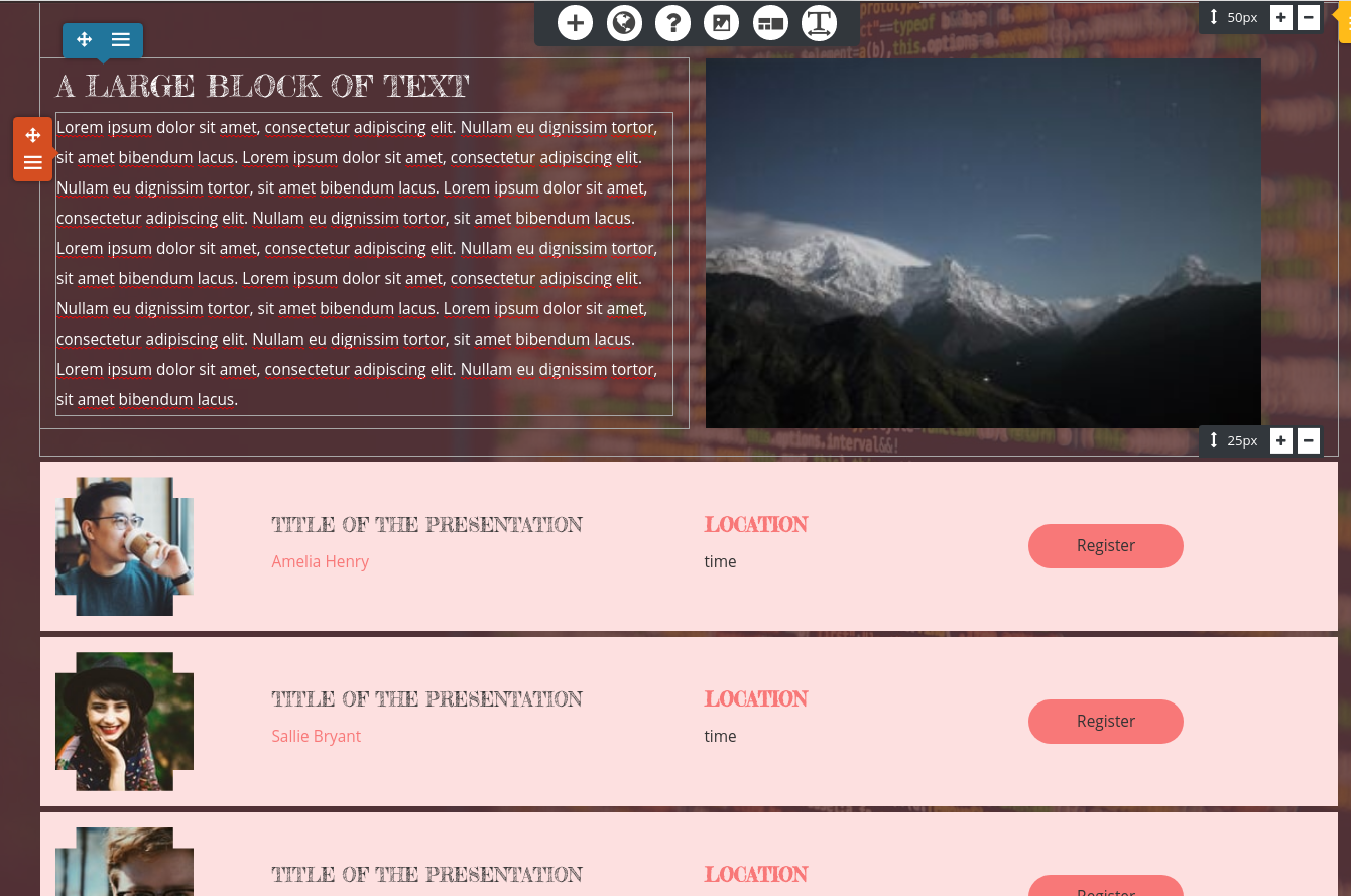
Have you checked out the “Schedule” block type? There are blocks there that might fit the need for a “box that has dates, times cost, and sign up procedures.” Here’s an example:
September 16, 2020 at 11:42 am #27074Neil BjorklundGuestThanks again Jesse! Some of those helped, and some did not.
- I made edits as suggested under items 1 and 2, which created other spacing issues on this page. It feels bit like I’m playing whack-a-mole. Right now nothing is overlapping but there’s still too much space above and below the self-mastery blog intro.
- the blog post date and title fix worked- yay!
- the main navigation bar didn’t change at all after pasting in your suggested CSS code, and I changed the color twice, no change
- the underline status for hovering over the blog post title works now – yay!
- the “schedule” block doesn’t have most of what I need for a page describing a class in detail
September 16, 2020 at 12:01 pm #27088Neil BjorklundGuestAlso, I accidentally unsubscribed from email updates to your posts, and would like to restore that!
Neil
September 16, 2020 at 12:36 pm #27124Jesse OwensMemberHi Neil-
We’re almost out of moles to whack I think!
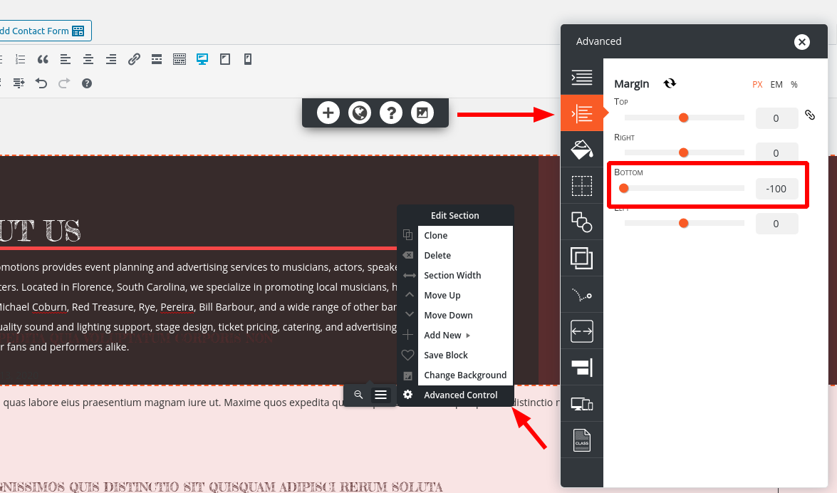
The last bit of space above your blog post list is coming from the inner paragraph itself.
Here’s a trick I use to figure out where margins and padding are coming from, if you have a few moments to watch this short video:
In summary, there’s still 100 pixels of margin, on the bottom of the paragraph element. You can remove this in the Text editor, or use the advanced controls on the paragraph itself.For your navigation hover customization, the code didn’t work because I made a typo! Sorry about that. Here’s the correct CSS rule, with the period (.) at the beginning of the selector:
.palette-primary .navbar-default .navbar-nav > li > a:hover {
border-bottom: 5px solid #ffffff;
}
To re-subscribe to email notifications, make sure you check the box for “Notify me of follow-up replies” when you respond or make a new topic. Currently, the forum software is set up so that we can’t force-subscribe email addresses without you checking that consent.
September 16, 2020 at 3:48 pm #27149Neil BjorklundGuestThanks, Jesse! That trick of viewing the source code via the inspector in a browser was a big missing piece. I was having a heck of a time identifying which div code was doing what.
For now the last thing on my To Do list is to figure out how to create custom blocks, when BoldGrid’s pre-made blocks don’t provide the layout that I need. I’ve read the support posts on creating custom blocks, but there isn’t much there. Any suggestions? Or do I have to hire someone to create the block layouts I need in a form that is compatible with the BoldGrid theme?
I also didn’t see a way to save a custom block as a template, so I guess I just have to copy the code of the block I created over to the new page, right?
Neil
September 16, 2020 at 5:24 pm #27176Jesse OwensMemberHi Neil-
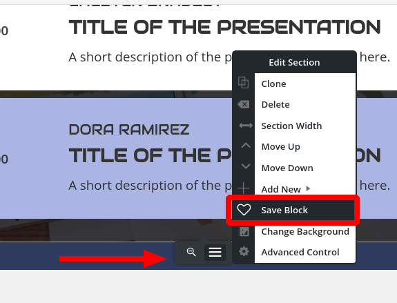
I’ll tackle the easy question first, how to save a custom block as a template.
At the bottom of each block is the Edit Section menu, which appears as a gray pop-up when you’re hovering over the block. From here, you can save your blocks:
Then, whenever you go to add a new block, you’ll see your saved blocks under the Block Library block type.
For your main question about designing a custom block, it’s a little tough to guide you on exactly how to accomplish what you’re after from what you’ve described so far. That said, I’m confident you can accomplish your goal with a little customization. If you have a few minutes to spare, I created this video to hopefully show you how to do your custom design.
September 16, 2020 at 6:53 pm #27181Neil BjorklundGuestJesse–That video was just what I needed! You gave me enough to begin creating the custom layouts I need, and when I get stuck, I’ll get in touch.
Thanks so much!
Neil
September 16, 2020 at 6:54 pm #27189Jesse OwensMemberI’m really glad to hear that helped Neil! Please do get in touch if you do get stuck, we’re happy to help.
September 17, 2020 at 1:23 pm #27195Neil BjorklundGuestShoot, I’m back already. Now I’m working refining the blog posts themselves.
The line spacing in my posts seems squirrelly and I’m not sure how to correct this. I want consistent spacing between paragraphs, but it is very inconsistent, even where I appear to have used the same approach.
I want to be able to change my September 9 post to draft, and keep working on it. Don’t see any obvious way to do that.
My September 16 post shows up, but it doesn’t have the formatting as a post that the 9/9 post has, such as list of posts at upper right, and commenting infrastructure at the bottom.Also, on my pages, I want to know how to get the page title block background and the page background to match on several pages. For example on pages with lots of text where the transparency is too much for readability, I want to change the background transparency of both to match, and be less transparent.
That’s it for now. I couldn’t build this website without you! Thanks for all your help.
Neil
September 17, 2020 at 1:58 pm #27210Jesse OwensMemberHi Neil-
I’ll try to answer each of your questions in turn.
The line spacing in my posts seems squirrelly and I’m not sure how to correct this. I want consistent spacing between paragraphs, but it is very inconsistent, even where I appear to have used the same approach.
When you’re describing the “spacing between paragraphs,” I’m assuming that you mean in between the blog posts. Please correct me if I’m mistaken.
If that’s what you mean, then you can target it with some more Custom CSS to set the gap between them to 0 pixels (it’s currently 40 pixels):
.bgc-postlist [data-columns] {
  grid-gap: 0px;
}
I also noticed the spacing in your actual posts themselves:
If that’s what you’re referring to, here’s what’s going on. The smaller spacings are actually part of the same paragraph with a line break inserted, whereas the wider gaps are two separate paragraphs. The easiest way to differentiate between them is that a line break can be inserted with SHIFT-ENTER, where a paragraph break is simply ENTER.
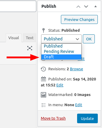
I want to be able to change my September 9 post to draft, and keep working on it. Don’t see any obvious way to do that.
To change a post or page back to a draft, click on Edit next to Status: Published in your editor’s Publish box:
My September 16 post shows up, but it doesn’t have the formatting as a post that the 9/9 post has, such as list of posts at upper right, and commenting infrastructure at the bottom.
Your post from September 9 is actually a blog post, while the one from September 16 is set up as a page. You’ll need to copy the Page content and paste it into a Blog Post to get the discussion and sidebar to show up.
Also, on my pages, I want to know how to get the page title block background and the page background to match on several pages. For example on pages with lots of text where the transparency is too much for readability, I want to change the background transparency of both to match, and be less transparent.
Right now, it’s actually the other way around. Your header is fully transparent and shows the image in its original color, while the content has a semi-transparent yellow background. It’s actually a little less readable when you make it match.
Here’s how it is now:
.palette-primary .site-content { background: rgba(247, 239, 203, 0.75); }To make that match your header, change the value 0.75 to 0. On the other hand, if you’d like to make it more readable, increase the value of 0.75 to 0.8 or even higher.
September 18, 2020 at 11:35 am #27282Neil BjorklundGuestJesse–Thanks, as usual for great instruction. All those solutions worked!
Now I’m fine-tuning the home page.
I want to link button at the bottom of the call-to-action section to go to an anchor ID I set in the page content below it. I’ve tried defining that link a couple of ways, but it doesn’t seem to be working.
I’ve got whack-a-mole spacing on the main page section called Self-Mastery Coaching. I can’t seem to get rid of the extra space around the section title, the hard rule, and the text below. I’ve looked at in the Firefox element inspector and I still can’t figure out how to get it to behave the way I want it to, after trying 5 different approaches.Hope you are having a great day!
Neil
September 18, 2020 at 1:55 pm #27290Jesse OwensMemberHi Neil-
When you say your anchor links don’t seem to be working, can you describe exactly what’s going on? If you have a moment, check out this video I created for another user on using anchor links:
We also have a detailed tutorial on anchor links here.
As for the spacing between your headers and horizontal rules, that’s coming from the margin on your H2 elements. Here’s what it is now:
.page-template-page_home .entry-content h2 {
margin-bottom: 40px;
padding-bottom: 15px;
}
You can copy that rule into your Custom Theme CSS and modify the values to suit your needs. Keep in mind this rule is specifying only the h2’s on your home page, so if you want to apply this to all the h2’s on your site, simply remove .page-template-page_home.
September 18, 2020 at 3:06 pm #27296Neil BjorklundGuestJesse–Thanks for the H2 tip. That’s now working.
Reviewing your video helped me see that I did not need to add a “/” before the “#” in the Anchor URL. All good now!
Thanks,
Neil
September 18, 2020 at 3:10 pm #27304Jesse OwensMemberHi Neil-
Oh, yep adding a slash would do it! That tells the computer to start looking in the “next directory” and since the anchor links are on the same page, that would cause a 404 error. I’ll make sure to add that note to the article.
September 28, 2020 at 2:41 pm #27574Neil BjorklundGuestHi Jesse–I’m just about to go live with the site, and noticed that the background image is not playing nice on the iPhone version. Its showing a small pixelated portion of the background photo that doesn’t look nice. I know you’ve got some custom CSS code for fixing that!
Neil
September 28, 2020 at 2:42 pm #27577Neil BjorklundGuestI’ve moved the website to its final hosting location, so note the new URL. I sent a request earlier about the background photo not playing nice on iPhone, and now I see the same problem on iPad. I think we need a custom rule for the background photo size on mobile devices.
A second mobile device issue is that the call to action “header:” “Create the Life You Want” is displaying too low on iPhone and is partially hidden. It’s fine on PC and iPad. I’d like to move it up with a custom rule.
Thanks!
Neil
September 28, 2020 at 3:06 pm #27605Jesse OwensMemberHi Neil-
The behavior of the background image is due to the way Mobile Safari displays the “Cover Page” image size rule together with the “Fixed” position. Here’s some Custom CSS that should do the trick:
@media only screen
and (max-device-height : 1024px)
and (max-device-width : 1024px) {
    .palette-primary.custom-background,
    .boldgrid-section.background-fixed {
        background-attachment: scroll !important;
	background-position: center top !important;
    }
}
In order to move the call-to-action text up, you can add a little bit to that rule:
@media only screen
and (max-device-height : 1024px)
and (max-device-width : 1024px) {
    .palette-primary.custom-background,
    .boldgrid-section.background-fixed {
        background-attachment: scroll !important;
	background-position: center top !important;
    }
    .call-to-action h2 { margin-top: -1em; }
}
October 1, 2020 at 11:27 am #27736NEIL BJORKLUNDGuestThanks, Jesse. It appears we have some more moles to whack on this one. : )
You sent me this suggested CSS custom code to address the background photo issues and call to action placement on mobile phone screens:
@media only screen
and (max-device-height : 1024px)
and (max-device-width : 1024px) {
   .palette-primary.custom-background,
    .boldgrid-section.background-fixed {
        background-attachment: scroll !important;
        background-position: center top !important;
    }
    .call-to-action h2 { margin-top: -1em; }
}
After I entered and published that, and it looked okay until I scrolled down, or turned the phone sideways which I often do to make it easier to read. In both cases, the photo is now too small. Secondly, by moving the call to action up, there is now too much blank space below it.I know you will have some custom code to address those issues as well!Thanks,NeilOctober 1, 2020 at 1:08 pm #27752Jesse OwensMemberHi Neil-
There’s a couple of things we can do to make this look better.
- The call-to-action currently has a 200 pixel margin on the bottom
- iOS is still treating the background-size “cover” strangely
- The font-size of the call-to-action is very large for a small screen
Here’s a modified version of the code you’re using to try:
@media only screen
and (max-device-height : 1024px)
and (max-device-width : 1024px) {
   .palette-primary.custom-background,
    .boldgrid-section.background-fixed {
        background-attachment: scroll !important;
        background-position: center top !important;
        background-size: unset !important;
    }
    .call-to-action { margin-bottom: 0px; }
    .call-to-action h2 {
       margin-top: -1em;
       font-size: 50px;
    }
}
It’s tough to test this out on a physical iPhone ahead of time, so let me know if anything doesn’t turn out as expected.
October 5, 2020 at 12:16 pm #27842NEIL BJORKLUNDGuestThank you, Jesse. We are making incremental progress on the home page!
On the home page I would like the background photo to extend below the “Learn More” button. I don’t understand the code you are using or modifying for the phone view, so I must rely on your suggestions.
For some reason, the font size of the call to action (“Create the Life You Want”) did not change with the addition of “font-size: 50 px.” I also tried 40 px and 30 px and those did not change the font size either. Something else seems to be keeping that font size as it is.
All the other pages are looking good on mobile devices.
You are a rock star!
Cheers,
Neil
October 5, 2020 at 12:16 pm #27843NEIL BJORKLUNDGuestThank you, Jesse. We are making incremental progress on the home page! On the home page I would like the background photo to extend below the “Learn More” button. I don’t understand the code you are using or modifying for the phone view, so I must rely on your suggestions. For some reason, the font size of the call to action (“Create the Life You Want”) did not change with the addition of “font-size: 50 px.” I also tried 40 px and 30 px and those did not change the font size either. Something else seems to be keeping that font size as it is. All the other pages are looking good on mobile devices. You are a rock star! Cheers, Neil
October 5, 2020 at 12:18 pm #27853NEIL BJORKLUNDGuestHi Jesse–I submitted this question yesterday, and then noticed that it went to a feedback team. I’m not sure if this is within your area… WordPress has a customizable subscription form block that can be easily designed (color, text, etc.) to match the page its plugged into. I cannot find such an option on BoldGrid or WPForms or elsewhere without an expensive subscription. I tried via MailChimp (free account) and I tried via WPForms, and I tried to find this in BoldGrid blocks to no avail. This is form is an essential tool for my website, so I need some guidance on to how implement a blog subscription form that matches the design of my site. Hope you can help!
Thanks,
Neil
October 5, 2020 at 3:05 pm #27882Jesse OwensMemberHi Neil-
Sorry about that font-size rule not working! Change that line to this:
font-size: 50px !important;
Once that font-size is fixed, you’ll see that your learn more button will have moved up enough so that the image is big enough.
For your Email Sign-up form, I’m thinking you’re referring to the “Newsletter Signup” block included with the Jetpack plugin. It’s a pretty straightforward form that just has a Name, Email Address, and submit button. For simple forms like that one, you can use weForms.
Most folks, however, want to use a plugin that automatically connects with your email marketing software. OptinMonster is probably the most popular plugin to accomplish this, and it integrates with most of the email marketing platforms.
You mentioned you had tried the MailChimp plugin but didn’t succeed, may I ask what went wrong with that?
October 5, 2020 at 6:33 pm #27899NEIL BJORKLUNDGuestJesse–Wonderful. That “important” rule did the trick. Home page looks great on mobile now.
Regarding the blog subscription form, what hasn’t been working (MailChimp, WPForms) is designing the form to look good and match the style/design of the site in an embedded form. MailChimp lets you design if its a separate landing page, but I don’t see how to do it with an embedded form. WPForms didn’t seem to have the custom style/design function at all, just the ability to pick which fields. I am probably not seeing an option that is there, but I spent a couple hours looking.
Thanks!
Neil
October 5, 2020 at 6:49 pm #27916Jesse OwensMemberHi Neil-
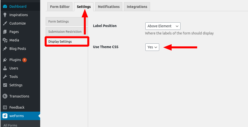
I’d recommend checking out weForms, which is the form builder that’s now being bundled with BoldGrid Inspirations (it sounds like you might have started your site when WPForms was our default form builder).
One reason that weForms might be better for you in this case is because it has the option to use your theme’s CSS so it looks more consistent with the rest of your website.
With the weForms Pro upgrade, it also integrates directly with MailChimp, Constant Contact, and several other popular email marketing platforms.
October 6, 2020 at 11:21 am #27917NEIL BJORKLUNDGuestThanks, Jesse–Yes, WPForms is what came installed. Is it the free version of WeForms that now comes bundled? or the paid one?
I plan to use MailChimp as my email management tool and it appears that only the paid version of WeForms will integrate with MailChimp. My business is still quite small, so I’m not using paid services unless I have to.
Thanks,
October 6, 2020 at 12:15 pm #27932Jesse OwensMemberHi Neil-
New BoldGrid Inspirations sites are bundled with the free weForms plugin, which includes integration with MailPoet, a very good email newsletter platform that offers all of their premium services up to 1000 subscribers.
That said, there are very many options that integrate with MailChimp without additional costs, like MC4WP which has over a million active users and very good reviews.
- AuthorPosts
- The topic ‘[Resolved] Title AND Logo’ is closed to new replies.