- AuthorPosts
- January 8, 2021 at 1:45 pm #32818
 KenGuest
Hello, Please visit the URL below.
Please help me create a page with the background picture that looks the same from the phone, tablet and desktop (laptop).
Also. is there an easier way to adjust each page in the mobile view? for example, if I drag pictures or yellow/orange cursor around, the entire page’s format changes into something that looks not fixable.Thank you very much
January 8, 2021 at 2:40 pm #32835Jesse OwensMemberHi Ken-
With the way you’ve got this block set up, with an empty column and a background image, the image’s height will be determined by the height of the row.
That means that on large screens, where it shows up to the right of your text, the image will be the same height of the text. But, when viewed on a mobile screen where it is moved below the text, it doesn’t have any height on its own.
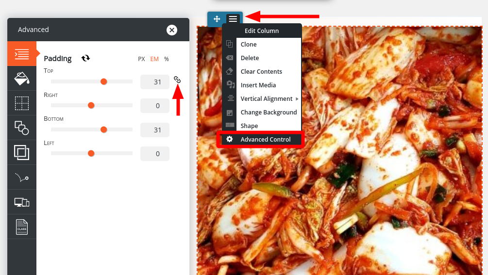
You can change that by adding padding on the top and bottom of the column that has the background image. Use the blue-colored Edit Colum menu, and choose Advanced Control. Here you’ll find the option to add the top and bottom padding.

Another way you can control the mobile view specifically is to use the Device Visibility settings to create custom sections of your page that only show on mobile or tablet devices. Check out these instructions for using responsive utilities.
- AuthorPosts
- The topic ‘why pictures look different in Mobile (phone and Tablet) view’ is closed to new replies.