-
AuthorPosts
-
January 29, 2021 at 1:18 pm #33356
Andrew
GuestHi there,
I spent so many hours trying to fix the issue with Customize Background looking fine on Desktop but not on Smartphones. The background image causes the smartphone browser to scroll to the left as it goes out of border.
I tired to add customized ccs you posted on many requested in advanced settings but still failed.
Please help me in solving the issue.
Thank you !
January 29, 2021 at 1:37 pm #33370Jesse Owens
KeymasterHi Andrew-
Thanks for reaching out! I’m sorry to hear about the frustration trying to fix that left-side gap.
It looks like you’ve got a negative margin set up on your logo in your Customize > Site Title & Logo > Horizontal Margin setting. When that negative margin is used together with a Right-to-Left font, it causes that gap.
I’d recommend setting that back to 0 to avoid this issue.
February 1, 2021 at 1:05 pm #33376GuestHi Mr. Ownes,
Apologies for the late reply as I’ve just seen it, the reply email somehow ended up in my junk.
I have just tried it and it works ! I would like to thank you so much for your quick reply and help ! I would never have though that this would be a probable cause. Even if I try to set it up to be just +1 horizontal margin it will create a gap.
Would you also be able to direct me on how I can display the background image fully on smartphone browsers ?. On desktops it looks fine but cropped on smartphones. I am using Parallax Background Effect setting and Cover Page Background Image Size.
Thank you again !
February 1, 2021 at 2:45 pm #33416KeymasterHi Andrew-
I can spot a few things you can do to improve your background image on mobile devices.
First, I’d recommend editing your source image to remove this white gap at the top of the image:
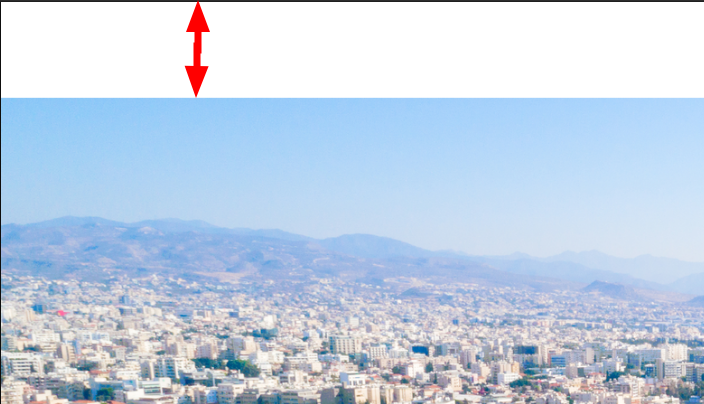 .
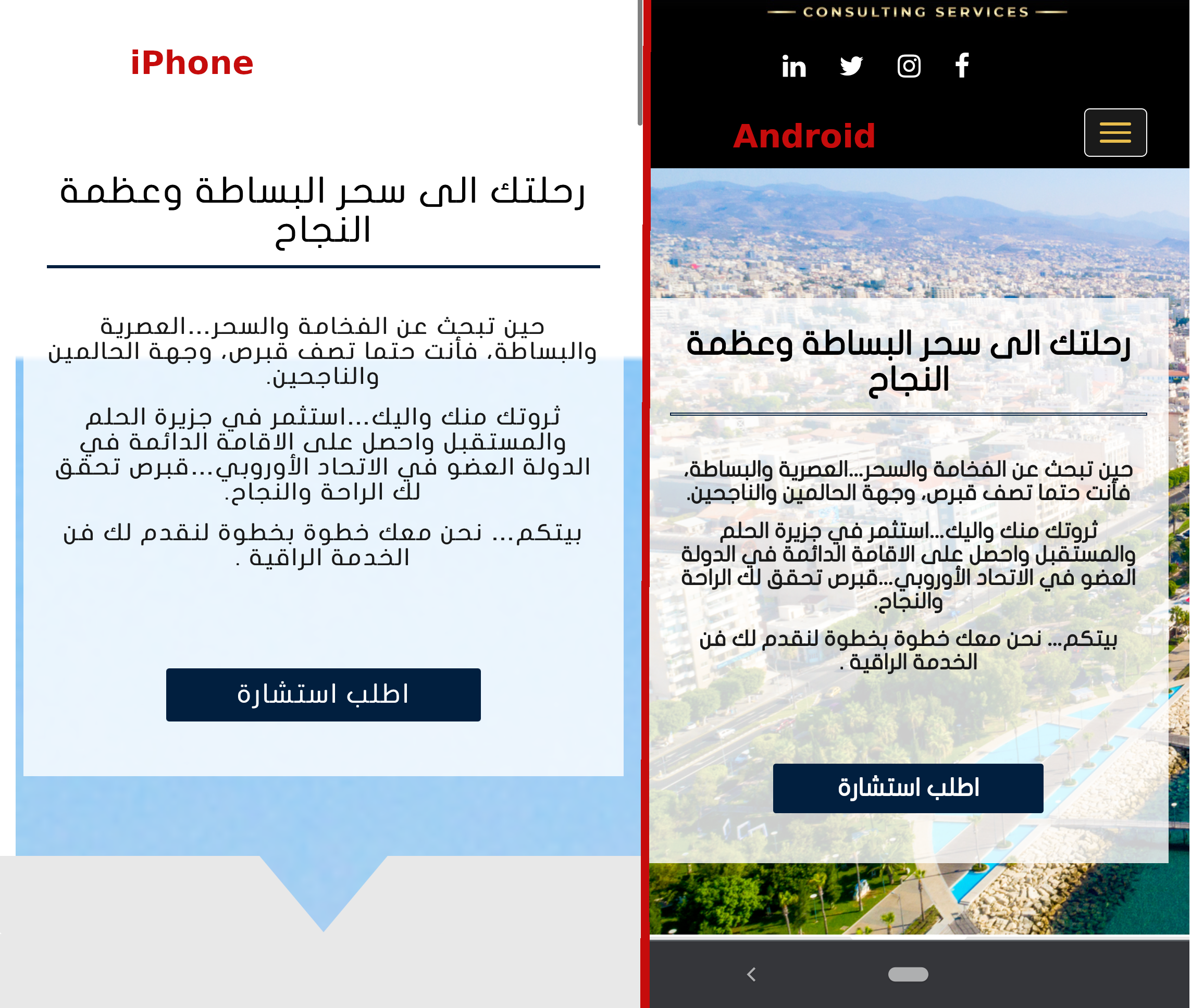
.Next, one reason you’ve found a few different answers for different people trying to solve this issue is that iPhone’s Safari in particular does not support the “Cover Page” size very well, and different CSS tricks work best for different individual images.
The technical reason for that is because iOS Safari uses the full height of the entire webpage to determine the “cover” size, rather than the height of the phone’s viewport, which results in the background image looking extremely zoomed-in. You can see the difference side-by-side here:
My favorite solution for this tricky issue so far is the following Custom CSS, which makes sure that the image is the right size on mobile devices, as well as centered:
@media (max-width: 991px) {
    body.custom-background {
        background-size: auto !important;
        max-height: 100vh;
        background-position: center top !important;
    }
}
By using the max-height: 100vh; rule, we make sure the image stays at 100% of the “View-height.”
-
AuthorPosts
- The topic ‘Customize Background looks fine on Desktop but not on Smartphones’ is closed to new replies.