Sometimes you may want a menu to appear horizontally on your website instead of vertically. Using the Post and Page Builder, our WordPress page builder plugin, and some simple CSS it’s easy to create a horizontal navigation menu and save as a block for use across multiple pages.
This article also provides the CSS needed to convert footer menus in the current default theme, Twenty Twenty-One.
Create a Horizontal Navigation Menu Step By Step
- Create a WordPress menu.
- Edit the page or post where you want to add the horizontal menu.
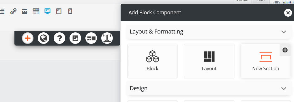
- Click the + icon in the DropTab to add a New Section for the menu.

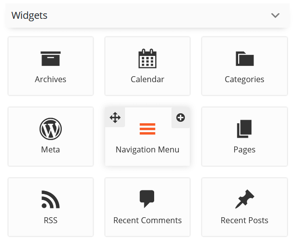
- Click the + icon again and scroll down to widgets to click on Navigation Menu. Drag it to the section you just created.

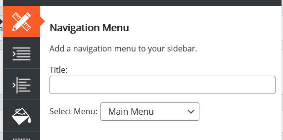
- In the popup, first select the menu you want to use from the dropdown.

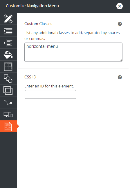
- Then click the Page icon on the bottom left to add a Custom Class and/or a Custom ID. We recommend using a descriptive class and ID, in this example we used only the class horizontal-menu. This class will be used again in step 9. Then close the popup.

- You can adjust the size and background color of the section as needed, but keep in mind the design will change when the custom CSS is added. When ready, save the page.
- Navigate to Appearance > Customizer > Custom CSS/JS.
- Add the code below. If you used the same horizontal-menu class in step 6, you can copy and paste this code exactly. If you used a different class or an ID in step 6, replace horizontal-menu with your class or ID, but be careful to leave the . before the class and if you used an ID don’t forget to add a # before the ID!
.horizontal-menu ul {
display: flex;
align-items: stretch;
justify-content: space-between;
width: 100%;
margin: 0;
padding: 0;
}
.horizontal-menu li {
display: block;
flex: 0 1 auto;
list-style-type: none;
}
If you’d like to further style the menu you can change the color, font and size like so:
.horizontal-menu li {
color: #000;
font-family: 'Roboto';
font-size: 16px;
}
Finally, you can change the active menu item’s color like this:
.boldgrid-shortcode.horizontal-menu .widget li.current-menu-item a { color: #FF0000; } - The Customizer live preview will refresh to show the menu horizontally. Save and close the Customizer.
- The menu now appears horizontally on the front end of your website!
Unfortunately at this time the Post and Page Builder will still show the menu vertically, as the code we just put in the Customizer is only read on the front end of your site. You should use the gray Preview Changes button in the Publish meta box to see how the design actually looks on the page before clicking the Update button.
Save Your Horizontal Menu Block
Now that you know how to create a horizontal navigation menu, it’s time to save it for use on other pages or posts. Hover in the section with the menu, and click the hamburger menu button at the bottom of the section.
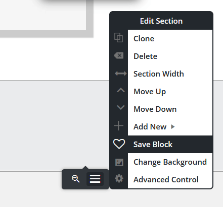
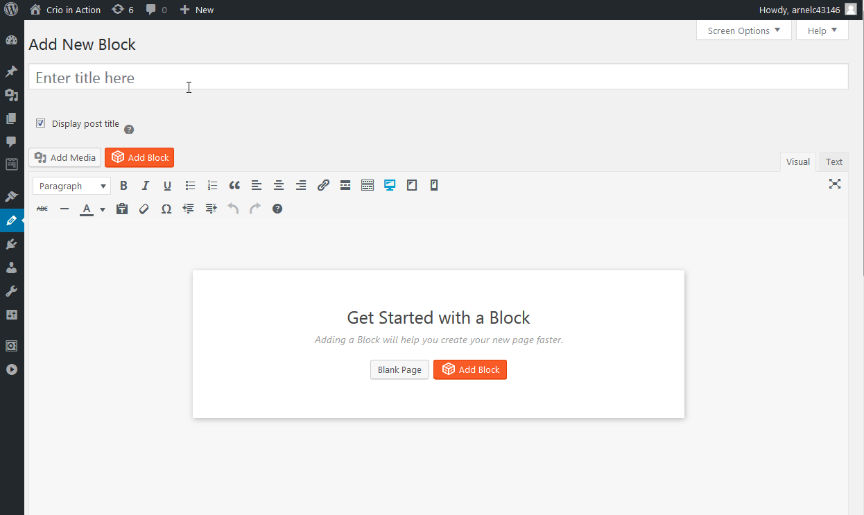
In the popup, give your block a name and save. Now it is saved to your Block Library! To access this block again, open the new page or post you want to add the menu to, and click the orange Add Block button below the page title / permalink.
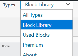
On the right side of the screen is a Types dropdown, the second option is your Block Library. Your new block is there waiting for you!
Test WordPress Safely in the Cloud!
If you have concerns about adding new content directly to your live site, you can use Cloud WordPress and Total Upkeep to work safely in the cloud. It’s easy! Simply make a backup of your site and transfer to the cloud, make your changes and then transfer back.
Anyone can create a free WordPress website in the cloud through BoldGrid Central. Click here to create a new WordPress website pre-installed with Total Upkeep, our WordPress backup plugin.
After your Cloud WordPress installation is ready, follow these step by step instructions to transfer your site:
- Add Total Upkeep to your live site by navigating to Plugins > Add New and searching for Total Upkeep.
- Navigate to Total Upkeep > Transfers and click the blue Backup Site Now button.
- In the popup make sure the Files and Folders and Database are set to Full Backup, then click the blue Backup Site Now button in the lower right to start the backup.
- After the backup is completed, navigate to Total Upkeep > Transfers > Source and click the gray Get Download Link button. Copy the link.
- Change to the Cloud WordPress installation. Navigate to Total Upkeep > Transfers > Destination, paste the transfer link, and click the gray Upload button.
- After the backup is uploaded, click the gray Restore button.
Now is the time to make changes! A Cloud WordPress installation is a great way to experiment with custom HTML and CSS. If something goes wrong you can restore the backup and start again right from Cloud WordPress.
If the ENTIRE site breaks, you can go to BoldGrid Central and delete the installation. Then, click the same link above to spin up a fresh WordPress site. Now only minutes have passed and you are ready to transfer your site and try again!
When your updates are completed, create a new backup, copy the transfer link and upload the backup to your live site. After restoring the backup your website will show the new changes. We also have additional information on how to transfer a website if needed.
Horizontal Navigation Menus in Twenty Twenty-One
This can also be done if you are using Twenty-Twenty One, the current WordPress Core default theme. The code below will change all navigation menus located in the Customizer > Widgets > Footer section.
.widget-area .widget > nav > ul {
display: flex;
align-items: stretch;
justify-content: space-between;
width: 100%;
margin: 0;
padding: 0;
}
Please note that when we say all navigation menus, we mean ALL. The list below details which widgets are actually navigation menus, along with the code needed to control each one.
- Archives – widget_archive
- Categories – widget_categories
- Meta – widget_meta
- Navigation Menu – widget_nav_menu
- Pages – widget_pages
- Recent Comments – widget_recent_comments
- Recent Posts – widget_recent_entries
Now you can choose which footer menus you want to display horizontally by replacing .widget in the provided code with your desired element. For example, this changes only the Categories widget:
.widget-area .widget_categories > nav > ul {
display: flex;
align-items: stretch;
justify-content: space-between;
width: 100%;
margin: 0;
padding: 0;
}
You can change multiple widget menus at once by adding a comma between each one. Keep stringing the widgets together until you’ve achieved your desired design. In the example below, both the Categories and Navigation Menu widgets will be horizontal:
.widget-area .widget_categories > nav > ul,
.widget-area .widget_nav_menu > nav > ul {
display: flex;
align-items: stretch;
justify-content: space-between;
width: 100%;
margin: 0;
padding: 0;
}
Congratulations! Now you can create a horizontal navigation menu in WordPress. We hope you found this article helpful, if you have any questions please let us know below!
SIGNUP FOR
BOLDGRID CENTRAL
200+ Design Templates + 1 Kick-ass SuperTheme
6 WordPress Plugins + 2 Essential Services
Everything you need to build and manage WordPress websites in one Central place.
Dave says:
Using a form of this method and is working for a wordpress menu.
Curious if you happen to have a method that after the user swipes far right, picks a menu item that the next page that loads will automatically scroll the menu to the last menu item clicked and keep it center of the page.
What’s happening now, is if the user swipes over picks a menu item, the next page loads, the whole menu is at the beginning again after refresh. Would be nice to keep the page loaded and menu selected item selected as center and focused.
Tough when working with 60 menu items (product categories), your solution above it basically what I’m seeing the easiest method. Thanks if know a way to keep the current page as focussed, or as page/menu clicked as the first menu item would also work I suppose.
Brandon says:
Hi Dave,
I definitely understand why you’d like to have more synchronization with your menu items. To assist you better can you please start a new forum topic and include the URL of your website so that we can take a look and give you our best suggestions on how we’d go about resolving this?
Thanks Dave, we look forward to assisting you further with this!
Timothy says:
You indicate Post or Page but never articulated a widget. Whichis what ineed horizontal menu in a widget.
andy says:
#horizontal-menu li {
color: #000;
font-family: ‘Roboto’;
font-size: 16px;
}
I can’t get this to fully work. In Crio theme, the menu text color is driven by the Theme Color so the color code above makes no difference The font size and family work but not the color which stubbornly stays the Theme color.
BoldGrid says:
Hi Andy,
Please try adding !important to the end of it, that should override the theme color:
 #horizontal-menu li {
 color: #000 !important;
 }
If that still doesn’t work, please provide your website URL and I can take a look.
Thanks,
Nicole
andy says:
Hi Nicole,
I’d already tried that (the power of Google!) to no avail. I’ve started a new Support Forum topic so you can see where I am going wrong.
Thanks,
Andy
Chidi says:
OK ! Good to go please.