
When viewing a website on a mobile device, the main menu generally displays as an icon. This mobile menu button will open the entire menu when clicked. In web design, we call this a Hamburger Menu. Our WordPress Theme Crio allows you to change the mobile menu icon from the Customizer.
Please note this article is about the design of the mobile menu button. If you’re looking to add or remove items from your menu, please read our article about working with menus in WordPress.
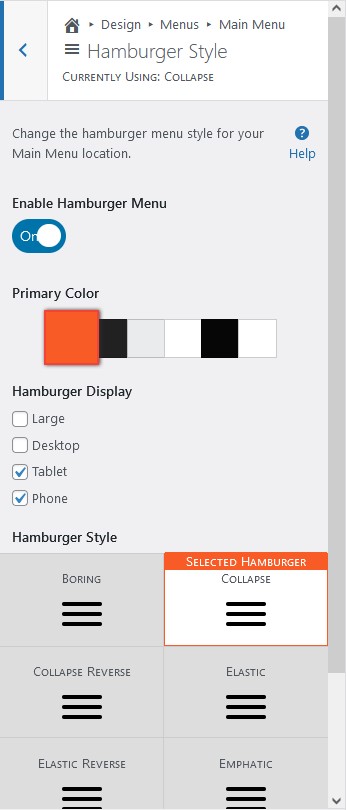
How to Edit the Mobile Menu Icon in WordPress
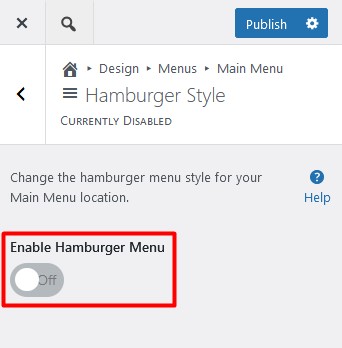
- Navigate to Customizer → Design → Menus → Menu Location → Hamburger Style
- Make sure the Hamburger Menu is enabled.

- Choose your WordPress mobile menu color from your active color palette. If you do not see the color you wish to use, please update your palette. The color selected will be used for the Hamburger Menu lines, not the button background. The button background is the header background.
- Hover over each Hamburger Menu design to see the effect in action and choose your favorite.

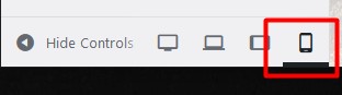
- We recommend clicking the mobile device icon at the bottom of the Customizer to see how the mobile header will look in the live preview.


- Click Publish to save your changes.
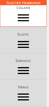

Want more hamburger menu styles to choose from? Upgrade to Crio Pro today!
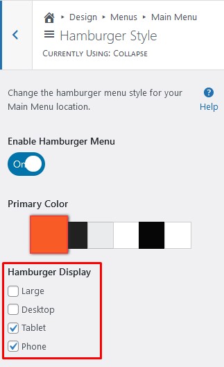
Use Mobile menu Icon on Desktop
With the release of Crio version 2.12.0, the mobile menu icon can be used on all device sizes. Use the checkboxes to select what devices display the Hamburger Menu icon.
Change Alignment of the Mobile Menu Icon
The hamburger menu button will be left aligned in the mobile header, regardless of the alignment on desktop. Some designers prefer a right aligned hamburger menu button on mobile because it’s easier to click on that side of the screen. If you’d like to right align your button, please add this custom css in the Customizer:
.standard-menu-enabled label[id$=-menu-btn] {
 justify-content: flex-end;
 }
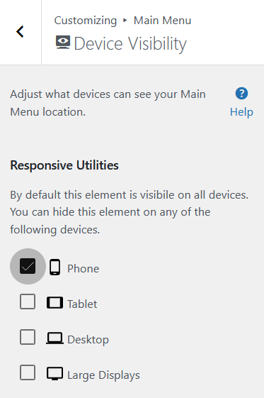
Hide a Mobile Menu Button in WordPress
Sometimes you may want to make variations of the same menu – one for desktop and one for mobile. If you have a menu you do not want to show on certain devices, you can use the device visibility tools in the Customizer to disable it. The hamburger menu icon will not show and the menu will not be available to users on that device.
- Navigate to Customizer → Design → Menus → Menu Location → Device Visibility
- Check the box next to Phone and Publish the Customizer to save the changes.

Troubleshooting
Why is there a hamburger menu icon showing when no menu is active?
If a menu location is active but doesn’t have a menu assigned, you may still see the mobile menu button. To remove it, open the Customizer, navigate to that menu location, and click the toggle to disable the hamburger menu.
SIGNUP FOR
BOLDGRID CENTRAL
200+ Design Templates + 1 Kick-ass SuperTheme
6 WordPress Plugins + 2 Essential Services
Everything you need to build and manage WordPress websites in one Central place.
Scott says:
why is the menu not showing on mobil
Brandon says:
Hi Scott,
Can you create a new forum topic and include the URL of your website so that we can take a look and tell you exactly what’s happening and how to resolve it.
We look forward to assisting you with this!