Crio Pro, BoldGrid’s newest WordPress theme includes the ability to create Custom Page Templates for headers, sticky headers, and footers. With Custom Page Templates, you are no longer limited to a single header or footer across your entire site.
Using the drag and drop functionality of the Post and Page Builder, Crio Pro allows you to create your page header or footer exactly how you want it. Create your own layouts. Choose from a wide variety of background images and gradients, as well as transparency options. You can even customize the responsiveness of your custom templates by choosing which elements display on which device sizes.
You can create as many Page Headers or Footers as you want, and assign them each to different areas of your site. Do you want a large cover image with a call to action on your home page, but have a more streamlined header for your blog pages and posts? With Crio Pro, now you can!
Custom Page Headers & Footers require Crio 2.11.0 +, Crio Pro 1.15.0+ and Post and Page Builder 1.15.0+, if you cannot see this feature please update to these versions.
How to Create a Custom Header or Footer Template
Creating a Custom Template for a header, sticky header, or footer with the Post and Page Builder is the same as creating a Block – you can drag and drop content in sections, rows, and columns. If you’d like to first learn more about working in the Post and Page Builder, please read our support article. If you’d prefer to watch a video series covering this feature, you can do so on BoldGrid’s YouTube channel.
There are several Block Components specific to Custom Templates you can add to your layout, which we will discuss below. You can also add any other standard Post and Page Builder Block Component, like an icon or button, if desired.
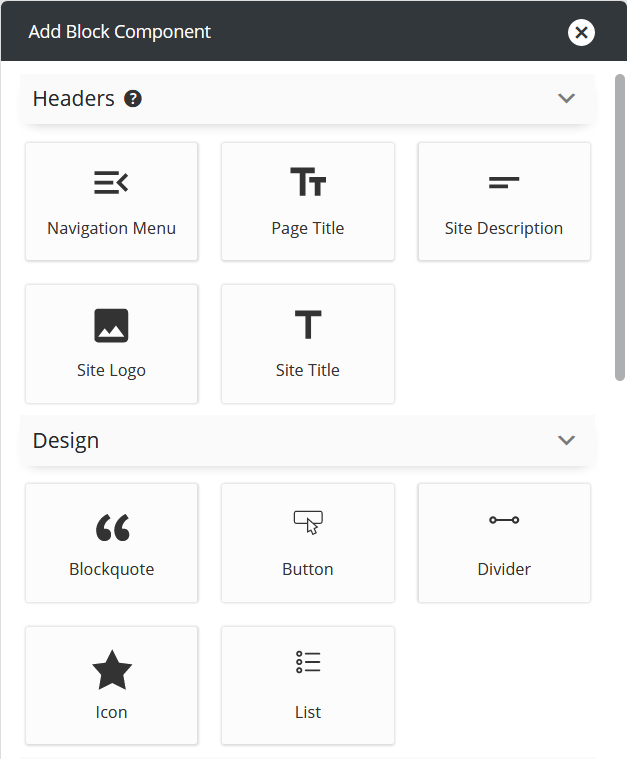
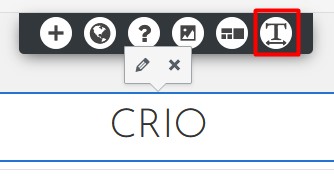
After adding a component, a panel opens with design options. To open the design panel again, click the component you want to change and then click the pencil icon that appears.
Site Title
The Site Title entered in the Customizer at Design > Header. Using the Site Title design panel you select the alignment on the page and Heading Type. Remember, the Heading Type selected here for the Site Title only affects SEO, the actual font size won’t change on the screen. The Site Title is generally an H1 on the home page and H2 on internal pages.
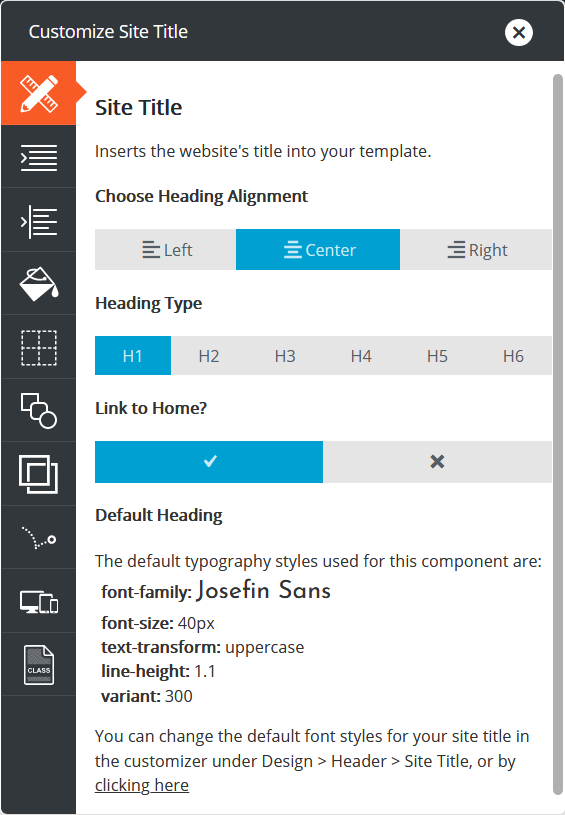
What Heading Type Should I Choose?
We know it might be difficult to know what Heading Type to select, so we recommend if the Page Header contains the Site Title but not the Page Title, the Site Title should be H1. If the Page Header contains the Site Title and the Page Title, we recommend that the Page Title be set H1 and the Site Title to H2.
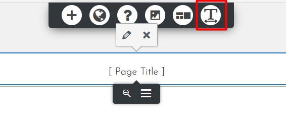
To change the font size of the Site Title, close the design panel, click the component on your screen, and then click the T in the DropTab that appears. From here you can change the font, font size, color, style, and more.
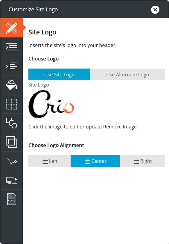
Site Logo
The Logo component will use the image uploaded to the Customizer at Design > Header, if one exists. If not, you can upload an image here to be used as your main Site Logo. This image will be saved in the Customizer and used when you add the Site Logo component to additional Page Headers. If you prefer, you can upload an Alternate Logo for use on this Page Header only.
Navigation Menu
A menu must first be created in the Customizer before it can be added to a Page Header (link to how to add a menu in Crio). First, choose a name for your menu and click the gray Register Menu Location button. Next choose a menu from the drop-down and align it left, center, or right within its column.
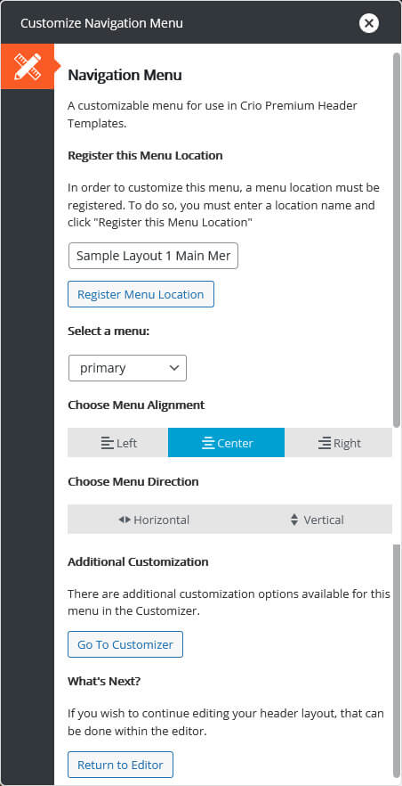
You can close the panel to continue creating your Page Header, or click the gray Go To Customizer button to style the menu’s font, color, and more. However, in order to see these menu design changes in the live preview, you will need to navigate to a page or post using the Page Header. If the Page Header has not been assigned yet, you will not be able to see the menu in the live preview.
If this is your first Page Header, we recommend changing only the font and color for now, and these changes will be shown upon returning to the editor. The final menu design can be completed when the Page Header is assigned in the Customizer.
Site Description
The Site Description is the Tagline in the Customizer at Design > Header. Using the Site Description design panel you can align the Tagline left, center, or right, as well as change the Heading Type. Just like with the Page Title, the Heading Type selected here for the Site Description only affects SEO, the actual font size won’t change on the screen. The Tagline in the Customizer is an H3, and we recommend you select H3 here as well.
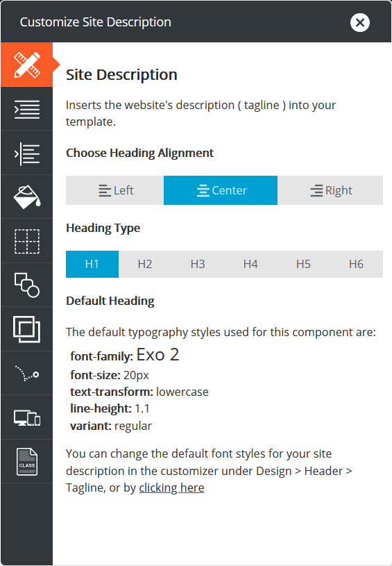
To change the font size, follow the same steps as with the Site Title – close the design panel, click the Site Description component on your screen, and then click the T in the DropTab that appears to open the font controls.
Page Title
The Page Title is the title entered in the WordPress dashboard when you create a Page or Post. The Page Title component is also used to display Product and Category titles if used for WooCommerce pages.
From the Page Title design panel you can set the Page Title alignment on the page, relative to the column it’s in. The Heading Type selected here only affects SEO, the actual font size won’t change on the screen.
What Heading Type Should I Choose?
If this Page Title is meant to be the main heading on the page, leave H1 selected. If you plan on adding the main heading to the page content, we recommend choosing H2 here. Finally if the Page Header contains the Site Title and Page Title, we recommend the Page Title be set H1 and Site Title to H2.
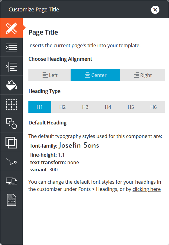
To change the font size, follow the same steps as with the other components – close the design panel, click the Page Title element on your screen, and then the T in the DropTab to open the font design panel.
This completes the overview of the different components available to you specific to custom Page Headers. The video below will show you more about how to create a Page Header.
How to Style your Custom Template
Now that you have a basic understanding of what components you can add and what each component does, we will move on to how to style the Page Header or Footer.
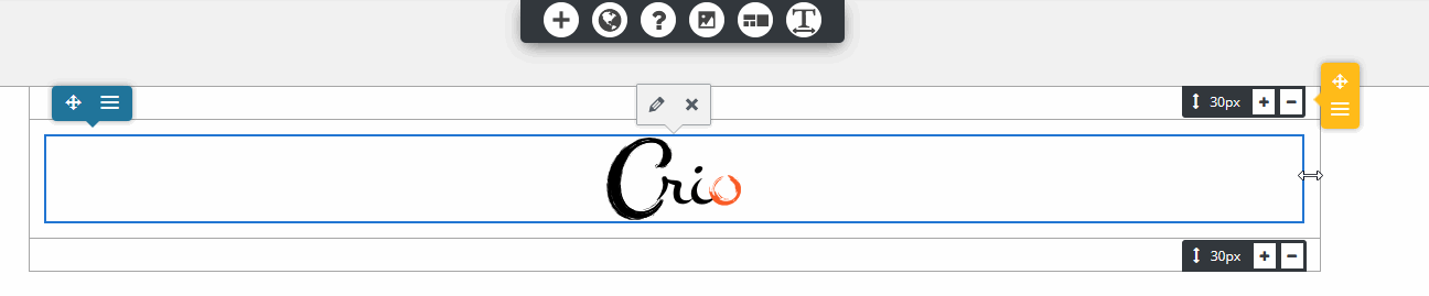
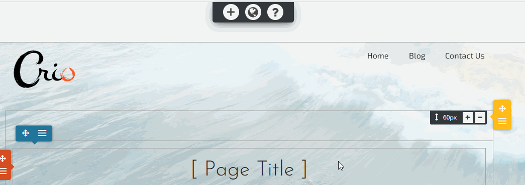
When you add a component to your Page Header or Footer, by default it will take up an entire row. If you want to add another component to the same row, you will first need to resize the column. Hover near the yellow popover until you see a two way directional arrow like shown below, then drag and drop to create a new column. You can add as many columns as you need, but be sure to check on the front end of your website for overlapping elements on all screen sizes.
Using a Background Image
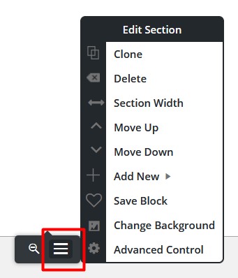
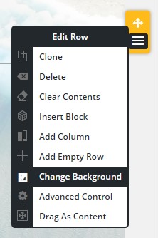
If you want a background image to fill the entire Page Header or Footer, add the background to the section. Start by hovering near the bottom of your Custom Template until you see the black popover like shown below. Click the hamburger menu to open the options, then select Change Background.
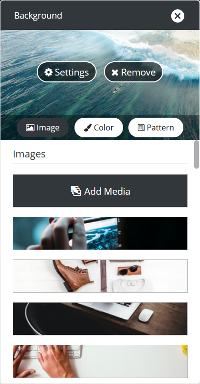
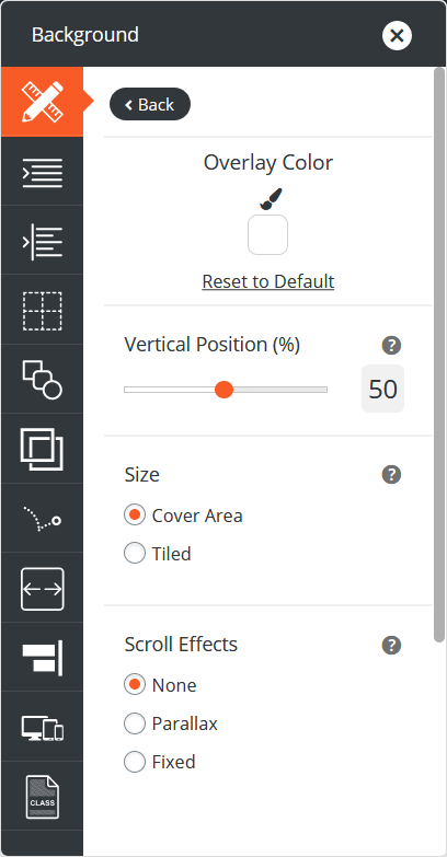
From the Background panel, you can select a stock photo or click Add Media to upload a new image use as the Custom Template background. Additional options are available by clicking the Settings button at the top of the background panel. If needed, you can add an Overlay Color for improved readability or add a scroll effect.
Working with Menus
When styling your menu, there are a few things to keep in mind to achieve the desired look. By default each component will align vertically at the top of the column. If you’d like to have your menu be centered with the component next to it, use the blue column popover to change the Vertical Alignment, like shown below.
If you want to have a full width menu with a background color, the best place to set the background color would be on the row, as shown here. If the menu has a drop-down menu, you’ll need to set the background color of the menu in the Customizer at Design > Menus > Menu Location > Background to have the drop-down background be the same.
Additional Options
If the Include Site Header option is checked, the standard header created in the Customizer will show above the Page Header content.
If Merge Page Header is checked, the standard header created in the Customizer is shown overlapping the Page Header content. This option is only available if Include Site Header is already checked. If you enable this option, it may cause the Site Header’s content to overlap your Page Header content, so it may require adjusting padding / margins of your elements to get them to appear the way you want.
Assign Your Custom Templates from the Customizer
Your current site header is what we will call the Customizer Header Layout, created by the Customizer settings. This will be shown across your entire site until new Page Headers are assigned in the Customizer by navigating to Design > Header > Page Headers. You will not see any of your custom Page Headers until they have been saved here.
Once in the Customizer you can select what Page Header is used by default on pages and posts across your website. The first Page Header you should assign is the Global Header. This defaults to Customizer setting, as shown below.
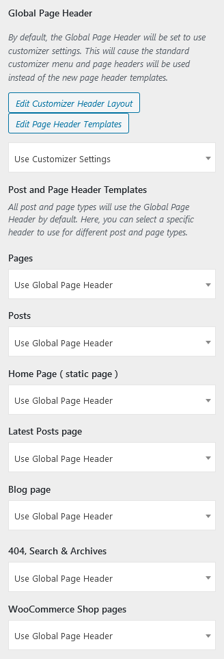
The Global Page Header shows everywhere on your site until new Page Headers are selected for specific pages or posts. If all settings in the Post and Page Header Templates section are set to Use Global Page Header and the Global Page Header selection is changed, every page and post on your site will change.
Next you can set specific Page Headers for pages, posts, the home page, blog page (assigned at Customizer > Design > Homepage), 404, Search & Archive pages, and WooCommerce pages (if installed). Keep in mind you can always override and assign a different Page Header while editing any individual page or post.
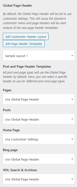
In this example below, we’ve changed the Global Page Header to use Sample Layout 1, but the Home Page is set to Use Customizer Settings. This means every page and post EXCEPT the home page will display Sample Layout 1, and the home page will show the header created in the Customizer.
This same process is used to assign custom Sticky Headers and Footers across your site as well.
Customizer Settings
Using a custom Page Header is designed to allow you to replace both the primary Site Header and the Page / Post Titles. Therefore, when using a custom Page Header, some Customizer controls will not affect the Custom Page Headers. When using the Customizer if changing these settings doesn’t change the live preview don’t worry! They will still work on any page set to use Customizer Settings, and you can edit the Page Header assigned to that page in the editor to achieve your desired layout.
- Design > Header > Layout
- Design > Header > Advanced
- Design > Site Content > Page Titles
- Design > Pages > Title
- Design > Blog > Posts > Title
Assign an Individual Page or Post Header
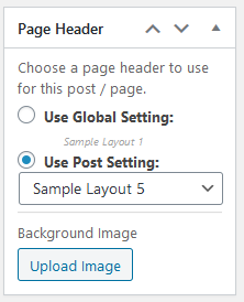
When editing an individual page or post, on the right side of the page editor is a metabox for Page Header. From here you can select a different Page Header Layout than would otherwise be used. If you want that Page Header to use a background image, you can upload an image here that will only be used on this page or post.
In this example, we have the Global Page Header still set to Sample Layout 1 but we want to override that setting and use Sample Layout 5 here. Since Sample Layout 5 has a background image, we can upload a new background image to be used instead of the background image currently in that Page Header.
Customize WordPress Headers for Mobile Devices
It’s important to consider what device type most of your visitors use to access your website and optimize for that experience. However, keep in mind Google no longer indexes the desktop versions of websites as of March 2021. Their crawlers are now only concerned with the mobile display. With this in mind, it’s more important than ever to view your website on all screen sizes to ensure the content displays correctly across them all.
Crio’s Custom Page Header feature can create multiple header layouts to optimize your end user’s experience and further fine tune the header’s layout.
If you only have one header and rearrange elements on it, by default it’s going to change the layout for all device sizes. This means getting elements like your logo and menu in the desired location can be tricky, especially if you want them to display in different areas of your header as the screen size shifts. The responsive framework in Crio that changes element sizes based on device screens can only do so much and position changes made in one view will affect the others.
Luckily we can change this behavior. In this section we will show you how to create a unique Custom Page Header for desktop and mobile devices (phone and tablet). You can follow along with our video as well.
First click the hamburger menu at the bottom of the Page Header section and select Clone. You should see two copies of your Page Header in the editor.
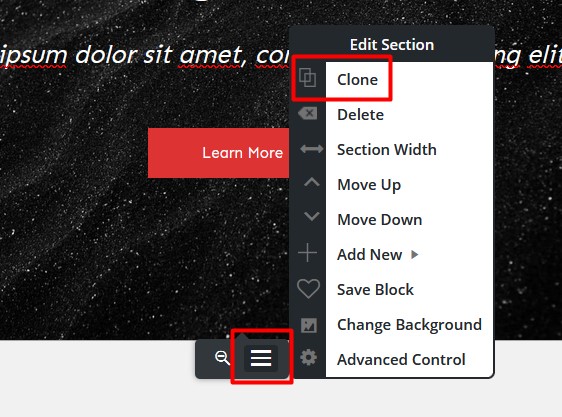
The top one we’re going to use on large device sizes. Click the hamburger menu at the bottom again and then Advanced Control. Now select the icon with 3 devices, which is the Responsive Utilities panel. Check the boxes next to Phone and Tablet, to hide this version of your header on these devices.
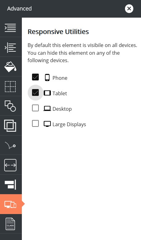
Next go to the bottom one and do the opposite – check the boxes next to Desktop and Large Displays to hide this version of the Page Header on those device sizes.
As soon as you click these checkboxes, that version of the Page Header will disappear from view – don’t worry this is supposed to happen! We have chosen for that one to only display on phone and tablet, and we are currently in desktop view in the editor.
When you click on each device icon at the top of the editor, you will only see one Page Header block. Any changes made in the phone or tablet view will only affect phone and tablet devices, and the same with desktop view.
Now you’re ready to style the Custom Page Header for each device size! It’s good to get in the habit of designing for mobile first.
We suggest paying special attention to where your navigation menu is located on mobile devices to ensure it’s easy to click without putting your hand in an awkward position.
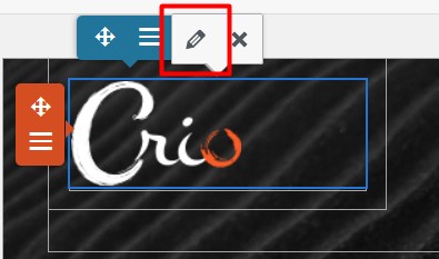
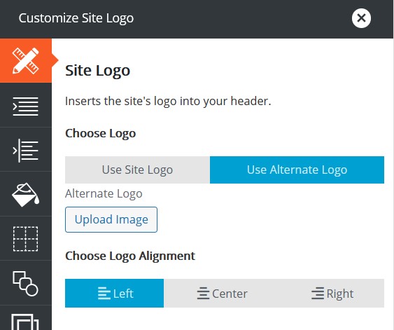
If you find your Logo is taking up too much space in the phone view, you can use a smaller Logo on the mobile version of your Custom Page Header. Start by clicking the current Logo and then the pencil icon that appears above.
In the popup, click Use Alternate Logo and then Upload Image. This image will be used in place of the Customizer uploaded Logo for this version of your Custom Page Header.
Congratulations!
You can now create custom Page Headers and assign them across your website. Next, you may want to review how to style your Customizer created header.
SIGNUP FOR
BOLDGRID CENTRAL
200+ Design Templates + 1 Kick-ass SuperTheme
6 WordPress Plugins + 2 Essential Services
Everything you need to build and manage WordPress websites in one Central place.
mazdaspeed says:
I cannot see where I can set a custom footer at the page edit level. Under Page Header, I tried using one of my custom footers listed, but this previews as the header. I do not see a Page Footer dialogue to do this in.
Elana says:
Hello,
Thanks for reaching out. You can set your footer templates by going to Design → Footer → Footer Templates, then scroll down to set the post and page footer options.
Thanks,
Elana
mazdaspeed says:
Elana, this is fine if one wants to use the same footer across all pages, or all pages but the home page. But unlike custom headers, there appears to be no method to use a custom footer per page. My site has both English and Spanish pages and I would really like to have a Spanish footer on those Spanish pages. Or, if I could suppress the footer, I could add the info to the body per page, but having the custom footer would be superior.
ethan says:
As soon as I create a custom header template, I loose all bloldgrid customizations.
When I open customize only the widgets section is present, no more color pallette, text fonts, nothing.
I have tried twice and get the same results.
As soon as I delete all the custom header templates, the options are all back.
Brandon says:
Hi Ethan, I see you have a forum topic currently in with us. It seems this issue could be related to the one in your topic. Can you respond to that post please so that we can continue from there? This also allows us to keep everything in one place.
Thank you, we look forward to assisting you further with this
Eraste says:
hello
I have an issue. when I post a blog post the bottom.
the theme shows the reader that they can use HTML tag followed by some codes. would you support to remove that block ?
Brandon says:
Hi Eraste,
I can understand why you wouldn’t want to give your reader the ability to post HTML in your “Comments” section. You can remove that block by navigating from your WordPress dashboard to Appearance < Customize < CSS/JS Editor and adding this bit off CSS:
.palette-primary .alert-info {display: none;
}
I hope this helps!
Vincenzo says:
additional info
Brandon says:
Hi Vincenzo,
We can definitely help if you have more questions about building Page Header & Footer Templates in Crio. Just Start a new Support Forum thread and include the URL to your blog or web page and we’ll hop right on it!
chris says:
Is it possible to clone/duplicate a custom header?
Brandon says:
Hi yes, the easiest way to go about this is to navigate to Crio<<Page Headers<<All Headers and open the header you need to duplicate in the editor. Inside of the header builder switch the to the Text editor tab and copy all of the html you see there. From here, all you need to do is create a new header and paste the contents of the original into the new headers Text editor, switch back to the Visual editor and save.