
The Post and Page Builder, BoldGrid’s WordPress page builder, uses the Bootstrap system of Sections, Rows, and Columns to layout your website elements. This article will discuss the controls specific to Columns. If you’re looking for a more general overview, you can read about how to use the Post and Page Builder.
How to Use Columns in the Post and Page Builder
Columns contain one or more elements, or can be left empty if the design calls for it. Columns allow content elements like text and images to reside next to each other in a single row.
The Post and Page Builder makes it easy to build your website by adding extra controls that appear on hover, called Drag Handles or Popovers. Once you click into the column you want to work with, these popovers will appear.
Sections > Rows > Columns > Elements
 Columns are inside of rows.
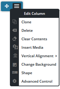
Each row on the page is comprised of one or more columns. To open the available options for the column, click the Blue popover that appears at the top of the column.
The Directional Arrow on the left allows you to drag and drop the column left or right in the current row, or into another row.
The Hamburger Menu icon on the right brings up a menu with controls for that specific column, as discussed below.
| Clone | Creates a duplicate of the existing column. |
|---|---|
| Delete | Removes the entire column and all its content. |
| Clear Contents | Removes the content but does not remove the column. |
| Insert Media | Opens the Media Library to select or upload an image |
| Vertical Alignment | Sets the alignment of the column to either top, center, or bottom of the row. This alignment is relative to the content in the rest of the columns in the row. |
| Change Background | Brings up the background panel to use a color, image, or pattern. This background will only be applied to this specific column. |
| Shape | Style this column with a shape, examples are shown below. |
| Advanced Control | Adjust padding, margin, border, animation, and more. |
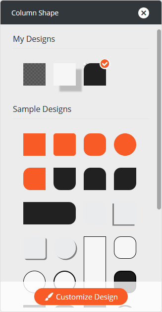
Column Shape
The Post and Page Builder includes over 30 Column Shapes to choose from, or click the Customize Design button at the bottom of the panel to modify any starting design into your own. Created designs are saved in the top My Designs section for easy reuse.
To open this panel you can use the column menu discussed above, or click the Layout icon in the DropTab at the top of the editor.
FAQs
How many columns does each row need?
In the Bootstrap system, each row needs to have 12 columns. This can be divided into one or more columns as illustrated here:
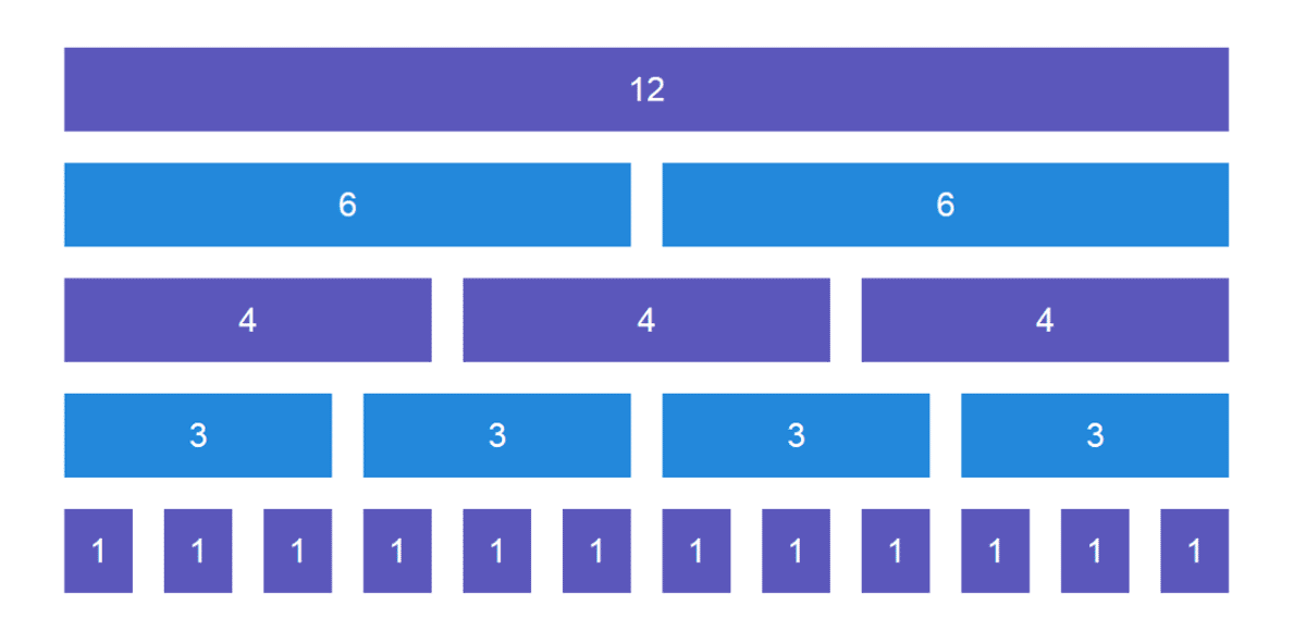
How each row is divided up can change on different screen sizes using the responsive controls in the Post and Page Builder, which are found in the WordPress toolbar above the DropTab. Drag each column’s width as needed for each device.
For example, if you have a row with 3 / 3 / 3 / 3 on desktop you may want to use 6 / 6 / 6 / 6 on tablet. A new row will automatically be created anytime the total columns are more than 12, so what is one row on desktop will become two rows on tablet. On mobile, we recommend each columns uses all 12, as there isn’t much screen size available.
How do I put space between column backgrounds?
There are two basic types of column backgrounds. You can have the background of each column fill the entire column, so consecutive column backgrounds touch each other, as shown here:

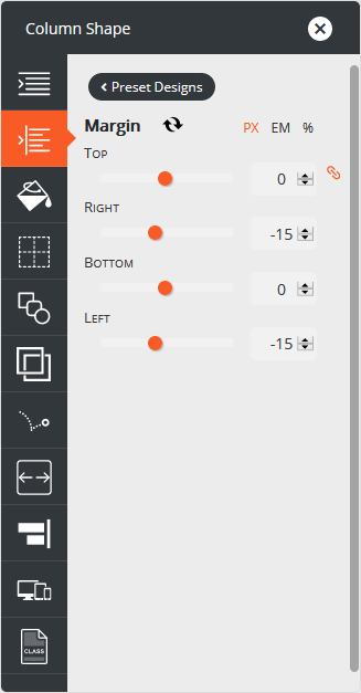
If you want the columns to have space between them, you will need to adjust the margin in the advanced settings. Don’t worry, this isn’t as hard as it sounds! Start by clicking into the column you want to change. From here you can click the Layout icon in the DropTab, then the Customize Design button at the bottom of the panel to open the advanced settings.
Click into the 2nd option – Margin. If your design has negative values for Right and Left like shown here, update them to 0.
Then you will see a space between the columns:

Congratulations!
Now you know how to work with Columns in the Post and Page Builder. Next, you may want to learn how to work with images or how to create a BoldGrid Block.
SIGNUP FOR
BOLDGRID CENTRAL
200+ Design Templates + 1 Kick-ass SuperTheme
6 WordPress Plugins + 2 Essential Services
Everything you need to build and manage WordPress websites in one Central place.
Sakib says:
Okay, so my columns are not horizontally aligned. They look aligned on the backend, but not on the frontend. Why is this happening?
Joseph says:
Hi Sakib,
Could you send us a link to the page on your website where the columns are not aligning correctly? Hopefully we will be able to determine where the problem is coming from once we take a look at the page markup.
Please let us know if you have any additional questions for us while we get this sorted out!
Sakib says:
Hi Joseph,
Sure thing man.
https://www.internetraiders.com/
Joseph says:
Thank you for providing that link Sakib!
I took a look at that page a saw the section with the Content Marketing, Full Stack SEO, and Multilateral Marketing elements, hopefully that is the content you are trying to fix the alignment for. The Content Marketing row seems to have a negative right margin applied to it that is responsible for the misalignment. Open the Visual editor for that page, highlight the Content Marketing element, and the use the yellow Row controls to open the Advanced customizations. Go to the Margin settings in those controls and remove the negative margin on the Right, that should help you get that content aligned with the other content.
Please let us know if you have any other questions for us Sakib!
Oddie says:
I’m struggling with how to change the color of cells within a grid. The grid seems to have an alternating color scheme and I can set the colors via the global palette but I cannot seem to set the colors for one instance of a grid. Is this possible? If I try to set them in the editor for the column or the row nothing happens. Thanks.
Jesse says:
Hi Oddie-
For each Section, Row, Column, and Element, you should be able to set the background color using the hover menu. For individual elements, you’ll find the background color in the Advanced Controls, but for each of the others you can find it in the main menu set. There, you’ll find defaults for your global color palette, as well an option to use a custom color from outside the palette. If those aren’t working for you, there might be some kind of error occurring. If that’s the case, open a new Support Forum thread and we’ll be happy to take a closer look for you.
Cory says:
This is very helpful, thank you! Is there a way to change where or how columns appear on mobile devices? For example, I have a page with two columns, but on mobile they are stacked upon one another, and it’s not clear there is more content unless you scroll all the way down. Is there a way to make the second, right side column (which is a menu list) appear as a row instead, on top of the left side column (which is a gallery) when viewed in portrait mode on mobile?
Joseph says:
Hi Cory!
You can change the ordering of columns on mobile devices using Bootstrap Pushes and Pulls. Jesse made a great video that shows how to use the Custom CSS Class tool in the Post and Page Builder to reorder your columns on different devices. If you have any questions about working with Pushes and Pulls please let us know!
Tom says:
Hi there
Is there any way to alter a columns width (or, rather, the relative width of 2 columns in a row) with a little more accuracy than what you get when you click and drag the column frame?
At the moment I only seem to be able to alter the column width in quite large chunks, and it would be useful to edit the size of the columns with more finesse because they contain images with specific dimensions which dont always match the dimensions of the column (even with changing the column/row widths and heights)
Thanks
Tom
Jesse says:
Hi Tom-
The width of columns is determined by two factors- the screen size, and the fraction of space a column is meant to take up on that screen. This is based on a grid pattern known as “Bootstrap.” Click here to see a visualization of the Bootstrap grid. Briefly, every row contains a possible 12 columns, and the relative width between them is a fraction of twelve. For example, if you have two columns and you want one to take 3/4 of the width, and the other to take up 1/4, they’ll have values of 9 (9/12) and 3 (3/12) in the code, respectively. When you drag the column widths with the visual editor, you’ll change these values by 1/12th at a time. So those two columns would move to 8/12 and 4/12 (two-thirds and one-third) if you dragged the column smaller.
Using fractions like this is the basis of how your site scales down to smaller devices like phones and up to full monitors, especially since phones and tablets have varying widths when measured in pixels.
To get more control over these values, switch to the text editor and look for the classes with names like “col-md-8” and “col-md-4.” Check out this detailed guide for more info.
Sam says:
How do you remove a column (i.e. not just delete its contents, but turn four columns into three)?
Jesse says:
Hi Sam-
Thanks for the great question! This was a little easier to show than tell, so I took a moment to make this video to help:
Sam says:
This is so helpful! It’s a bit cumbersome process, but you explained it perfectly. Thanks!
Jesse says:
Glad I could help Sam!
April says:
Hello how to reset the page builder? I chose the wrong position of the posts. Everytime i post, it is always on the right side even thoug when I edit the post, I select the center alignment. I’m unable to find the choices again on how to full page all my posts.
Jesse says:
Hi April-
It sounds like you might be experiencing a technical issue, can you contact our support team with some screenshots so we can investigate for you?