While we include an extensive selection of Blocks you can use within your site in the WordPress page editor, there is always going to be an instance where the look you envision is something that requires you to use a custom Block builder to fill the need. If you have a working knowledge of HTML and CSS, creating a Block of your own can be easily accomplished. This goal of this 3 part article is to familiarize you with how the Block structure works, how to add content to a Block, and how to style the content with Custom CSS.
The BoldGrid Block Structure
BoldGrid uses a grid system that is based on Bootstrap. To fully understand the structure and Grid System BoldGrid uses, we recommend you review the documentation for Bootstrap 3.3. We will provide an overview of what is needed to accomplish creating your own, but there are a lot of responsive utilities and classes within Bootstrap that can be used within your design.
Since BoldGrid uses Bootstrap for a foundation, having a good knowledge of the predefined classes is essential to creating Blocks that behave as expected across different sized screens. The basic structure of a Block is shown below.
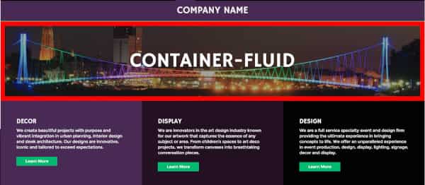
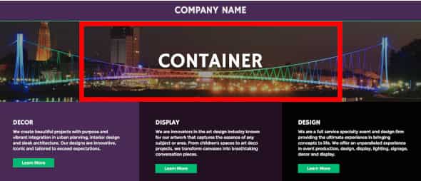
BoldGrid requires a containing element to wrap site contents and house our grid system. When using “container-fluid”, the row is full width, whereas the class “container” indicates a fixed width, which would be dictated by the CSS being used in the theme you are using.
container vs container-fluid
A fluid container (aka container-fluid) is a container that takes up the full width. When you hear “fluid”, think of water. Pour water into a container and it will expand to the full width of the container. Container on the other hand, is a fixed width container that will be centered.
Here are two screenshots that show the difference:
<div class="container-fluid">
<div class="container">
Here’s a 3 minute video that explains the difference and shows you how to change this setting within the Post & Page Builder:
The Content
The content in a Block for BoldGrid should rest inside of columns that are within the 3 divs explained previously. Bootstrap uses a system of rows and columns for layout. Each row has a total column width of 12. This can be divided into one or more columns as illustrated here:
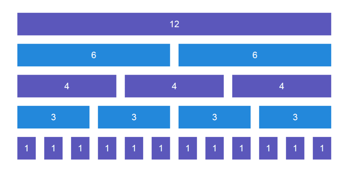
While Bootstrap does have an additional class larger than col-md-*, it is not used within the BoldGrid system since the need to break from >1000 px is not required. Here is table with information about the three separate breakpoints included in the Grid System for BoldGrid.
| Extra small devices Phones (<768px) | Small devices Tablets (≥768px) | Medium devices Desktops (≥992px) | |
|---|---|---|---|
| Grid behavior | Horizontal at all times | Collapsed to start, horizontal above breakpoints | |
| Container width | None (auto) | 750px | 970px |
| Class prefix | .col-xs- | .col-sm- | .col-md- |
| # of columns | 12 | ||
| Column width | Auto | ~62px | ~81px |
| Gutter width | 30px (15px on each side of a column) | ||
| Nestable | Yes | ||
| Column ordering | Yes | ||
The following code is an example of how to create a single full width content section in your Block, that will show full width on all devices, such as phone, tablet and desktop.
The following code is an example of how to create a content section in your Block that will show 4 full width columns on your phone, 2 rows of 2 columns on your tablet, and 1 row with 4 columns on your desktop.
Congratulations! You now know how to create a basic BoldGrid Block, and how the structure of a Block is composed. Now its time to add content to your Block
SIGNUP FOR
BOLDGRID CENTRAL
200+ Design Templates + 1 Kick-ass SuperTheme
6 WordPress Plugins + 2 Essential Services
Everything you need to build and manage WordPress websites in one Central place.
Fadil says:
I use Bold Grid because it’s ease of use (at least that’s what has been dubbed). But have difficulties in modifying blocks, columns, rows, etc and now we have to use codes 🙁
So there’s no way to modify the blocks we get from the library without coding mastery?
Jesse says:
Hi Fadil-
You can definitely customize your blocks without using code. For one example, check out this video about how to modify columns in a pre-made block:
https://youtu.be/ZNBSfl1vBKw
Andy says:
Is there a way to have a column that spans multiple rows? I want to have a graphic that runs down the left side of the page that spans two rows to the right:
For example: https://images.app.goo.gl/1Q5y7rLvBbbyYK5f8
Essentially the flipped on its side version of:
|——-row ——|
|– row – | –rwo–|
Joseph says:
Hi Andy!
One technique you can use to create the layout shown in your example link is Inner Rows. Inner Rows function exactly the same as regular ones in terms of layout responsiveness, but are treated as content objects when manipulated in the Post and Page Builder’s Visual editing mode.
You can build the example layout by starting with a blank Section with 2 columns in it. Then create your 2 Inner Rows and drag them into the right column so they are stacked on top of one another.
Hopefully you can use Inner Rows to achieve your design goals and please let us know if you have any other questions for us!
Andy says:
Ok, wow, that worked! Complicated, but it worked. “Inner row”… who knew? Thanks for the help.
Joseph says:
You’re welcome Andy!
Inner Rows are admittedly a little complicated at first, but once you get the hang them you can create some really cool layouts for your website!
CG says:
The first code example has an extra quote mark at line 4.
Jesse says:
Good Catch CG, this has been updated!