BoldGrid Theme Framework Configuration File
The configuration file is the primary file that sets up default configuration options within a BoldGrid theme. It can be used to set things such as the font to be used, colors, and more.
To modify and view your current theme's configurations, open /inc/boldgrid-theme-framework-config/config.php.
When creating a new BoldGrid theme with the BoldGrid Theme Framework, most everything can be customized through the configuration options that are provided by BoldGrid.
An empty config file looks like this:
<?php

function boldgrid_theme_framework_config( $boldgrid_framework_configs ) {

    // This is where your configs options are entered.

    return $boldgrid_framework_configs;
}
add_filter( 'boldgrid_theme_framework_config', 'boldgrid_theme_framework_config' );

?>
This config has no options set, and will use all the default parameters set in the theme framework itself. When creating a BoldGrid theme, modifying the configuration file is a quick way to customize things.
Text Domain
The first thing to set is the Text Domain for the theme. The text domain is used for translations into different languages for a theme. This should be set to boldgrid-$your-themes-name in the ['theme_name'] configuration option. The name of the theme should be where $your-themes-name is.
If using the name 'Indigo' for a theme, then this example is correct:
$boldgrid_framework_configs['theme_name'] = 'boldgrid-indigo';
If nothing else has been added to the theme's configuration file, it will look like this:
<?php

function boldgrid_theme_framework_config( $boldgrid_framework_configs ) {

    // This is where your configs options are entered.
    $boldgrid_framework_configs['theme_name'] = 'boldgrid-indigo';

    return $boldgrid_framework_configs;
}
add_filter( 'boldgrid_theme_framework_config', 'boldgrid_theme_framework_config' );

?>
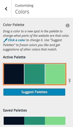
Colors
Inside of the BoldGrid Theme Framework, colors play a major role in how the tool is used. The framework includes a palette builder and suggestion tool for the end user to use. A default color palette can be specified, and alternative color palettes that remain above the fold when users are searching and saving palettes can be set.
This section is broken up into the following subsections:
- Enable Color Palettes
- Add The Default Color Palette
- Add Additional Custom Color Palettes
- Text Contrast Colors
- SCSS Compiler
Enable Color Palettes
First the configuration option for allowing the theme to use this feature must be set.
This is done with the ['customizer-options']['colors']['enabled'] configuration. This is set to false by default, so to enable it, set it to true.
This code is what should be included in a theme to enable the color option:
$boldgrid_framework_configs['customizer-options']['colors']['enabled'] = true;
Back to Colors.
Add Default Color Palettes
After a theme has enabled the color palette feature, then it's time to set the default color palette for the theme.
The BoldGrid Color Palette system works by providing the hexadecimal codes for the colors that make up the color palette.
Note: The palette system supports 2-5 colors, and there's an optional field that doesn't change color when a user generates new color palettes, called "neutral color." A neutral color is NOT required.
The configuration option to set is the defaults for the colors: ['customizer-options']['colors']['defaults'].
For the first palette in the theme, it's good practice to make this the default color palette option. This is what is used when a user first activates and uses the theme without setting any color palette options. This is controlled by the ['customizer-options']['colors']['defaults']['default'] configuration option, which is set to false by default.
It should be set to true for this palette. This is the only palette that should be set as a default, since there's only one palette able to be shown at a time.
This example will set the default color palette up with #041122, #259073, and #7fda89. It will also add a neutral color of #ffffff for the theme's background:
$boldgrid_framework_configs['customizer-options']['colors']['defaults'] = array (
    array (
        'default' => true,
        'format' => 'palette-primary',
        'neutral-color' => '#ffffff',
        'colors' => array(
            '#041122',
            '#259073',
            '#7fda89',
        )
    ),
);
Now that a default color palette has been assigned, the WordPress Customizer can be loaded with the theme activated. The color palette will be set as the default color palette option for the user when loaded:
Back to Colors.
Add Additional Custom Color Palettes
Once the default color palette has been added, additional palettes can be displayed for a user to select from as the default set of color palettes that are displayed. Add additional values to the array of color defaults ( ['customizer-options']['colors']['defaults'] ).
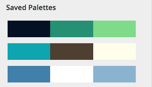
This example will add two additional palettes, along with the default palette. This will result in a total of 3 color palettes that are included in this theme's configuration:
$boldgrid_framework_configs['customizer-options']['colors']['defaults'] = array (
    // Default palette.
    array (
        'default' => true,
        'format' => 'palette-primary',
        'neutral-color' => '#ffffff',
        'colors' => array(
            '#041122',
            '#259073',
            '#7fda89',
        )
    ),
    // Second palette.
    array (
        'format' => 'palette-primary',
        'neutral-color' => '#ffffff',
        'colors' => array(
            '#0ca5b0',
            '#4e3f30',
            '#fefeeb',
        )
    ),
    // Third palette.
    array (
        'format' => 'palette-primary',
        'neutral-color' => '#ffffff',
        'colors' => array(
            '#4180ab',
            '#ffffff',
            '#8ab3cf',
        )
    ),
);
Now instead of one default color palette displayed, like this:
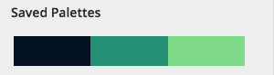
There are three color palettes shown:
Back to Colors.
Text Contrast Colors
The text contrast colors are the colors that appear for readability of the font against dark and light backgrounds. Since the BoldGrid Theme Framework allows a user to select their own color palettes, it will automatically use these values to provide the most legible color of text on the backgrounds and elements.
Typically the light text value should be a value that's light, such as white, and the dark tet should be a value that's dark, such as black.
To set these values, add the configuration options for ['customizer-options']['colors']['light_text'] and ['customizer-options']['colors']['dark_text'].
- The default value for
light_textis #ffffff. - The default value for
dark_textis #4d4d4d.
$boldgrid_framework_configs['customizer-options']['colors']['light_text'] = '#ffffff';
$boldgrid_framework_configs['customizer-options']['colors']['dark_text'] = '#000000';
When there are dark colors on an element, it will result in the text displayed over that element automatically changing with the color the user selects from the color picker in the WordPress Customizer.
This is how dark_text would be outputted if the user has selected a light colored background:

If the user changes the background to a darker color, the text automatically adjusts and outputs the light_text color:

Back to Colors.
SCSS Compiler
The BoldGrid Theme Framework has a built-in SCSS compiler, which is used to compile the stylesheets that are in use when the theme changes it's color palette options.
This section is broken up into the following subsections:
SCSS Compile Directories
The SCSS Compile Directory configuration option contains the directories that are used by the BoldGrid Theme Framework. It contains SCSS files that need to be compiled in the WordPress Customizer when a user changes color options. The configuration options for the compile directories are located in ['customizer-options']['colors']['settings']['scss_directory']. All files that reside in these directories that are .scss files will be compiled and outputted to an output.css file.
There are two directories used by the BoldGrid Theme Framework:
['framework_dir']- Default Value:
/inc/boldgrid-theme-framework/assets/scss - This contains SCSS styles that are compiled across all BoldGrid themes.
- No trailing slash after the directory name.
- Default Value:
Note: It's not recommended to change this as theme updates can provide styles that are required by the framework here.
This example will change the ['framework_dir'] directory to /inc/boldgrid-theme-framework/custom/path:
$boldgrid_framework_configs['customizer-options']['colors']['settings']['scss_directory']['framework_dir'] = '/inc/boldgrid-theme-framework/assetsds/scss';
['default']- Default Value:
/inc/boldgrid-theme-framework-config/scss - This is the default directory that theme specific SCSS is read from to compile.
- No trailing slash after the directory name.
- Default Value:
This example would change the ['default'] directory to /scss:
$boldgrid_framework_configs['customizer-options']['colors']['settings']['scss_directory']['default'] = '/scss';
CSS Output File
After BoldGrid Theme Framework compiles the .scss that is used by the theme, it will output the .css file that will be used for live previews and the frontend of the site. This is handled by the configuration option for the CSS output file located in ['customizer-options']['colors']['settings']['output_css_name'].
- Default Value:
/css/color-palettes.css
Note: The file doesn't need to be preexisting, but make sure the directory exists if changing the directory name.
To change the output file of the theme, set the configuration option for output_css_name.
This example will change the output filename and directory to /css/output.css:
$boldgrid_framework_configs['customizer-options']['colors']['settings']['output_css_name']= '/css/output.css';
Minify CSS Output
The BoldGrid Theme Framework will automatically compile all SCSS files from the specified SCSS directories. When it outputs the CSS - it can be set to have the output file minified.
This configuration option is located in ['customizer-options']['colors']['settings']['minify_output'] and has a default value of true.
It's generally a good practice to leave this set to true when a website is an active production website, but during development of a theme, setting this to false will make .css output easier to debug.
- Default Value:
true
This example will set the .css output file to be unminified:
$boldgrid_framework_configs['customizer-options']['colors']['settings']['minify_output']= false;
Back to SCSS Compiler.
Default Background Images
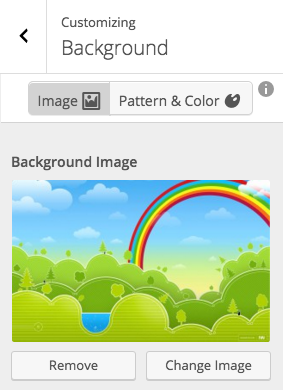
Initially BoldGrid themes provide support for a custom background image. The image's default path is located in the theme directory under /images/background.jpg.
If there's a default background image uploaded to that location, then it can be seen by clicking on 'background' in the WordPress Customizer.
It will look like this:
Changing the Location or Name of the Default Background Image
Most of the time the default /images/background.jpg is sufficient, but occasionally an image in a different format, directory, or name is desired.
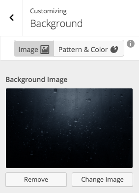
This can be overridden in the theme's configuration by setting the path to the file in the configuration option ['customizer-options']['background']['defaults']['background_image'], like this:
$boldgrid_framework_configs['customizer-options']['background']['defaults']['background_image'] = get_template_directory_uri( ) . '/img/custom_bg.png';
Now that the custom .png background is set as the default, when the theme is activated, the custom .png background image is displayed as the default image:
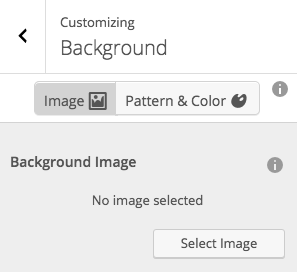
Providing a Theme Without a Default Background Image
Sometimes the option for a user to add their own background image should be available, but a default background image isn't wanted. To do this, set the configuration option to false for ['customizer-options']['background']['defaults']['background_image'].
Example:
$boldgrid_framework_configs['customizer-options']['background']['defaults']['background_image'] = false;
Setting this to false would cause the background image to be empty in the customizer by default, but still allows a user to upload their own image if they wish.
Setting this option to false will be displayed like this in the WordPress Customizer:
Site Logo
- Default Value:
true - Configuration Option:
['customizer-options']['site_logo']
An option to allow users to upload their own logo to be displayed in a theme is available in the WordPress Customizer as well. The output of the site logo is handled in the boldgrid_site_title hook. If this configuration option is set to true, the logo upload field will be displayed in the customizer, so users can take advantage of this feature.
Inside of a theme (usually in header.php), the following code will provide the site logo or site title section that is displayed. It will not display both the site title, and the site logo:
<?php do_action('boldgrid_site_title'); ?>
This code will disable the Site Logo in the customizer through the configuration option:
$boldgrid_framework_configs['customizer-options']['site_logo'] = false;
Typography
This section contains the following subsections:
Enqueue Google Fonts
BoldGrid supports Google Fonts as the primary choice for custom typography as users create new themes. There's two configuration options to set for Google Fonts. The first being whether or not to use the custom Google Font. This configuration option can be set to on or off to tell translators to use the custom Google font or not. This is important because not all fonts support all languages and special characters.
$boldgrid_framework_configs['font']['translators'] = array ( 'on' );
The second configuration option will tell WordPress which Google Font to use. When adding a font that has more than one word in it's name like "Open Sans," words should be separated by a plus ( "+" ).
This example adds Open Sans:
$boldgrid_framework_configs['font']['types'] = array ( 'Open+Sans' );
Multiple font families can be used in a theme by separating them with a pipe ( | ).
This example adds "Open Sans" and "Oswald":
$boldgrid_framework_configs['font']['types'] = array ( 'Oswald|Open+Sans' );
By default the Google Fonts API provides a font weight of 400(normal). Sometimes it may be necessary to specify additional font weights for each font. To do so the font family needs to be separated from the font weight(s) with a colon ( : ).
If more than one additional font weight is required for a font family, then separate out the font weights with a comma ( , ).
This example adds multiple font weights to Open Sans and Oswald:
$boldgrid_framework_configs['font']['types'] = array ( 'Open+Sans:400,600,700|Oswald:300,400,700' );
Site Title
The Site Title section is another important component of a BoldGrid theme. BoldGrid uses the Kirki library to assist with some of the controls, and the site-title has many options that can be set by default.
To pass new settings to be used for the default setup of a theme, a new method and filter for Kirki should be added to the theme's configuration file.
After the initial BoldGrid configuration section that looks like this:
<?php

function boldgrid_theme_framework_config( $boldgrid_framework_configs ) {

    // This is where your configs options are entered.

    return $boldgrid_framework_configs;
}

add_filter( 'boldgrid_theme_framework_config', 'boldgrid_theme_framework_config' );
Add the new Kirki method and filter, like this:
function filter_logo_controls( $controls ) {

    // This is where you will add your $controls configs.

    return $controls;
}

add_filter( 'kirki/fields', 'filter_logo_controls' );

?>
Note: An easy way to collect together configuration options that will be changing is to visit the WordPress Customizer, click on the 'Site Title & Logo' section, and play around with the settings.
Default Font
For this configuration change, the site-title currently looks like this:

No additional configuration options have changed, and the most dramatic change will be the Font that's used.
The configuration options for Kirki will go in place just like the BoldGrid configuration options.
This example shows how to change the default font for the site title:
function filter_logo_controls( $controls ) {

    // This is where you will add your $controls configs.
    $controls['logo_font_family']['default'] = 'Arizonia';

    return $controls;
}

add_filter( 'kirki/fields', 'filter_logo_controls' );

?>
When the customizer is reopened, the Site Title displays with the new font in place:

Default Font Size
After changing the default Site Title font, the font size may be much smaller than the original font used. The default value for the size of the site title's custom font can be set as needed. This is handled by the ['logo_font_size']['default'] configuration option.
- The values are in px.
- The default value is set to 42px.
This example code will set the default font size of the custom logo to 102px:
$controls['logo_font_size']['default'] = 102;
Before changing default Font Size:
After changing default Font Size:

Default Margins
- The values are in px.
- The default value is set to 0px.
$controls['logo_margin_top']['default'] = 30;
Before changing default margin-top by 30px:

After changing default margin-top by 30px:

Social Media Icons
BoldGrid themes include Font Awesome, and use this to add social media icons to menu locations. The icons are automatically detected when a corresponding URL is used in one of the menu locations. If a user enters in facebook.com/username - then this will automatically be converted by BoldGrid to display the facebook icon in the style that is set by the theme's configuration options.
Available Icons
There's a variety of icons supported by the BoldGrid Theme Framework, which include the following:
| Available Social Media Icons | ||||
|---|---|---|---|---|
| Bitbucket | Gratipay | Yelp | Vimeo | |
| Codepen | Trello | YouTube | Vine | |
| Dribbble | JS Fiddle | Tumblr | SlideShare | VK |
| Dropbox | Stack Overflow | Steam | ||
| Stack Exchange | ||||
| Flickr | WordPress.com | SoundCloud | RenRen | |
| Foursquare | Google+ | WordPress.org | Stack Exchange | Github |
Available Icon Styles
There's several styles available for social media icons as defaults. The BoldGrid Theme Framework utilizes Font Awesome's 'stack' and 'inverse' classes, which allows icons to stack on top of each other to create icons with circular backgrounds and square backgrounds.
To set the style of the social media icons in a theme, the configuration option for ['social-icons']['type'] is used.
These icon types are supported in the BoldGrid Theme Framework:
Plain Icon
This will be the icon with no additional decorations applied for it's appearance.
Note: This is the default style.
$boldgrid_framework_configs['social-icons']['type'] = 'icon';
This is what the icons would look like ( size is large ):
Sign Icon
This isn't supported by all icons, and uses the alternative Font Awesome icons that provide a square appearance around the icons.
$boldgrid_framework_configs['social-icons']['type'] = 'icon-sign';
This is what the icons would look like ( size is large ):
As seen in the screenshot, the Pinterest icon is the only one from this set of four icons that had any change to it's appearance.
Open Square Tile
This provides a square border around the outside of the icon giving it more of a two tone tile look with the background showing through.
$boldgrid_framework_configs['social-icons']['type'] = 'icon-square-open';
This is what the icons would look like ( size is large ):
Closed Square Tile
This gives a closed square tile look to the icon.
$boldgrid_framework_configs['social-icons']['type'] = 'icon-square';
This is what the icons would look like ( size is large ):
Open Circle Tile
This value will add a circle around the icon. Sometimes it's too thick for normal and large icons, so try icon-circle-open-thin as well.
$boldgrid_framework_configs['social-icons']['type'] = 'icon-circle-open';
This is what the icons would look like ( size is large ):
Thin Open Circle Tile
This value will provide a thin circle around the icon since icon-circle-open is sometimes too thick for smaller icons.
$boldgrid_framework_configs['social-icons']['type'] = 'icon-circle-open-thin';
This is what the icons would look like ( size is large ):
Closed Circle Tile
This value will provide a solid circle background for the icon.
$boldgrid_framework_configs['social-icons']['type'] = 'icon-circle';
This is what the icons would look like ( size is large ):
Available Icon Sizes
The icons' sizes can be set with the ['social-icons']['size'] configuration option. Font Awesome has "pixel-perfect" sizing built in, which works perfectly with it's stack feature, and gives enough flexibility to get a desirable size for your site.
Icons from normal to 5x
The available sizes can be set by passing in the size in the theme's configuration as follows:
Normal
Note: This is the default style.
$boldgrid_framework_configs['social-icons']['size'] = 'normal';
This is what an icon would look like at normal:
Large
$boldgrid_framework_configs['social-icons']['size'] = 'large';
This is what an icon would look like at large:
fa-2x
$boldgrid_framework_configs['social-icons']['size'] = '2x';
This is what an icon would look like at 2x:
fa-3x
$boldgrid_framework_configs['social-icons']['size'] = '3x';
This is what an icon would look like at 3x:
fa-4x
$boldgrid_framework_configs['social-icons']['size'] = '4x';
This is what an icon would look like at 4x:
fa-5x
$boldgrid_framework_configs['social-icons']['size'] = '5x';
This is what an icon would look like at 5x:
Setting Default Social Media Icons
When using the BoldGrid Theme Framework, it comes with a default set of social media icon links for end users to see for examples when they manage their icons through the menu system. This is not always going to be the set of icons that may be desired in a theme though. Additional default icons to use can be added to the existing defaults, or a new set of default social media icons to use can be created.
Default Social Media Icons
The set of default links/icons that are set in the BoldGrid Theme Framework are:
- Google Plus
- YouTube
If no modifications are made, then when navigating to the WordPress customizer after a BoldGrid theme has been activated, those menu items under Menus > Social Media looks like this:
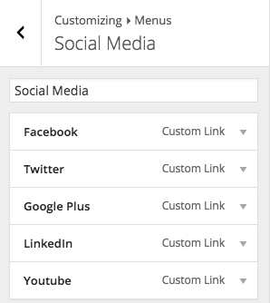
Each of these menu items have a link for the default entry of the basename of the social media's profile.
Facebook for example will be facebook.com - this displays the social media icon in the menu.
The default set of icons will produce a page that looks like this:
Add Default Social Media Icons to Existing Defaults
Sometimes the icons aren't optimal for all themes based on a certain category. Additional icons can be added to the default icons with the ['menu']['default-menus']['social']['items'] configuration option.
This example will add Pinterest to the group of default links and icons that will presented when the theme is activated:
$boldgrid_framework_configs['menu']['default-menus']['social']['items'][] = array (
    'menu-item-title' =>  __( 'Pinterest' ),
    'menu-item-classes' => 'pinterest',
    'menu-item-url' => '//pinterest.com',
    'menu-item-status' => 'publish'
);
Now when the theme is activated, the five default options - plus the Pinterest icon that was added will be displayed:
The social media menu items will look like this on the front end of the website:
Creating a New Set of Default Social Media Icons to Use
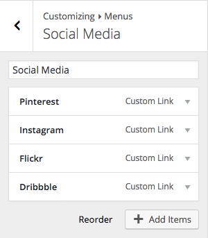
Certain categories of themes may require different sets of icons that aren't in the default set of icons. To use Pinterest, Flickr, Dribbble, and Instagram as the default icons for example, the configuration option for ['default-options']['social']['items'] will be modified, like this:
$boldgrid_framework_configs['menu']['default-menus']['social']['items'] = array(
    array (
        'menu-item-title' =>  __( 'Pinterest' ),
        'menu-item-classes' => 'pinterest',
        'menu-item-url' => '//pinterest.com',
        'menu-item-status' => 'publish'
    ),
    array (
        'menu-item-title' =>  __( 'Instagram' ),
        'menu-item-classes' => 'instagram',
        'menu-item-url' => '//instagr.am',
        'menu-item-status' => 'publish',
    ),
    array (
        'menu-item-title' =>  __( 'Flickr' ),
        'menu-item-classes' => 'flickr',
        'menu-item-url' => '//flickr.com',
        'menu-item-status' => 'publish'
    ),
    array (
        'menu-item-title' =>  __( 'Dribbble' ),
        'menu-item-classes' => 'dribbble',
        'menu-item-url' => '//dribbble.com',
        'menu-item-status' => 'publish',
    ),
);
When the theme is activated, the new set of social media icon menu items are displayed:
The front end of the site would show the four default social media icons associated with the menu items:
Menus
Change Names of Menu Locations
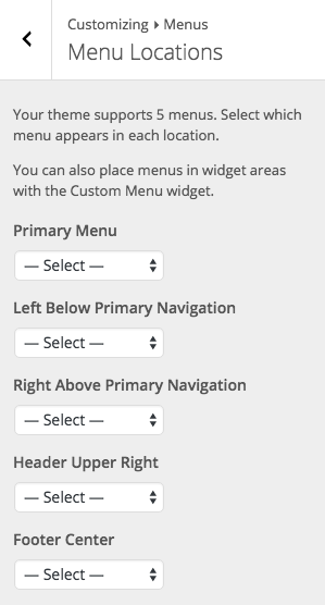
The BoldGrid Theme Framework has five default menu locations with the following names assigned:
- primary
- social
- secondary
- tertiary
- footer_center
These menu names aren't visible to the public, and are used to identify the menus easily when working with the navigation elements.
These locations can be used without any additional modifications, but occasionally the labels in the WordPress Customizer of the menu locations aren't descriptive to the actual locations of the menus.
The labels for the five menus by default are:
- Primary Menu ( primary )
- Left Below Primary Navigation ( social )
- Right Above Primary Navigation ( secondary )
- Header Upper Right ( tertiary )
- Footer Center ( footer_center )
From the WordPress Customizer, select Menus > Menu Locations to see the current menu locations and any assigned menus.
This is what the default menu locations would look like with no menus assigned to them:
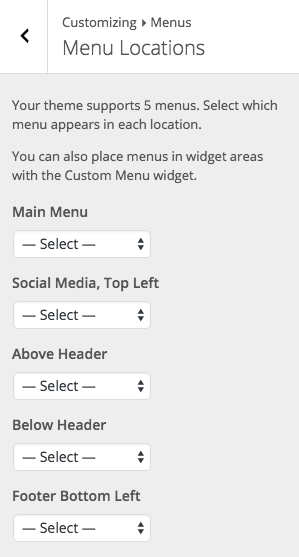
This can cause confusion for the end user if the description doesn't match where the menu actually is located in a theme. These values in the theme's configurations can be overridden. The configuration option to change this is ['menu']['locations'][$menu_name]. $menu_name will be the menu location's name to change.
This example will change all of the menu labels:
$boldgrid_framework_configs['menu']['locations']['primary'] = "Main Menu";
$boldgrid_framework_configs['menu']['locations']['social'] = "Social Media, Top Left";
$boldgrid_framework_configs['menu']['locations']['secondary'] = "Above Header";
$boldgrid_framework_configs['menu']['locations']['tertiary'] = "Below Header";
$boldgrid_framework_configs['menu']['locations']['footer_center'] = "Footer Bottom Left";
This is what the default menu locations would look like with the changes above applied:
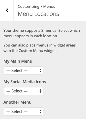
Change the Number of Menu Locations
Sometimes five menu locations isn't preferred. Menu locations can be added or removed by editing the configuration option for ['menu']['locations'].
This example will allow only 3 of the 5 default menu locations; primary, social, and footer_center:
$boldgrid_framework_configs['menu']['locations'] = array (
    'primary' => 'My Main Menu',
    'social' => 'My Social Media Icons',
    'footer_center' => 'Center of My Footer',
);
Use Alternative Menu Locations
It may be necessary to provide a custom menu location for menu items in some themes. This requires a little extra configuration by adjusting the configuration options for ['menu']['prototype'].
To add a menu called 'another,' utilize the code from Change the Number of Menu Locations to set up the default locations in ['menu']['locations'] like this:
$boldgrid_framework_configs['menu']['locations'] = array (
    'primary' => 'My Main Menu',
    'social' => 'My Social Media Icons',
    'another' => 'Another Menu Item',
);
That provides three menu locations that, and it can be confirmed that the menus are set by activating the theme and visiting the WordPress Customizer > Menus > Menu Locations:
primary and social are already in the ['menu']['prototype'] array. This is overridden with custom menu items. The following code will add another:
$boldgrid_framework_configs['menu']['prototype'] = array (
    'primary' => array (
        'theme_location'    => 'primary',
        'depth'             => 2,
        'container'         => 'div',
        'container_class'   => 'collapse navbar-collapse',
        'container_id'      => 'primary-navbar',
        'menu_class'        => 'nav navbar-nav',
        'fallback_cb'       => 'wp_bootstrap_navwalker::fallback',
        'walker'            => new wp_bootstrap_navwalker(  )
    ),
    'social' => array (
        'theme_location'  => 'social',
        'container'       => 'div',
        'container_id'    => 'menu-social',
        'container_class' => 'menu-social',
        'menu_id'         => 'menu-social-items',
        'menu_class'      => 'menu-items',
        'depth'           => 1,
        'fallback_cb'     => '',
    ),
    'another' => array (
        'theme_location'  => 'another',
        'container'       => 'div',
        'container_id'    => 'another-menu',
        'container_class' => 'another-menu',
        'menu_id'         => 'another-menu-items',
        'menu_class'      => 'another-menu-items',
        'depth'           => 1,
        'fallback_cb'     => '',
    )
);
Special Cases
Primary Menu
BoldGrid Themes are constructed with the Bootstrap Grid and Framework in mind, so the primary menu uses the Bootstrap Nav by default.
$boldgrid_framework_configs['menu']['prototype'] = array (
    'primary' => array (
        'theme_location'    => 'primary',
        'depth'             => 2,
        'container'         => 'div',
        'container_class'   => 'collapse navbar-collapse',
        'container_id'      => 'primary-navbar',
        'menu_class'        => 'nav navbar-nav',
        'fallback_cb'       => 'wp_bootstrap_navwalker::fallback',
        'walker'            => new wp_bootstrap_navwalker(  )
    ),
);
Menus in the Footer
As a default the BoldGrid Theme Framework fully supports a menu in the footer, which is called 'footer_center' and has the label 'Footer Center.' A theme may need to add different menu locations to the footer that aren't added by default. This is perfectly fine to do, but it's important to ensure that all features within the WordPress Customizer work properly, so the end user's experience is optimal.
One such feature that the BoldGrid Theme Framework provides is the option to disable the footer. When adding additional menus to the footer, the BoldGrid Theme Framework should know, so it can remove the menu locations that aren't needed when a user selects the option to disable their footer. This is done by editing the configuration option for ['menu']['footer_menus'].
The following example will add the 'social' menu location as a menu location in the footer:
$boldgrid_framework_configs['menu']['footer_menus'][] = 'social';
Additional Scripts
Animate.css
- Configuration Option:
['scripts']['animate-css'] - Default Value: false
Animate.css is a powerful CSS animation stylesheet. It provides an easy method to apply a variety of different animations to any elements on a page.
The BoldGrid Theme Framework includes this stylesheet. Since every theme doesn't need this - it's disabled by default. It can be enabled by setting the configuration option ['scripts']['animate-css'] to true.
This example adds the Animate.css stylesheet:
$boldgrid_framework_configs['scripts']['animate-css'] = true;
Wow.js
- Configuration Option:
['scripts']['wow-js'] - Default Value: false
Wow.js is a handy script that is typically used in conjunction with animate.css. The BoldGrid Theme Framework includes this javascript file, but not all themes make use of it - so it's disabled by default. It can be enabled by setting the configuration option ['scripts']['wow-js'] to true.
This example adds the Wow.js javascript:
$boldgrid_framework_configs['scripts']['wow-js'] = true;
Sticky Nav Header
- Configuration Option:
['scripts']['boldgrid-sticky-nav'] - Default Value: false
This example adds the BoldGrid Sticky Nav Header javascript:
$boldgrid_framework_configs['scripts']['boldgrid-sticky-nav'] = true;
Sticky Footer
- Configuration Option:
['scripts']['boldgrid-sticky-footer'] - Default Value: false
This example adds the BoldGrid Sticky Footer javascript:
$boldgrid_framework_configs['scripts']['boldgrid-sticky-footer'] = true;
Customizer Panels
Header Panel
- Default Value:
true
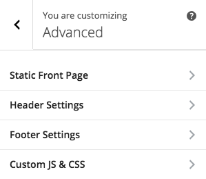
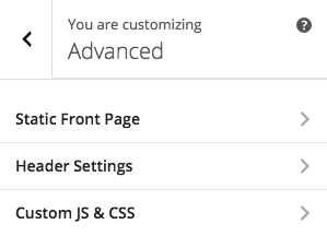
The header panel in the WordPress Customizer is displayed by going to the Advanced section. This contains the options to add more widget areas to a theme, and custom HTML to the header.
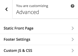
This panel can be disabled with the configuration option for ['customizer-options']['header_panel'], by setting it to false.
Example of how to disable the header panel in your configuration file:
$boldgrid_framework_configs['customizer-options']['header_panel'] = false;
The customizer should now reflect your changes by refreshing and going to the Advanced section:
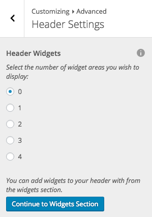
Inside of this section, you will see the two controls that are implemented by the configuration options, Header Widgets and Custom Header HTML:
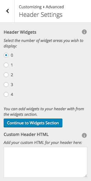
You may wish to disable the header widgets control or disable the custom HTML control instead of removing the section entirely.
Disable Header Widgets Control
- Default Value:
true
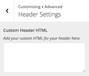
To disable the Header Widgets section, pass false to ['customizer-options']['header_controls']['widgets'], like this:
$boldgrid_framework_configs['customizer-options']['header_controls']['widgets'] = false;
The WordPress customizer should now reflect your change and the Widgets control is no longer present:
Disable Header Custom HTML Control
- Default Value:
true
To disable the Custom Header HTML control, pass false to ['customizer-options']['header_controls']['custom_html'], like this:
$boldgrid_framework_configs['customizer-options']['header_controls']['custom_html'] = false;
Inside of the customizer, you should no longer see the Customer Header HTML control display:
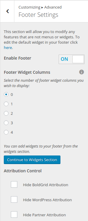
Footer Panel
- Default Value:
true
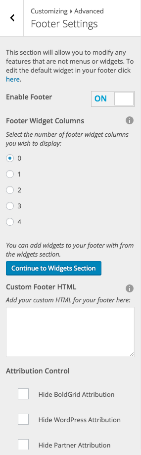
The footer panel inside of the customizer is shown in the theme by navigating to the Advanced section. It is labeled as Footer Settings.

This panel can be disabled with the configuration option for ['customizer-options']['footer_panel'], by setting the configuration option to false.
This code can be used to disable the footer panel in your configuration file:
$boldgrid_framework_configs['customizer-options']['footer_panel'] = false;
You can confirm that the footer panel has been deactivated inside of the WordPress customizer:
Inside of this section, you will see four controls that are implemented by the configuration options, Enable Footer, Footer Widget Columns, Custom Footer HTML, and Attribution Control:
You may wish to disable the footer widgets control or disable the custom footer HTML control instead of removing the section entirely.
Disable Footer Widgets Control
- Default Value:
true
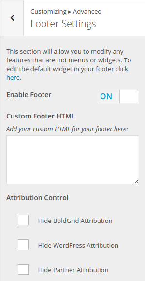
Passing false to ['customizer-options']['footer_controls']['widgets'], will disable the footer widgets control. This example can be used to disable the footer widgets:
$boldgrid_framework_configs['customizer-options']['footer_controls']['widgets'] = false;
The WordPress customizer will reflect your change and the Widgets control is no longer present:
Disable Footer Custom HTML Control
- Default Value:
true
To disable the Custom Footer HTML control, set the configuration option ['customizer-options']['footer_controls']['custom_html'] to false, like this:
$boldgrid_framework_configs['customizer-options']['footer_controls']['custom_html'] = false;
Inside of the customizer, the Customer Footer HTML control is no longer displayed: