BoldGrid Theme Submission Requirements
The following sections are intended to be used as a guide for successful submission of themes or design components to the BoldGrid system.
This section is broken up into the following subsections:
- BoldGrid Layers
- GridBlocks
- Modules
- Themes
- Theme Framework
- Required Files
- Activate Framework
- Required Hooks
- Available Resources
- CSS Standards
- Color Palettes
- Custom Site Title
- Menu Locations
- Widget Areas
- Plugin Support
BoldGrid Layers
All BoldGrid sites are constructed using Themes, GridBlocks, and Modules. Understanding the relationship between these components is essential to proper BoldGrid Theme development. Because of their modular nature, it's entirely possible to design for one layer without designing for another.
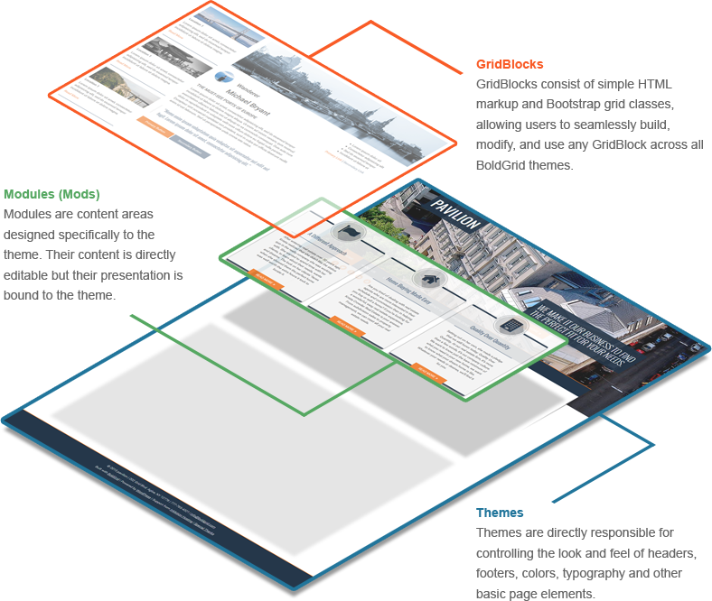
GridBlocks
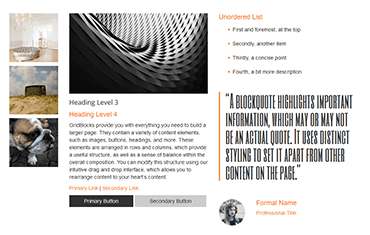
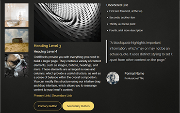
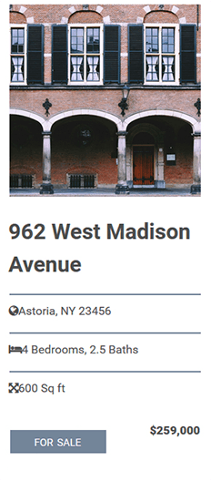
All BoldGrid Themes should support a number of GridBlocks, defined generally as small, discrete pieces of content intended as manageable models, or 'blocks,'' for users to rearrange and customize.
GridBlocks include appropriate content elements arranged in a specific layout as chosen by a Designer or Theme Developer.
At their core, GridBlocks are snippets of code that handle most of a BoldGrid site's content. They're designed to be modular, allowing users to deploy them on any BoldGrid Theme of their choosing, all while the content and structure within the GridBlock remains intact. This is possible because GridBlocks exist independently from CSS styling and only depend on grid-related Bootstrap classes for structuring content.
This approach allows GridBlocks to be moved from one Theme to another while letting the Theme handle style choices (e.g. typography, color, button styles, etc.).
Example: GridBlocks inherit their styling from the Theme in which they're used.
GridBlock Support
In order to support the range of elements represented within GridBlocks, a theme's stylesheet must be comprehensive in its approach to base styles, setting up as complete a style guide as possible All BoldGrid Themes must include styles to support common elements used in GridBlocks: h1, h2, h3, h4, h5, h6, p, a, ol, ul, li, hr, img, blockquote, a:hover, a:focus, .link-primary, .link-secondary, .button-primary, .button-secondary
The Grid
All BoldGrid Themes use the Bootstrap Grid System with the following adjustments and exceptions:
- Avoid applying additional classes to any div used as a Container, Row, or Column
- As the BoldGrid Editor plugin only deals with xs, sm, and md sizes, avoid using the lg size if possible
- As the BoldGrid Editor plugin calculates Column sizes for xs, sm, and md sizes, it will add the default size of 12 in the markup for any size that has not been specified. While this is unnecessary in Bootstrap, it is commonly found in BoldGrid content (see example):
<div class="col-md-6 col-xs-12 col-sm-12">
Although Column Offsets are a feature of Bootstrap, they should be avoided in BoldGrid content due to the desired User Experience. The BoldGrid method of approximating a Column Offset is to add an empty Column of the size to be offset directly before the subsequent Column (see example):
<div class="row">
    <div class="col-md-4"></div>
      <div class="col-md-8">
         <p>Lorem ipsum</p>
      </div>
</div>
Content Standards
The following standards are relevant to BoldGrid as an entire content delivery system, and will apply to GridBlocks in a more general sense.
All content produced for BoldGrid should serve as an example for BoldGrid users to follow.
- As opposed to providing Lorem Ipsum filler text, which has traditionally been used to de-emphasize the content itself in favor of the design, our content has been written for a specific customer vertical as an example of effective use of text suitable for a website within that particular category.
All content should be designed in such a way as to provide a practical model of fundamental design principles.
- The stronger the application of fundamental design principles (balance, contrast, etc.) to content, the greater positive influence this will have on the user's customization of content for their own purposes.
All content should be flexible in terms of its interaction with the BoldGrid Editor plugin
- Generally speaking, this means that designs should avoid being too dependent on context or specific content, as it is extremely likely that both the context and content will be modified by the user, often to the point of being radically different from the original.
- Borrowing from the traditional programming concept of coupling, this is similar in practice to the preference toward loose coupling in a well designed software system.
Modules
All BoldGrid Themes use a modular system applied to associated BoldGrid content to provide for more sophisticated user interactions.
Perhaps the best way to think of a Module is as an area of content aesthetically designed to the Theme. Mods essentially allow BoldGrid Theme designers to extend their CSS to content in ways that a Theme's GridBlock Key won't accomodate for, allowing designers to piece together richer and more involved ways for presenting user content.
Modules provide a context for elements and specify the presentation of elements within that context.
Modules are a key component in the deliberate separation of presentation (i.e. standard CSS properties) from layout (i.e. the rows and columns of the Grid).
Using modules effectively will allow elements to adopt certain style characteristics within the module, while also providing the user with the ability to drag elements outside of the module or into other modules where the element will adopt a different set of style characteristics.
The important thing to keep in mind is that Module presentation is specific to the Theme. When content is pulled out of a Module, its context then changes and assumes the styling defined by the Theme's GridBlock Key.
The BoldGrid modular system is similar to the approach used by Scalable and Modular Architecture for CSS (SMACSS).
Module Naming Conventions
Modules will follow the Bootstrap convention of using class prefixes followed by additional hyphenated descriptors.
The word 'module' will be abbreviated as 'mod' in the class prefix (see example):
<div class="mod-example">
In the case of Universal Content (shared between Categories and Page Sets, generally referred to as Inside Page Content), the descriptor should refer to the module's intended functional use.
As the universality of these modules involves their use in other themes, these modules will be determined by the BoldGrid Theme Review team (see example):
<div class="mod-image-gallery">
In the case of specific Home Pages, deriving semantic meaning is more complex, presenting the following issues:
- Home Pages are intended to serve as sophisticated models of Layout and Design across multiple Categories. As such, content will change significantly from one Category to another, and will change even more radically once content is customized by the user.
- For this reason, neither functional use nor original written text will provide sufficient semantic meaning.
- Additionally, any naming convention referring to specific styles would be problematic. For example, the semantic meaning of color values would be obscured by the intentional switching of color palettes.
- Any type of numeral (e.g. 1,2, etc.) or ordinal (e.g. primary, secondary, etc.) naming convention would also be problematic, since it is entirely possible that descriptors containing early numbers in the series will eventually be removed, which would obscure the semantic meaning for later numbers in the series.
- Due to the above considerations, the naming convention needs to be both flexible and abstract.
- Modules will be conceived as prototypes for the user, and named accordingly, using the Greek Alphabet in sequence, following existing naming conventions in prototyping (see example):
<div class="mod-alpha">
Module Usage
Modules should be appended to the standard Row > Column structure, forming a revised Row > Column > Module structure.
Standard implementation of the revised structure (see example):
<div class="row">
    <div class="col-md-6">
        <div class="mod-alpha">
            <p>Lorem ipsum</p>
        </div>
    </div>
    <div class="col-md-6">
        <div class="mod-beta">
            <p>Lorem ipsum</p>
        </div>
    </div>
</div>
Nested Rows and Submodules
Modules should not have sibling elements, only descendant elements.
In the case where sibling elements would be desirable, the proper application will be a Nested Row > Column structure.
The Nested Row > Column structure will preserve the Layout relationship among elements, while allowing flexibility in terms of styling in different parts of the page.
Nested Rows may also contain Submodules (named sequentially in reference to the parent Module), which can contain additional style properties that are distinct from the parent Module (see example):
<div class="row">
    <div class="col-md-12">
        <div class="mod-alpha">
            <div class="row">
                <div class="col-md-8">
                    <div class="mod-alpha-1">
                        <p>Lorem ipsum</p>
                    </div>
                </div>
                <div class="col-md-4">
                    <div class="mod-alpha-2">
                        <p>Lorem ipsum</p>
                    </div>
                </div>
            </div>
        </div>
    </div>
</div>
Module Styles
Modules allow for additional specification of CSS properties applied to an element or elements within a given module context. These properties should not apply to elements removed from the module by the user, and thus need to be coded in a specific way.
For example, assuming a horizontal rule has the following base styles:
hr {
    background: #738599;
    height: 2px;
}
The above styles would be changed within the alpha module in the following example:
.mod-alpha hr {
    background: #ccc;
    height: 1px;
}
Themes
Themes account for much of the appearance visitors experience when they visit a BoldGrid website. Themes define the general look and feel of areas like headers, footers, and typography while also establishing the width of the content area.
A BoldGrid Theme also houses what is known as a GridBlock Key, which is a set of styled elements that define the look and feel of content on the Theme's pages. This Key is utilized by GridBlocks (see below) to inherit the aesthetic qualities of the Theme. Every BoldGrid Theme should account for all of the elements presented within the Key. Defining GridBlock Key styles is an important part of BoldGrid Theme development, as leaving elements unstyled will result in unstyled GridBlocks.
Theme Framework
All BoldGrid Themes include all current theme framework files in the following directory: themename/inc/boldgrid-theme-framework
All BoldGrid Themes include all framework configuration files in the following directory: themename/inc/boldgrid-theme-framework-config
Required Files
All BoldGrid Themes include the following files in the root directory: 404.php, archive.php, comments.php, editor-style.css, footer.php, functions.php, header.php, index.php, page.php, page_home.php, readme.md, rtl.css, screenshot.jpg, search.php, searchform.php, sidebar.php, single.php, style.css, woocommerce.php
All BoldGrid Themes include the following folders (containing the specified files in parentheses): css (color-palettes.css), fonts (empty), images (background.jpg as necessary, boldgrid.png, boldgrid-logo.png), inc (specified above), js (empty), languages (boldgrid-themename.pot, readme.txt), template-parts (content.php, content-none.php, content-page.php, content-search.php, content-single.php)
All BoldGrid functions, actions, filters, and hooks contained within existing theme files must remain. Any of these may be (and many likely will be) reorganized or moved within the file structure, but none may be removed.
Activate Framework
To activate the framework, open up the functions.php file. We need to include the BoldGrid Theme Framework Configuration File, and the BoldGrid Theme Framework itself.
This example will load both of the required files to setup the BoldGrid Theme Framework:
<?php
/**
 * Add Theme framework configuration
 */
require_once get_template_directory(  ) . '/inc/boldgrid-theme-framework-config/config.php';

/**
 * Include the BoldGrid Theme Framework
 */
require_once get_template_directory(  ) . '/inc/boldgrid-theme-framework/boldgrid-theme-framework.php';
?>
Required Hooks
The BoldGrid Theme Framework makes use of WordPress hooks and filters. The following hooks are required by the BoldGrid Theme Framework to ensure things are easy to extend, and work properly:
- boldgrid_html_before
- boldgrid_head_top
- boldgrid_head_bottom
- boldgrid_header_before
- boldgrid_header_bottom
- boldgrid_header_after
- boldgrid_header_top
- boldgrid_body_top
- boldgrid_body_bottom
- boldgrid_sidebar_before
- boldgrid_sidebar_top
- boldgrid_sidebar_bottom
- boldgrid_sidebar_after
- boldgrid_footer_before
- boldgrid_footer_top
- boldgrid_footer_bottom
- boldgrid_footer_after
- boldgrid_comments_before
- boldgrid_comments
- boldgrid_comments_after
- boldgrid_search_form
- 404_before
- boldgrid_404
- 404_after
- boldgrid_site_title
- boldgrid_print_tagline
- boldgrid_display_attribution_links
- boldgrid_menu_primary
- boldgrid_menu_tertiary
- boldgrid_menu_secondary
- boldgrid_mesnu_social
- boldgrid_menu_footer_center
Available Resources
All BoldGrid Themes include the following resources, enqueued by the Theme Framework:
- Bootstrap - primarily included for its Grid System, but also includes base styling for other elements (may be edited to a condensed version in the future)
- Font Awesome - icon font library, open source and awesome
- Underscores - includes CSS reset and other relevant WordPress styles
- Kirki - extends the WordPress customizer with a number of useful functions
In the case where additional functionality is desired, other external resources or libraries may be included in your theme in the appropriate folders (css, js, etc.) and enqueued in functions.php according to current WordPress Standards.
The BoldGrid Theme Review team will review all external resources and make the final decision on whether or not to include those resources in its Theme Framework.
If resources are not approved by the BoldGrid Theme Review team, those resources may not be included in an individual theme submission.
CSS Standards
To a large extent, BoldGrid Themes should follow existing WordPress CSS Standards
Structure
- Use tabs, not spaces to indent each property.
- Each selector should be on its own line, ending in either a comma or an opening curly brace. Property-value pairs should also be on their own line, with one tab of indentation and an ending semicolon.
- The closing brace should be flush left, using the same level of indentation as the opening selector.
Correct:
#selector-1,
#selector-2,
#selector-3 {
    background: #fff;
    color: #000;
}
Incorrect:
#selector-1, #selector-2, #selector-3 {
    background: #fff;
    color: #000;
    }

#selector-1 { background: #fff; color: #000; }
Spacing
- Group similar blocks together with no lines between each block.
- Add a blank line before a new group within a section.
- Add a blank line before a new section.
Correct:
/*--------------------------------------------------------------
# Header
--------------------------------------------------------------*/
.site-header {
    background: rgba(0, 0, 0, 0.8);
}
.site-title {
    font-weight: normal;
    text-align: center;
}

/* Call To Action */
.slogan {
    color: #fff;
    font-family: 'Raleway';
}

/*--------------------------------------------------------------
# Navigation
--------------------------------------------------------------*/
Incorrect:
/*--------------------------------------------------------------
# Header
--------------------------------------------------------------*/
.site-header {
    background: rgba(0, 0, 0, 0.8);
}

.site-title {
    font-weight: normal;
    text-align: center;
}
/* Call To Action */

.slogan {
    color: #fff;
    font-family: 'Raleway';
}
/*--------------------------------------------------------------
# Navigation
--------------------------------------------------------------*/
Selectors
- Use human readable selectors that describe what element(s) they style.
- Use lowercase and separate words with hyphens when naming selectors. Avoid camelcase and underscores.
- Refrain from using over-qualified selectors, div.container can simply be stated as .container
Correct:
#comment-form {
    margin: 1em 0;
}
Incorrect:
#commentForm { /* Avoid camelcase. */
    margin: 0;
}

#comment_form { /* Avoid underscores. */
    margin: 0;
}

div#comment_form { /* Avoid over-qualification. */
    margin: 0;
}

#c1-xr { /* What is a c1-xr?! Use a better name. */
    margin: 0;
}
Properties
- Properties should be ordered alphabetically.
- Properties should be followed by a colon and a space.
- All properties and values should be lowercase, except for font names and vendor-specific properties.
- Vendor prefixes should appear last, ordered from longest (-webkit-) to shortest (unprefixed).
- A comment line should appear before the block of vendor prefixes describing its purpose (except when there are no other properties).
Correct:
#overlay {
    color: #fff;
    padding: 10px;
    position: absolute;
    z-index: 1;
    /* Box Shadow */
    -webkit-box-shadow: inset 0 0 1px 1px #eee;
    -moz-box-shadow: inset 0 0 1px 1px #eee;
    box-shadow: inset 0 0 1px 1px #eee;
}
Incorrect:
#overlay {
    z-index:1;
    position:absolute;
    box-shadow: inset 0 0 1px 1px #eee;
    -moz-box-shadow: inset 0 0 1px 1px #eee;
    -webkit-box-shadow: inset 0 0 1px 1px #eee;
    padding:10px;
    color:#FFFFFF;
}
Values
- Space before the value, after the colon
- Always end values in a semicolon
- Use double quotes rather than single quotes, and only when needed, such as when a font name has a space.
- Zero values should not have units unless necessary, such as with transition-duration.
- Use a leading zero for decimal values, including in rgba().
- Use hex code for color values, or rgba() if opacity is needed.
- Hex codes should always be presented in lowercase characters.
- Shorten values when possible: #fff instead of #ffffff.
Correct:
.class { /* Correct usage of quotes */
    font-family: "Helvetica Neue", sans-serif;
}

.class { /* Correct usage of zero values */
    text-shadow: 0 -1px 0 rgba(0, 0, 0, 0.5);
}

.class { /* Correct usage of hex values */
    background: #fff;
}
Incorrect:
.class { /* Avoid missing space and semicolon */
    background:#fff
}

.class { /* Avoid adding a unit on a zero value */
    margin: 0px 0px 20px 0px;
}

.class { /* Use lowercase values, shorten when possible */
    background: #FFFFFF;
}
Color Palettes
All BoldGrid Themes include five pre-selected color palettes (including the base palette), which may include two to five customizable colors, plus an additional 'Neutral Color' if necessary.
Each theme includes a SCSS file that defines the elements that will be changed and by which variables. When the user visits the Color Palette Customizer the colors defined by the theme, in turn define the variables. The now complete SCSS file, is compiled and then attached to the preview window to display an up-to-date reflection of the site. When the user is happy with their changes, they can save the changes. At which point all the updated variables are passed back to the server, the SCSS is compiled, and the new color palette CSS file is updated.
Color Palette Implementation
A BoldGrid Color Palette consists of three properties:
- Default ( boolean ) - Whether or not this palette will be automatically set if the user has not chosen/created a palette yet
- Format ( string ) - The format indicates the body class that will be used to apply the new color scheme to a theme. Multiple format types can be used to define which element groups will have a color applied to it.
- Colors ( array ) - List of colors to be included in a palette. Can be defined in hex, rbg, hsl etc.
The following function, included in config.php, creates a new Color Palette control with one color palette included.
Note: color palettes added through this filter cannot be removed by the user (see example):
$boldgrid_framework_configs['customizer-options']['colors']['enabled'] = true;
  $boldgrid_framework_configs['customizer-options']['colors']['defaults'] = array (

    $palettes = array (
        array (
            'default' => true,
            'format' => 'palette-primary',
            'neutral-color' => '#ffffff',
            'colors' => array(
                   '#ef7928',
                   '#25374a',
                   '#738599',
                   '#25374a',
                   '#f3f3f3',
            )
        )

return $palettes;
}

add_filter( 'boldgrid_theme_helper_color_palettes', 'theme_helper_color_palettes' );
SCSS Variables
A color variable consists of the format (primary) followed by the order of the color that is defined in the color format.
The following describes the first color in the palette-primary format (see example):
background: $palette-primary_1;
A standard text contrast function is also used so that colors may change appropriately in relation to the background color (see example):
color: $text-contrast-palette-primary_1;
Custom Site Title
All BoldGrid Themes support a number of customizable properties controlling the appearance of the Site Title.
See the following reference material in the Configuration File Documentation
Menu Locations
All BoldGrid Themes include five available menu locations, two of which are populated during site deployment.
Social Media icons must be able to appear in all menu locations with appropriate styling The specific locations are as follows:
- Primary
- Social Media
- Upper Right
- Footer
- Designer's Choice
See the following reference material in the Configuration File Documentation
Widget Areas
All BoldGrid Themes include three customizable widget areas in the Header.
The specific locations are as follows:
- Header Row Columns (automatically created)
- CTA / Call To Action (if applicable)
- Designer's Choice
Plugin Support
BoldGrid Themes need to provide support for the following plugins.
WooCommerce Support
All BoldGrid Themes will provide minimal support for WooCommerce and should be able to pass the following User Acceptance Tests:
- Install WooCommerce Dummy Data to the test store
- Woocommerce pages (Shop, Cart, Checkout, My Account) can be added to menus
- Woocommerce pages have appropriate styles and layout of theme
- All buttons have Woocommerce branding (purple)
- Enable Paypal and test payments with Paypal sandbox
- woocommerce.php is part of the template files
- Tables have appropriate styling (cart page)
- Comments will inherit bootstrap classes and colors of theme
- Sidebar can be added with widgets to the products page