Tagged: Crio, Page Headers
- AuthorPosts
- October 16, 2023 at 1:45 pm #109495
 YasirGuest
My website title does not appear correctly on mobile. The text of the title (only) seems not to adjust to mobile and instead is crunched. How do I fix this so that it is uniform on any device (laptop, desktop, or mobile)?
DreamHost support said: I would suggest reaching out to Boldgrid support. The issue looks to be related to the element and the way it is formatted. It may be beneficial to hide that element on mobile, but it may require manually adjusting the CSS to fit the larger header.Can you help me with this please?
Thanks,
Yasir
October 16, 2023 at 5:55 pm #109521Brandon CParticipantHi Yasir,
Thanks a lot for reaching out with your Crio Pro WordPress theme questions. We’re happy to help with your Page Header, let’s first clarify exactly what it is that you want to do.
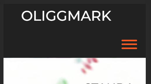
When inspecting your page header on mobile here’s how it looked on our end:

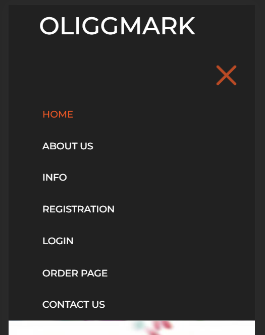
And here’s how it looks with the Hamburger Nav Menu expanded:

If you can explain exactly where you would like your elements to be placed I’m sure we can assist you further with this. It would also be helpful to know how you’re implementing your page header. If you’re using the native Crio page headers you can change the layout of your page headers from the Design > Header > Site Header Layout > Select Layout.
You can also use a Custom Crio Page Header to capture the desired layout of our page header. Custom Page Headers in Crio use the same drag and drop functionality as the BoldGrid Post and Page Builder. We have a video you can follow that shows how to set this up in your Crio theme.
I hope this helps Yasir. We look forward to assisting you further with this if need be!
October 17, 2023 at 10:13 am #109533YasirGuestHi Brandon, sorry, by title I meant the text that is on top of the image (right below where you took a screenshot). I don’t know how to upload an image to show you, but it the text that says: “STANDARDIZED IMMUNOAFFINITY PROTEOMICS WITH OLIGO(RARE) IGG(ANTIBODY) MARKERS “. this is all over the place crunched downwards when I open it on mobile.
I’m not sure why its the only thing that is not adjusting to mobile. Everything else and on other pages as well, look fine.
-Yasir
October 17, 2023 at 10:48 am #109677Brandon CParticipantHi Yasir, thanks for clarifying that!
I inspected the header text in your “Hero section” and it looks like you have too much padding added to the column that holds your text causing it to bunch up like this.
I would go about resolving this by duplicating the row that holds your text (Hover over the text and click the hamburger of the “yellow” tab that appears to pull up its options and click “Clone“), then use the responsive utilities in Post and Page Builder to hide the original row that holds your text on “Mobile Devices” and “Tablets”. Also hide the newly created row of text on “Desktop” and “Laptop” screen sizes.
After that, switch to the “Phone View” screen by clicking the “phone” icon in your editor toolkit so that you can view the page from a mobile perspective.

You should only see one row of text for your title. Hover over the text again but this time choose the “blue” column hamburger toggle and click “Advanced Control“, and here you can adjust the padding on mobile devices only for your element.
I hope this helps Yasir! Please let us know if you have any questions!
October 17, 2023 at 2:49 pm #109687YasirGuestHi Brandon, this was very useful. but I’m still encountering an issue on mobile.
So I did as you said, cloned and set the responsive settings – which resulted in some edits working, but not others. Moreover, for some reason mobile is no longer responding to any changes I do now. The changes do not show up when I look in my or my wifes iphones (havent checked any other mobiles), whereas on wordpress “Phone View”, the edits are there and can be edited some more without change on the actual phones. I know that one edit did transfer over to the actual phones, I removed a sentence to see if things change, but nothing else is changing if I move things around. Currently, the “Learn More” button is sitting right on top of the text and does not change if I move either the button nor the text (even if I relocate them – they stay in the same place on the Phone).
Thanks a lot for all your help.
-Yasir
October 17, 2023 at 2:49 pm #109688YasirGuestBrandon,
Please disregard my previous message. It seems to have updated now. It must have been a cache issue, or something I probably I have no idea about. Anyways, its fixed itself, so I dont think I need any help unless I run into the issue again.Thanks
October 17, 2023 at 2:50 pm #109697Brandon CParticipantHi Yasir!
I’m so happy to hear that you were able to get this resolved. I should have mentioned caching would probably be necessary especially because you had already been making a lot of changes on your site.
Please don’t hesitate to reach back out if there’s anything else that we can answer for you!
- AuthorPosts
- The topic ‘Crio theme title doesn’t load correctly on mobile devices’ is closed to new replies.